Design PDF templates, bind them to your data, and deliver the output on demand or on a schedule.
Often visited
[Components](reports/components/text.md)
[Parameters](reports/parameters.md)
[Themes](reports/themes.md)
[API](administration/integration/api.md)
## Get started
1**Install**
Run the server and its Postgres database with Docker Compose.
[Installation](getting-started/install.md)
2**Connect your data**
Point a data source at SQL, an API, MongoDB, a spreadsheet or a file.
[Data Sources](reports/data-sources.md)
3**Design and deliver**
Lay out the template, bind it to fields, then render or schedule it.
[Invoice tutorial](reports/tutorial-invoice.md)
### Prefer to watch first?
A four-minute introduction to CxReports. It covers:
- the report editor
- binding a template to your data
- rendering and delivering the output
## Browse by area
:material-file-document-edit-outline:{ .cxh-ico } [**Reports**](reports/index.md)
The editor, components, data binding, themes, export formats and scheduled jobs.
[Report Editor](reports/report-editor.md)
[Data Sources](reports/data-sources.md)
[Themes](reports/themes.md)
[Jobs](reports/jobs/index.md)
:material-view-dashboard-outline:{ .cxh-ico } **Portals** Coming soon
Pages your users sign into, built from the same data as your reports.
:material-cog-outline:{ .cxh-ico } [**Administration**](administration/index.md)
Workspaces, users and roles, install and hosting, and the API.
[Application settings](administration/install/appsettings.md)
[SSO](administration/install/sso.md)
[Roles](administration/workspace/roles.md)
[API](administration/integration/api.md)
## Start from a use case
- [Invoices and billing](use-cases/invoices.md)
- [Customer statements](use-cases/statements.md)
- [Financial statements](use-cases/financial-statements.md)
- [Scheduled reports](use-cases/scheduled-reports.md)
- [Documents for your customers](use-cases/customer-facing.md)
- [Multi-language documents](use-cases/multi-language.md)
- [Regulatory and archival](use-cases/regulatory.md)
- [Document merge](reports/document-merge.md)
## What's new
[All release notes](changelog/index.md)
Sep 16, 20261.26.2 [Report delivery to volumes, S3 and SFTP](changelog/index.md)
Aug 26, 20261.26.1 [In-house PDF engine](changelog/index.md)
Aug 21, 20261.26.0 [Reports and Admin split into separate modules](changelog/index.md)
## Use these docs with an AI agent
Every page is also served as raw Markdown at its URL with a `.md` suffix. `llms.txt` indexes
them, and `llms-full.txt` holds the whole corpus in one file.
```bash
curl https://docs.cx-reports.com/llms.txt
curl https://docs.cx-reports.com/reports/themes.md
```
[llms.txt](/llms.txt){ .md-button .md-button--primary }
[llms-full.txt](/llms-full.txt){ .md-button }
---
# Running the CxReports Docker Application
This guide outlines the steps to run the CxReports Docker application, which has a dependency on a Postgres database, using Docker Compose.
## Setup Video
## Prerequisites
- Docker installed on your machine. Visit [Docker's official installation guide](https://www.docker.com/get-started) for instructions.
- Basic knowledge of Docker commands.
## Docker Compose Configuration
!!! note "Prepared Configuration Files"
Prepared configuration files [are available on GitHub](https://github.com/cx-reports/configuration-samples/tree/main/cx-reports).
Create a new folder on your machine and save the `docker-compose.yml` file in it.
Below is the file that defines the codaxy/cx-reports service and its database dependency:
```yaml
services:
app:
image: codaxy/cx-reports:latest
depends_on:
- db
volumes:
- ./logs:/app/Logs
ports:
- "80:8080"
restart: always
secrets:
- source: appsett_app
target: /app/appsettings.Production.json
db:
image: postgres
volumes:
- postgres_data:/var/lib/postgresql/data
environment:
POSTGRES_DB: cxreports # Replace with your database name
POSTGRES_USER: postgres # Replace with your database user
POSTGRES_PASSWORD: password # Replace with your database password
restart: always
secrets:
appsett_app:
file: ./appsettings.Production.json
volumes:
postgres_data:
```
> CxReports runs internally on port 8080, so you need to map it to desired port on your machine. In the example above, we mapped it to port 80.
## Application Configuration
1. Create a new folder named `logs` in the same root directory.
2. Create a new file named `appsettings.Production.json` in the root directory as well with the following content to it:
!!! note "User password requirements"
User password must have a minimum of 8 characters, out of those 8 characters, at least 1 special character, number and letter need to be present.
```json
{
"ConnectionStrings": {
"Database": "Host=db;Database=cxreports;Username=postgres;Password=password"
},
"Encryption": {
"Key": "6F761C152A69C34B655BFF6226116AD4",
"Vector": "A9B2BC02C2FDDE88"
},
"RootUser": {
"Email": "first.user@cx-reports.com",
"Password": "password",
"DisplayName": "First User"
}
}
```
RootUser is the first user that will be created in the system. You can change the email and password to your liking.
### Using environment variables instead
The configuration file is optional. The same settings can be passed to the container as environment
variables, which is usually more convenient on managed platforms and with secret stores:
```yaml
services:
app:
image: codaxy/cx-reports:latest
environment:
ConnectionStrings__Database: "Host=db;Database=cxreports;Username=postgres;Password=password"
Encryption__Key: "6F761C152A69C34B655BFF6226116AD4"
Encryption__Vector: "A9B2BC02C2FDDE88"
RootUser__Email: "first.user@cx-reports.com"
RootUser__Password: "password"
RootUser__DisplayName: "First User"
```
With this in place you can drop the `secrets:` block and the `appsettings.Production.json` file
altogether. Nested settings use a double underscore per level, and environment variables take
precedence over the file if you use both. See [Environment variables](../administration/install/environment-variables.md)
for the complete reference.
## Encryption
You should replace the default encryption parameters to protect sensitive data stored in the database, i.e. license keys, database connection strings, etc.
To generate a new encryption key and vector, run the following bash command:
```bash
openssl enc -aes-128-cbc -k secret -P -md sha1
```
This command will generate 32 chars long key (`key`) and vector (`iv`). The vector should be 16 characters long, so use just the first 16 chars. Replace the values in the `appsettings.Production.json` file with the values you get from the command.
!!! warning
Key is 32 chars long and vector should be 16 chars long, so use the first 16 chars of the newly generated vector (`iv`).
Final directory structure should look like this:
```bash
├── appsettings.Production.json
├── docker-compose.yml
└── logs
```
1. Run the following command in the same directory to start the application:
```bash
docker-compose up -d
```
5. Open your browser and navigate to `http://localhost:80` to access the application.
6. To stop the application, run the following command:
```bash
docker-compose down
```
## Path Base
Path Base is a feature that allows you to host the application under a subdirectory. For example, if you want to host the application under `https://example.com/reports`, you need to set the `PathBase` property in the `appsettings.Production.json` file:
```json
{
"PathBase": "/reports"
}
```
## SMTP Configuration
To configure SMTP settings, edit the `appsettings.Production.json` file and add the following section:
```json
{
"SmtpServer": {
"From": "no-reply@example.com",
"ReplyTo": "reply@example.com",
"DisplayName": "Company Report",
"Host": "smtp.example.com",
"Port": 25,
"Username": "username",
"Password": "password",
"EnableSsl": true
}
}
```
---
# Use Cases
What people actually build with CxReports, and the shortest path to each.
- :material-receipt-text-outline:{ .lg .middle } __Invoices and billing__
---
Exact layout, tax lines, per-customer branding — the document your finance
team already has strong opinions about.
[:octicons-arrow-right-24: Invoices and billing](invoices.md)
- :material-account-multiple-outline:{ .lg .middle } __Statements at scale__
---
One template, one run, one PDF per customer — delivered to each of them.
[:octicons-arrow-right-24: Customer statements](statements.md)
- :material-finance:{ .lg .middle } __Financial statements__
---
Grouped, subtotalled and cross-footed tables that have to add up.
[:octicons-arrow-right-24: Financial statements](financial-statements.md)
- :material-clock-outline:{ .lg .middle } __Scheduled operations__
---
Reports that run unattended and land where they are needed.
[:octicons-arrow-right-24: Scheduled reports](scheduled-reports.md)
- :material-view-dashboard-outline:{ .lg .middle } __Documents for your customers__
---
A branded place where your users find their own documents, or an API that
puts them inside your product.
[:octicons-arrow-right-24: Customer-facing documents](customer-facing.md)
- :material-translate:{ .lg .middle } __Multi-language documents__
---
One template, several languages, no duplicated layouts.
[:octicons-arrow-right-24: Multi-language documents](multi-language.md)
- :material-shield-check-outline:{ .lg .middle } __Regulatory and archival__
---
Documents that must be accessible, reviewable and reproducible.
[:octicons-arrow-right-24: Regulatory and archival](regulatory.md)
## What's included
CxReports runs **on-premises or in the cloud**, and installs with [Docker](../getting-started/install.md).
It supports [single sign-on](../administration/install/sso.md), separates work into
[workspaces](../administration/system/workspaces.md) with
[roles and permissions](../administration/workspace/roles.md), and can be driven entirely through
its [V1 API](../administration/integration/api.md).
Reports export to **PDF** and **HTML** out of the box; **Word, Excel and PowerPoint** require the
Apryse module — see [Export Formats](../reports/export-formats.md).
---
# Invoices and billing documents
Finance teams have exact expectations for an invoice: where the totals sit, how tax is broken out, which logo appears. CxReports is built for documents where the layout is the requirement, not an afterthought.
## What it produces
A PDF that matches a specified layout every time — the same margins, the same table geometry, the same rounding — driven by your billing data.
## How you build it
1. Connect your billing data with a [data source](../reports/data-sources.md) — SQL, an API, or a file
2. Lay the document out in the [Report Editor](../reports/report-editor.md)
3. Put line items in a [Data Table](../reports/components/data-table.md), with totals in its footer
4. Move fixed parts — letterhead, payment terms, footer — into a [template](../reports/templates.md) so every invoice shares them
5. Drive per-customer variation with [parameters](../reports/parameters.md)
6. Deliver on a schedule with [Report Generation Jobs](../reports/jobs/index.md)
The [invoice tutorial](../reports/tutorial-invoice.md) walks the whole thing end to end.
## What makes it tricky
- **Totals must be computed, not transcribed.** Use the Data Table's aggregate footer rather than a separate query, so the figures cannot drift from the lines above them.
- **Tax breakdowns are usually grouped.** Grouping levels in the Data Table produce per-rate subtotals without a second data source.
- **Currency formatting is per-report, not per-cell.** Set the default in *Formatting* and override only where a column genuinely differs — see [Text Formats](../reports/text-formats.md).
- **Branding belongs in a [theme](../reports/themes.md)**, not in each component. One theme swap then re-brands every invoice.
## Related
[Custom Table](../reports/components/custom-table.md) ·
[Document Merge](../reports/document-merge.md) ·
[Export Formats](../reports/export-formats.md)
---
# Customer statements at scale
One template, one run, thousands of PDFs — each one holding a single customer's data and delivered to that customer.
## What it produces
A separate document per customer, generated in one job and emailed to each recipient's own address, or written to cloud storage under a per-customer path.
## How you build it
1. Build the statement once, as an ordinary [report](../reports/report-editor.md)
2. Create a [Report Generation Job](../reports/jobs/index.md) and add your customer data source
3. Turn on the data source's **Repeating** flag — the job then produces one entry per row
4. Add the statement template to the job
5. Add an **Email** delivery and bind the recipient to the row's address
6. Set a [schedule](../reports/jobs/index.md), or trigger runs through the [API](../administration/integration/api.md)
## What makes it tricky
- **The Repeating toggle is the whole mechanism.** Without it the job produces one document containing every customer, which is rarely what anyone wants.
- **Inside a repeating job, the current row is `{$record.…}`.** `{$data.…}` reaches the whole set. Getting this backwards is the most common cause of every statement showing the same customer.
- **One SMTP server can send from several addresses.** Define a From address per brand or department, and let each job choose — see [SMTP Settings](../administration/workspace/smtp.md).
- **Turn on hold-for-review for the first runs.** Deliveries wait until someone approves them, which is worth doing before a thousand emails leave the building.
## Related
[Report Generation Jobs](../reports/jobs/index.md) ·
[Repeating Elements](../reports/repeating-elements.md) ·
[Data Sources](../reports/data-sources.md)
---
# Financial statements
Balance sheets, P&Ls and trial balances: documents whose credibility rests on the numbers adding up and the structure being legible.
## What it produces
Multi-level grouped tables with subtotals at each level and a cross-footed total, formatted to accounting conventions.
## How you build it
1. Bring the ledger in through a [SQL data source](../reports/data-sources.md), or reshape it first with a [data transformation](../reports/data-sources.md)
2. Place a [Data Table](../reports/components/data-table.md) and generate columns from the data
3. Open **Grouping Settings** and define up to three levels — for example account class, then account group
4. Enable **Show Footer** per level for subtotals, and set the aggregate per column
5. Use **Caption tpl** to label each group from its own data
6. Set number and currency defaults once in the *Formatting* section
## What makes it tricky
- **Three grouping levels is the limit.** Deeper hierarchies need either a pre-aggregated data source or [subreports](../reports/subreports.md).
- **Aggregates are configured per column, not per table.** A column with no aggregate simply renders blank in the footer, which is easy to mistake for a calculation error.
- **Weighted figures need a *Weight Field*.** A plain average across rows of different sizes will not reconcile.
- **Use fixed table layout** when columns must align across several statements in the same pack, rather than letting each table size itself to its content.
## Related
[Data Table](../reports/components/data-table.md) ·
[Custom Table](../reports/components/custom-table.md) ·
[Subreports](../reports/subreports.md)
---
# Scheduled operational reports
Recurring reports that have to run without anyone remembering to run them, and arrive somewhere useful.
## What it produces
A document, or a set of documents, produced on a schedule and delivered to email, Google Drive, SharePoint, S3, SFTP, or a local volume.
## How you build it
1. Build the report and confirm it renders with real data
2. Create a [Report Generation Job](../reports/jobs/index.md)
3. Add [parameters](../reports/parameters.md) the schedule should vary — a reporting period, for example
4. Turn on **Enable scheduled generation** and set the recurrence
5. Add one or more deliveries and set their targets
6. Watch the first runs in the job's run history
## What makes it tricky
- **A job can have several deliveries.** The same run can email a summary and drop the file on SFTP, each with its own condition.
- **Delivery conditions are evaluated per entry.** In a repeating job that means a delivery can fire for some rows and not others.
- **Folder paths accept [text templates](../reports/text-templates.md).** `{$record.tier}/{$params.period}` builds the destination path per entry, and missing folders are created.
- **Schedules run on the server's clock.** Check it before assuming a 1st-of-the-month run lands on the 1st in your timezone.
- **Jobs cannot be created through the API** — the V1 API triggers and monitors runs, but jobs themselves are built in the UI.
## Related
[Report Generation Jobs](../reports/jobs/index.md) ·
[Google Drive Delivery](../reports/jobs/google-drive.md) ·
[SMTP Settings](../administration/workspace/smtp.md) ·
[API](../administration/integration/api.md)
---
# Documents for your own customers
Getting a document to the person it belongs to, without a human forwarding an email — either by giving them somewhere to collect it, or by putting it inside your own product.
## What it produces
Either a branded destination your users sign into and download from, or documents fetched on demand by your application through the API.
## How you build it
**As a portal**
1. Build the report as usual
2. Create a [portal](../portals/index.md) and add the pages your users need
3. Apply your branding with [White Label](../administration/system/white-label.md)
**Through the API**
1. Create a Personal Access Token
2. Call the [V1 API](../administration/integration/api.md) to generate or fetch a PDF for a given report and parameters
3. Stream the result to your user, or store it on your side
## What makes it tricky
- **Scope the data by the caller, not the template.** A parameter that selects a customer is only as safe as the check that the caller is that customer — enforce it on your side of the API.
- **Branding is platform-wide, not per report.** White Label changes the product's appearance; per-document branding belongs in a [theme](../reports/themes.md).
- **Portals are not yet generally released.** The pages here describe current behaviour and may change before release.
## Related
[Portals](../portals/index.md) ·
[API](../administration/integration/api.md) ·
[Developer Resources](../administration/integration/developer-resources.md) ·
[White Label](../administration/system/white-label.md)
---
# Multi-language documents
The same document, produced in several languages, without maintaining a separate template for each.
## What it produces
One report template that renders in whichever language the run requests, with translated labels and locale-appropriate dates and numbers.
## How you build it
1. Add the languages you need under [Languages](../administration/workspace/languages.md)
2. Move every fixed string in the template into a [dictionary](../reports/dictionaries.md) entry
3. Provide a translation per language for each entry
4. Check dates, numbers and currency against [Text Formats](../reports/text-formats.md) for each locale
5. Select the language when generating, by parameter or through the API
## What makes it tricky
- **Only dictionary text is translated.** Anything typed directly into a component stays as typed, which is why a half-migrated template renders in two languages at once.
- **Layout has to survive the longest translation.** German and Finnish routinely run 30% longer than English; fixed-width columns that fit in English will clip.
- **Data is not translated.** Values coming from your data source arrive in whatever language they are stored in — translate them at the source or map them with a [Badge](../reports/components/badge.md).
- **Date and currency formats are locale-dependent**, and are set separately from the language.
## Related
[Dictionaries](../reports/dictionaries.md) ·
[Languages](../administration/workspace/languages.md) ·
[Text Formats](../reports/text-formats.md)
---
# Regulatory and archival documents
Documents that must be readable by assistive technology, reviewable before they leave, and reproducible afterwards.
## What it produces
A tagged, accessible PDF, optionally held for human approval before delivery, with a record of what was produced and when.
## How you build it
1. Build the report, giving every meaningful [image](../reports/components/image.md) and chart a real *Alt text*
2. Use [Heading](../reports/components/heading.md) components for structure so the document has a real outline, not just large text
3. Request an accessible export by setting `accessible=true` on the [API](../administration/integration/api.md) call
4. Turn on **hold-for-review** in the [job](../reports/jobs/index.md) so deliveries wait for approval
5. Use the run history as the record of what was generated
## What makes it tricky
- **Accessible export is currently an API option**, not a switch in the editor — see the `accessible` parameter in the [API reference](../administration/integration/api.md).
- **Alt text left empty still produces a valid document**, described merely as "Image" or "Chart". That passes validation without helping anyone; write real descriptions.
- **Mark ornaments as decorative.** A logo in a page master is announced on every page unless it is flagged, which makes a document hostile to read with a screen reader.
- **Text that only looks like a heading is not one.** Only [Heading](../reports/components/heading.md) contributes to the document outline — a [Text](../reports/components/text.md) component in a large font does not.
## Related
[Heading](../reports/components/heading.md) ·
[Image](../reports/components/image.md) ·
[API](../administration/integration/api.md) ·
[Report Generation Jobs](../reports/jobs/index.md)
---
# Reports
## Design it once, render it for every customer
A report is a template you build visually from components — text, tables, charts, images —
and render against different data. Every run comes out pixel-identical and on-brand.
[Build your first report](tutorial-invoice.md){ .md-button .md-button--primary }
[Component reference](components/text.md){ .md-button }
!!! tip "Never built one? Start here"
The [**invoice tutorial**](tutorial-invoice.md) walks you through a complete report end to
end. It's the fastest way to understand how the pieces fit together.
## What goes into a report
:material-shape-outline:{ .cx-tile-icon } **Components** Text, tables, charts, images and barcodes, placed on a canvas and bound to your data.
:material-database-outline:{ .cx-tile-icon } **Data and parameters** Rows from SQL, an API, MongoDB or a file, filtered by parameters supplied at run time.
:material-palette-outline:{ .cx-tile-icon } **Themes and dictionaries** Shared styling, page geometry and per-language text, so every template stays consistent.
## How it comes together
1**Connect data** Point a data source at your database, API or file and explore the shape of what comes back.
2**Design the template** Lay out components on the page, bind them to fields, and apply a theme.
3**Render and deliver** Generate on demand or on a schedule, one document per customer, to email, Drive, S3 or SFTP.
## Explore
- :material-pencil-ruler:{ .lg .middle } __Author__
---
The editor, reusable templates, and the text and layout building blocks
you assemble a report from.
[:octicons-arrow-right-24: Report Editor](report-editor.md) ·
[Templates](templates.md) ·
[Text Templates](text-templates.md)
- :material-database:{ .lg .middle } __Connect data__
---
Pull rows from your database or API, explore the shape of them, and make the
report configurable at run time.
[:octicons-arrow-right-24: Data Sources](data-sources.md) ·
[Data Explorer](data-explorer.md) ·
[Parameters](parameters.md)
- :material-shape:{ .lg .middle } __Place components__
---
Tables, charts, images, barcodes and more — the building blocks you
assemble on the canvas.
[:octicons-arrow-right-24: Component reference](components/text.md)
- :material-palette:{ .lg .middle } __Control the look__
---
Shared themes, page geometry and per-language dictionaries so every report
comes out on-brand.
[:octicons-arrow-right-24: Themes](themes.md) ·
[Page Types](page-types.md) ·
[Dictionaries](dictionaries.md)
- :material-clock-outline:{ .lg .middle } __Automate delivery__
---
Run templates on a schedule, produce one document per customer, and deliver
by email, Google Drive, S3 or SFTP.
[:octicons-arrow-right-24: Report Generation Jobs](jobs/index.md)
- :material-robot-outline:{ .lg .middle } __Use AI__
---
Generate and refine report content with the assistant, and teach it your
conventions with skills.
[:octicons-arrow-right-24: AI Assistant](ai-assistant.md) ·
[AI Skills](ai-skills.md)
## Common tasks
| You want to… | Read |
| --- | --- |
| Repeat a block once per row | [Repeating Elements](repeating-elements.md) |
| Embed one report inside another | [Subreports](subreports.md) |
| Combine several PDFs into one | [Document Merge](document-merge.md) |
| Export as XLSX, HTML or CSV | [Export Formats](export-formats.md) |
| Build your own component | [Custom Components](custom-components.md) |
| Format dates, numbers or currency | [Text Formats](text-formats.md) |
| Attach static files to a report | [File Management](file-management.md) |
!!! info "Before you start"
Reports read from a connected database. If you haven't set one up, see
[Databases](../administration/workspace/databases.md).
---
# Invoice Tutorial
## Invoice Report Tutorial
In this tutorial, we'll set up all necessary components in a blank workspace to create a new template for printing invoices.
Assuming you have just launched a new workspace that is completely blank, we'll set up a few crucial elements:
1. [Theme](themes.md)
2. [Languages](../administration/workspace/languages.md)
3. [Report Types](report-types.md)
4. [Page Types](page-types.md)
5. [Template](templates.md)
### Set Up a Theme
A theme controls the aesthetics of your report, such as the choice of colors and typography styles.
Navigate to the `Themes` page and create a new theme named "Blue theme." Once there, follow these steps:
1. Introduce a new color named `primary` with the value `#3b25e4`. This color will subsequently be accessible throughout your report by its name.
2. On the `Text` tab, initially set the Font Family to `Inter` and the Font Size to `14px`.
3. Because `Inter` is an external font, switch to the `External CSS` tab and append the following link:
`https://fonts.googleapis.com/css2?family=Inter:wght@100..900`. Returning to the `Text` tab will confirm the font is now correctly applied.
4. Proceed to define the styles for paragraphs and headers.
Once the text styles are complete, proceed to the `Tables` tab and ensure the following settings:
For `Headers`:
1. Set the font weight to `Bold`, the font size to `11px`, and set the text to `Uppercase`.
2. Set a bottom border of `1px solid black`.
For `Cells`:
1. Apply a bottom border of `1px dashed lightgray`.
Preview the table styles to confirm they match your desired default look. Remember to click `Save theme` when finished.
### Languages, Report Types, Page Types
A few more Workspace Configuration changes need to be added:
1. In `Languages`, add English and French with codes `en` and `fr` accordingly, indicating the supported languages, and add culutre codes as `en-US` and `fr`
2. Under `Report Types`, create a new type called Invoice with the code `invoice`.
3. In `Page Types`, introduce a Standard page with the description "Standard counted page".
### Templates
Think of templates as the blueprint for page layouts and design, similar to Slide Masters in PowerPoint.
Visit the Templates section to create a new template named "Standard", and apply the "Blue theme".
When the editor appears, please execute the following steps:
1. Enable the Standard page type from the left sidebar.
2. Drag and drop the [Flow](components/flow.md) component from the component palette to the top of the page, above the "Placeholder (master)". You can also use "Elements" tab on the left sidebar and drag & drop components there.
3. Add the [Text](components/text.md) component into the created flow.
4. Double-click the text and enter your company's actual name.
5. Using the [right sidebar](report-editor.md), style the text using the primary font color, set the size to 24px, and make it bold.
6. Locate the [Spacer](components/spacer.md) component and place it just below the flow.
7. Adjust the spacer to set the top padding.
8. Scroll to the bottom of the page and add a Text component there.
9. Update this text to `{$page.number} of {$report.pageCount}`.
10. In the Text component's editor on the right sidebar, align the text to the right.
11. Go to the Page tab in the top ribbon and activate the "Count this page" option.
Upon completion, you have created a Standard page template with consistent headers and footers for each page of its type.
Next, navigate to the Reports section by clicking the product logo at the top left corner.
## Making the Invoice
Create a new report named "Invoice" with the type set to Invoice and select the Standard template. A blank editor will open up.
### JSON Data
Add the invoice data before introducing any visual components. For the purposes of this example, use the static JSON object provided:
```json
{
"invoiceNumber": "12345",
"dateIssued": "2024-01-27",
"dueDate": "2024-02-10",
"recipient": {
"name": "ABC Enterprises",
"address": "456 Enterprise Blvd, Commerce City, CC 67890",
"phone": "987-654-3210",
"email": "info@abcenterprises.com"
},
"items": [
{
"description": "Product 1",
"quantity": 10,
"unitPrice": 29.99,
"total": 299.9
},
{
"description": "Product 2",
"quantity": 5,
"unitPrice": 49.99,
"total": 249.95
}
],
"subTotal": 549.85,
"taxRate": 0.07,
"taxAmount": 38.49,
"total": 588.34,
"notes": "Thank you for your business. Please make payment by the due date."
}
```
To utilize this data within your report, add it as a [data source](data-sources.md) by clicking on "Data sources" in the Report tab on the top ribbon. Name the new data source `invoice`, select the JSON type, and input the provided JSON data.
### Adding Visual Elements
#### New Page
To begin, click on the `New page` button located within the `Pages` tab on the [left-hand sidebar](report-editor.md). Choose the `Standard page` type from your page options. You'll be presented with a blank sheet that already incorporates your defined company template.
Now you can move on to adding the necessary visual elements to construct your invoice.
#### Title
1. Begin by placing a `Text` element at the top of the page.
2. Double-click the newly added `Text` element and type `Invoice #{$data.invoice.invoiceNumber}` into the field.
3. Center the text, apply a bold style, and set the font size to `24px`.
4. Incorporate a `Spacer` before and after the text to fine-tune the vertical spacing.
#### Bill To Section
1. Add a `Flow` element below the title and make it horizontal using the right sidebar.
2. Inside this flow, create a new vertical `Flow`. Resize it to obtain about half of the page width and set an aproximate height of `100px`. This can also be adjusted in the `Appearance` tab, as needed.
3. Insert a `Text` element titled "BILL TO" into the vertical flow, make the text bold, and set the font color to `primary`.
4. Below that, add another `Text` block with `{$data.invoice.recipient.name}`. Make it bold and set `20px` for font size.
5. Continue with a `Text` block for the address using `{$data.invoice.recipient.address}`.
6. Right-click the address text component, select `Locate` to find it in the `Elements` tree, copy it, and then paste it as a duplicate within the parent `Flow`.
7. Adjust the duplicate element's text to `{$data.invoice.recipient.phone}` and replicate this step once more for the email, ensuring to use `{$data.invoice.recipient.email}`.
#### Details Section
1. Add another `Flow` element within the horizontal `Flow`, just next to the "Bill To" section.
2. In "Elements" tab, insert a new vertical `Spacer` between two flows and resize it to be approximately `100px` wide. Now, two flows should be side by side.
3. Copy the "BILL TO" element and paste it into the new vertical `Flow`, renaming it to "DETAILS".
4. Below that, add a [Key Value Grid](components/key-value-table.md) component.
5. Click `Configure` on the right to set up keys and values.
6. The first key-value pair should be `Issue Date:` and `{$data.invoice.dateIssued:d}`. On top left add another key-value pair with `Due Date:` and `{$data.invoice.dueDate:d}`. Note the `:d` suffix in the string template. This means format as a date.
7. Close the editor and adjust the styling in the `Row Styling` area, bolding the `Value` and setting the `Key Field Width` to `100px`.
#### Invoice Items
1. Select the "BILL TO" text element in your report.
2. Use the `Locate` function to find and highlight this element within your document's element hierarchy.
3. Right-click the highlighted element and select `Copy` from the context menu.
4. Right-click the top-level Content select `Paste`.
5. Once the element is pasted, rename it to "ITEMS" by double-clicking on the text or using the properties panel placed on the right side of the editor.
6. Add Spacers as necessary by dragging and dropping them from the component palette.
7. Below the "ITEMS" heading, insert a `Data Table` component to organize the itemized details of the invoice.
8. In the `Data source` field of the data table's properties, select `invoice.items`.
9. Click on `Generate columns` to automatically create column fields based on your JSON structure.
10. For further customization such as formatting currency, double-click the table or access the `Column settings`.
11. In the `Description` column, scroll down to `Footer and Caption` section, enable footer and input "TOTAL" under `Text` field which will appear as the table's summary row.
12. For the `Unit Price` column, under `Content` menu, establish a `Custom` format by selecting the `Format type` option and entering `currency;USD;2`, which denotes the currency format and two decimal precision.
13. For `Total` column, apply the same currency formatting, scroll down to `Footer and Caption` section and modify the footer's aggregate function to `Sum` to automatically calculate the sum of the items' totals.
Save the completed adjustments. Your data table is now ready.
#### Total Section
To keep this tutorial concise, we will skip detailing this section. Utilize your knowledge of `Flow`, `Text`, and `Key Value Grid` components to assemble this part on your own.
#### Notes
1. Below everything, add a "NOTES" `Text` element, styling it in bold with the `primary` color font.
2. Insert another `Text` element and populate it with `{$data.invoice.notes}`.
3. Access the `Appearance` tab on the right and in the `Box Style`, insert the following CSS styling:
```css
padding: 8px;
border: 1px dashed lightgray;
min-height: 100px;
```
### Preview and PDF Export
Finally, to review your report:
1. Click on the `Report` tab in the top ribbon.
2. Check the `Preview report` to evaluate the final look.
3. Adjust any spacing as necessary to ensure a consistent format.
4. Use the Export PDF option to create a PDF version of your document.
## Generating PDFs using the API
To enable PDF generation of the report using the API, please follow these additional setup steps:
1. Access the `Report Types` in the `Workspace Configuration` section. Set the default report for the `invoice` report type to the newly created report.
2. Navigate to Personal Access Tokens by clicking on the user menu in the top right corner of the screen.
3. Create a new token, often referred to as a PAT, and ensure it's stored in a secure location. This token will be revealed only once and grants API access to the application, mirroring the privileges of the logged-in user.
4. Utilize a tool such as [Postman](https://www.postman.com/), `curl`, or an equivalent to send a request formatted as follows:
```curl
GET http://localhost:80/api/v1/ws/{workspaceId}/reports/{reportTypeCode}/pdf
```
To find your workspace ID, refer to the URL in your browser—it's the number located directly after `ws/`. The `{reportTypeCode}` should be set to `invoice`, as defined when you initially configured the report types.
It's essential to include the `Authorization` header set to `Bearer {PAT}` with your request.
And with that, you can straightforwardly download the invoice.
### Providing Data for the Invoice
Should you use the static JSON data source, the same invoice details will always be applied. However, it's possible to override this by supplying your own data using the `data` query string parameter. Ensure the keys in the provided object match the names of the data sources in the report, with corresponding data structures.
```
{
"invoice": {
"invoiceNumber": "54321",
"dateIssued": "2024-02-27",
"dueDate": "2024-03-10",
"recipient": {
"name": "XYZ Enterprises",
"address": "567 Enterprise Blvd, Commerce City, CC 56789",
"phone": "987-654-3210",
"email": "info@abcenterprises.com"
},
"items": [
{
"description": "Product 1",
"quantity": 10,
"unitPrice": 29.99,
"total": 299.90
},
{
"description": "Product 2",
"quantity": 5,
"unitPrice": 49.99,
"total": 249.95
}
],
"subTotal": 549.85,
"taxRate": 0.07,
"taxAmount": 38.49,
"total": 588.34,
"notes": "The data for this invoice is provided through the data query string parameter."
}
}
```
## Conclusion
By completing this tutorial, you're now equipped with the knowledge to set up a workspace, develop a new report, and access it using the API.
---
# Report Editor
The Report Editor is a central user interface designed to facilitate the creation and customization of reports. This page will guide you through the various options available in the Report Editor, helping you to efficiently manage and customize your reports. The editor is structured into three main areas: the Ribbon Toolbar at the top, the Left Sidebar, and the Right Sidebar.
## Ribbon Toolbar
The Ribbon Toolbar is organized into three tabs, each catering to different aspects of report management and customization:
### Home Tab
- **Actions Section**: Provides tools to preview the report, copy, paste, delete elements, and undo or redo changes.
- **Options Section**: Includes toggles for data binding and displaying a ruler to help align components.
- **Components Section**: Lists all available components which can be filtered by type or name for easier access. If the workspace has no [custom components](custom-components.md) yet, the section shows a **Click here to create one.** link to the Custom Components page.
### Page Tab
- **Clear Page**: Clears all content from the current page.
- **Delete Page**: Removes the selected page from the report.
- **Set as Thumbnail**: Captures and sets the current page view as the report thumbnail.
- **Delete Thumbnail**: Removes the existing thumbnail.
- **Page Name Field**: Allows you to name the page for better organization.
- **Page Type Field**: Enables changing the page type (e.g., page master).
- **Count this Page**: A toggle to assign a page number to the page inand include it in the table of contents.
- **ToC Label Field**: Sets a custom label for the page in the table of contents.
- **Page Visibility Expression**: Allows writing expressions to conditionally display pages based on parameters.
### Report Tab
- **Preview Report**: Opens a preview of the report in a new tab.
- **Export PDF**: Exports the report to a PDF file.
- **Show Available Data**: Displays a popup with the content of all data keys (`$data`, `$params`, `$dict`, `$report`).
- **Report Settings Section**: Enables modifications to the report's name, type, theme, template, and language.
- **Data Configuration Section**: Configures dictionaries, parameters, and data sources.
- **Danger Zone Section**: Provides options to delete the report, change access rules, or convert the report to a subreport.
## Left Sidebar
The Left Sidebar is divided into two tabs:
- **Pages Tab**: Displays all pages within the report. Here, you can reorder, rename, delete, or duplicate pages as needed.
- **Elements Tab**: Shows all components of the report in a tree structure. This tab allows for detailed interaction with components such as selection, movement, copying, pasting, and deletion. It is particularly useful for managing complex pages with multiple elements.
## Right Sidebar
The Right Sidebar is dedicated to configuring the selected component. Configuration options vary by component type and may be organized into multiple tabs:
### Configuration Tab
- Displays the primary settings and features for the selected component.
### Appearance Tab
- Provides options to customize the appearance of the component. You can apply CSS directly or use provided styling options to enhance the visual appeal of your report components.
## Central Area
The Central Area displays the contents of the currently selected page, providing a real-time view of how the report will appear. This area is interactive, allowing you to directly select, move, resize, or delete report components as you see them, facilitating a more intuitive design process.
By familiarizing yourself with these tools and options in the Report Editor, you can effectively create and customize reports to meet your specific needs.
!!! note annotate "Designer's note"
When designing a report in a tool like Figma, please note that the default resolution for A4 paper is 72 DPI (1). However, in CxReports, A4 paper is set at 96 DPI (2). To ensure your design maintains a 1:1 ratio when transferred from any designer tool to CxReports, use the 96 DPI A4 paper setting in your design tool.
1. Equating to 595 x 842 pixels.
2. Equating to 1123 x 794 pixels
---
# Report Templates
## Defining Report Templates
Report templates in CxReports control the layout for various page types within a report, from cover pages to standard portrait or landscape pages, and specialized pages like tables of contents and disclaimers. These templates specify headers, footers, and assign content placeholders to be filled during the report design process. Templates are linked with [themes](themes.md) that ensure visual consistency across the report.
## Using Templates
Users manage templates through the Templates page, where new designs can be made or adjustments to existing ones applied. For collaborative flexibility, templates can be [transferred between workspaces](../administration/workspace/data-import.md), enabling a consistent reporting style across different teams and projects.
## Working within the Template Editor
The template editor is where users set up default settings, like page size, orientation, and margins before diving into the design phase. Here, each page type is crafted, including the creation of fixed elements—headers and footers—and the placement of content placeholders.
The design process leverages a drag-and-drop interface from the top ribbon toolbar for easy addition of page elements. Elements like company logos are frequently added to headers, while footers might house page numbers or other relevant information.
Through [text templating](text-templates.md), dynamic data like `Page {$page.number} of {$report.pageCount}` can be integrated, allowing for real-time updates on page counts directly within reports.
Concluding customization options, including whether pages are included in the page count or changing the default page orientation and margins, are accessible in the Page tab of the ribbon toolbar, offering additional control over the final report presentation.
In essence, the template editor tool streamlines the process of creating adaptable and visually coordinated report templates in CxReports.
---
# **Themes**
Themes establish baseline styling that applies consistently across all reports and templates. While every component can be customized individually within reports or templates, themes provide:
* Consistent branding across multiple reports
* Shared styling foundation that reduces repetitive formatting work
* Easy maintenance - change theme settings once to update all associated reports
Individual component customization remains available in the report editor for complex styling requirements that go beyond theme settings. However, theme-level styling serves as the starting point, ensuring visual consistency while allowing flexibility where needed.
Access your themes through the left sidebar on the home screen, where you can:
* View all existing themes
* Create new themes
* Edit, duplicate, or delete themes
* Preview associated reports and templates
The options menu (located on the right side of each theme row) provides additional functionality, including the ability to view which reports and templates are currently using that specific theme.
After creating a new theme or editing an existing one, the Theme Edit page is opened. Each theme tab controls specific visual elements of your reports. The live preview in each tab allows you to see changes applied immediately.
## Edit as JSON
The **Theme Info** section has an **Edit as JSON** button that opens the whole theme — colors, text, tables, charts, components and CSS settings — as a single JSON document. Use it to make many changes at once, or to copy a theme's styling into another theme:
* **Copy JSON** copies the full theme definition to the clipboard
* **Save** applies the edited JSON to the theme; invalid JSON is rejected with an error and nothing changes
Saving the JSON window updates the theme in the editor only. Click **Save** on the Theme Edit page to keep the changes. The theme name and code are not part of the JSON and are edited in their own fields.
## Colors
Define your color palette and create reusable color variables. Adding new colors is done using the **+ Add new color** button. Each color definition includes:
* **Color name** - Reference name for the color
* **Color value** - Can be either selected using the built-in color picker or manually entered as a hex code, RGBA, or HSLA value.
* **Variable** - Auto-generated CSS variable (e.g., `var(--dark-gray)`) based on the color name and can not be separately defined or changed
Use the color variables defined here in other theme settings as well to maintain consistency. When a color is changed here, all elements using that color will be updated automatically.
## Text
Control typography for text elements and the table of contents.
Text, paragraphs, links, and headings are styled in the **General** section, where you can configure:
* Font family, size, weight, and color
* Line height and text transformation (uppercase, lowercase, capitalize)
* Top and bottom margins
Styling for the table of contents and its levels (L1-L6) can be done in the **Table of Contents** section, with additional options:
* Indentation control for hierarchical display
* Padding and border settings for each ToC level
## Tables
Style data tables and their components.
Switch between **Table**, **Header**, **Cells**, **Footer**, and **Group** using the styling buttons. Each component supports:
* Background and text colors
* Font properties and text transformation
* Padding controls for all four sides
* Border styling with individual side controls and color selection
## Charts
Configure data visualization colors and chart elements.
**Color Palette**: Set 16 colors for chart data series. Charts automatically cycle through these colors for multiple data sets.
**Labels Font Size**: Control text size for:
* Chart labels (data point labels)
* Axis labels (category and value labels)
* Axis label and tick colors
**Guidelines**: Set color and width for chart grid lines.
**Zero Marker**: Style the zero-value reference lines on X and Y axes with custom colors and widths.
## Chart Legend
Control legend appearance and positioning.
Configure legend elements:
* **Shape** - Choose legend marker style
* **Shape Size** - Set marker dimensions
* **Item Width/Max Width** - Control legend item spacing
* **Font properties** - Size, color, and weight for legend text
* **Positioning** - Item and shape alignment options
* **Spacing** - Gaps between legend elements, margins, and padding
* **Borders** - Full border control for the legend container
## Figures
Style images, charts, and visual elements in reports.
**Common Tab** - General figure styling, including text alignment, fonts, margins, and borders.
**Name/Title Tabs** - Separate styling for figure captions and titles.
**Table of Figures Section** - Style figure lists with independent formatting options similar to the table of contents, including alignment, background colors, and spacing controls.
## Components
In this tab, you can configure report components and visual separators.
**Separator Configuration** - Style divider lines between report sections:
* Color and size selection
* Padding controls for spacing around separators
**Key-Value Table**: Format data tables with key-value pairs:
* **Field widths** - Control column proportions
* **Row styling** - Alternate background colors for odd/even rows
* **Spacing** - Row gaps and cell gaps
* **Borders** - Full border controls with collapse options
* **Element styling** - Use tabs (Common, Keys, Values, Divider, Frame) to style different table parts independently
## Custom CSS
For advanced styling, custom CSS can be defined. Write CSS code directly to override default styles or add effects not available in the standard interface. This section accepts standard CSS syntax and applies after all theme settings.
## External CSS
Link external stylesheets and import fonts.
Add external CSS file URLs to extend your theme capabilities. Use this section to import web fonts from services like Google Fonts or Adobe Fonts.
Add Google Fonts to your theme through this section:
1. Select fonts on [Google Fonts](https://fonts.google.com/)
2. Copy the `` tag from the Web tab
3. Paste it into the External CSS section
4. Use the font name in the theme typography settings
!!!example
In this code snippet:
```html
```
The actual font import is done via the following URL:
```html
https://fonts.googleapis.com/css2?family=Ubuntu:ital,wght@0,300;0,400;0,500;0,700;1,300;1,400;1,500;1,700&display=swap
```
## ECharts
Here you can configure Apache ECharts themes for advanced data visualizations.
This tab provides access to the ECharts theme builder functionality. Configure colors, fonts, and styling specifically for ECharts-based visualizations. Changes here affect only ECharts components, not standard CxReports charts.
Refer to the Apache ECharts theme builder documentation for detailed configuration options \[[here](https://echarts.apache.org/en/theme-builder.html)\].
---
# Text Templates
A text template is ordinary text with placeholders in it. Anywhere a component accepts a template — a [Text](components/text.md) component, a table cell, an email subject, a file name — you write the sentence you want and mark the parts that come from your data.
```cxtemplate
Invoice {$data.invoiceNumber} for {$data.customer.name}
```
Everything outside the braces is printed as-is. Everything inside is looked up when the report is generated.
## Understanding Placeholders
```cxtemplate
{$data.order.amount:currency;USD;2|Not priced}
```
| Part | Example | What it does |
|---|---|---|
| Keyword | `$data` | Where to look — see [Accessing data](#accessing-data) |
| Path | `.order.amount` | Which value to take from there |
| Format | `:currency;USD;2` | How to render it — see [text formats](text-formats.md) |
| Fallback | `\|Not priced` | What to print instead when the value is null |
Only the keyword and path are required. A format is introduced by a colon, its options are separated by semicolons, and formats can be chained by adding another colon.
## Accessing data
| Keyword | Holds | Available |
|---|---|---|
| `$data` | Results of the report's [data sources](data-sources.md) | Everywhere |
| `$params` | The [report parameters](parameters.md) supplied for this run | Everywhere |
| `$dict` | Entries from the report's [dictionaries](dictionaries.md), translated per language | Everywhere |
| `$it` | The current item of a [repeating element](repeating-elements.md), or of a [job's](jobs/index.md#delivery-conditions) repeating data source | Inside a repeating scope |
| `$record` | The current row | Inside a [data table](components/data-table.md) or chart |
| `$group` | The current group's aggregates | In a data table group caption or footer |
Reaching for the wrong keyword is the most common reason a placeholder comes out empty: `$it` does not exist outside a repeating element, and `$record` does not exist outside a table or chart.
## Formatting values
```cxtemplate
// A short date
{$data.order.purchaseDate:date}
// A date with long month names
{$data.order.purchaseDate:datetime;YYYYMMMMdd}
// A number with two decimals, then a suffix — formats chain with a colon
{$data.item.weight:number;2:suffix; kg}
// Minimum zero and maximum eight decimals, printing "Market" when null
{$data.order.price:n;0;8|Market}
```
Every available format is listed on the [Text Formats](text-formats.md) page.
## A worked example
The template:
```cxtemplate
Dear {$data.order.customerName},
Thank you for your purchase of {$data.order.productName} on {$data.order.purchaseDate:date}.
The total amount charged was {$data.order.amount:currency;USD;2}.
Best regards,
{$data.order.sellerName}
```
The data:
```json
{
"order": {
"customerName": "John Doe",
"productName": "Wireless Keyboard",
"purchaseDate": "April 10, 2024",
"amount": 45.0,
"sellerName": "Tech Gadgets Inc."
}
}
```
The result:
```text
Dear John Doe,
Thank you for your purchase of Wireless Keyboard on 04/10/2024.
The total amount charged was $45.00.
Best regards,
Tech Gadgets Inc.
```
## Notes
- Use the [Data Explorer](data-explorer.md) to check a path before typing it into a template — it shows the shape of what the data source actually returns
- A path that does not resolve prints nothing rather than failing the render, so an empty spot in the output usually means a wrong path or the wrong keyword
- Put translatable wording in a [dictionary](dictionaries.md) and reference it with `{$dict.…}`, rather than writing the same sentence into several templates
---
# Text Formats
There are numerous formats for presenting dates, numbers, currencies, and text, each tailored to specific functional requirements.
| Format | Description | Unformatted Value | Formatted Value |
| -------------------- | -------------------------------------- | :----------------------: | :-------------: |
| **Number formats** | | | |
| `n;2` | Two decimals | 1537.2598 | 1,537.26 |
| `n;0` | No decimals | 1537.2598 | 1,537 |
| `n;6` | High precision (6 digits) | 1537.2598 | 1,537.259800 |
| `n;2;6` | Flex precision (min 2, max 6 decimals) | 1537.2598 | 1,537.2598 |
| `number;0;2;c` | Compact Number | 1537.2598 | 1.54K |
| `zeropad;2` | Zero pad (2 digits) | 5 | 05 |
| **Percent formats** | | | |
| `p;2` | Default | 0.994587 | 99.46% |
| `ps;2` | Add percent sign | 0.994587 | 0.99% |
| `percentnosign;2` | Hide percent sign | 0.994587 | 99.46 |
| `p;0` | No decimals | 0.994587 | 99% |
| `p;1` | One decimal | 0.994587 | 99.5% |
| **Date formats** | | | |
| `d` | Default date | 2024-04-18T22:46:27.639Z | 04/19/2024 |
| `dt` | Default date and time | 2024-04-18T22:46:27.639Z | 04/19/2024 10:46 PM |
| `dt;MMMyy` | Month name and Year | 2024-04-18T22:46:27.639Z | Apr 24 |
| `dt;MMyy` | Month number and Year | 2024-04-18T22:46:27.639Z | 04/24 |
| `dt;MMMMyyyy` | Long Month name and Year | 2024-04-18T22:46:27.639Z | April 2024 |
| `dt;yyyyMMddHHmm` | Full date time | 2024-04-18T22:46:27.639Z | Apr 18, 2024 10:46 PM |
| `quarter` | Year Quarter | 2024-04-18 | Q2 2024 |
| `quarter;;exclusive` | Year Quarter, period end (day before) | 2024-04-01 | Q1 2024 |
| `quarter;{yy}Q{q}` | Short Year Quarter | 2024-04-18 | 24Q2 |
| `quarter;{yy}Q{q};exclusive` | Short Year Quarter, period end | 2024-04-01 | 24Q1 |
| `dateq` _(deprecated, use `quarter`)_ | Year Quarter | 2024-04-18 | Q2 2024 |
| `daybefore;MMMddyyyy`| Day before (full date) | 2021-01-01 | Dec 31, 2020 |
| `daybefore;MMMyyyy` | Day before, month & year | 2021-01-01 | Dec 2020 |
| `yearperiod;2` | 2 Years Period | 2024-04-18T22:46:27.639Z | 2024-2026 |
| `yearperiod;4` | 4 years Period | 2024-04-18T22:46:27.639Z | 2024-2028 |
| **Currency formats** | | | |
| `currency;;0;2` | Currency (Default) | 137890.95 | $137,890.95 |
| `currency;USD;0;2` | Currency USD | 137890.95 | $137,890.95 |
| `currency;EUR;0;2` | Currency EUR | 137890.95 | €137,890.95 |
| `currency;USD;0;2;c` | Compact Currency USD | 137890.95 | $137.89K |
| `currency;EUR;0;2;c` | Compact Currency EUR | 137890.95 | €137.89K |
| **Text formats** | | | |
| `suffix; kg` | Suffix | 15 | 15 kg |
| `wrap;(;)` | Wrap | Category | (Category) |
| `ellipsis;10` | Ellipsis | More than 10 letters | More th... |
| `ellipsis;10;middle` | Ellipsis (middle) | More than 10 letters | More...ers |
| `ellipsis;10;start` | Ellipsis (start) | More than 10 letters | ...letters |
## DateTime Format Specifiers
The `dt` format supports custom patterns using these specifiers. Separators and formatting are automatically applied based on the selected report language.
| Specifier | Description |
|-----------|-------------|
| **Year** | |
| `YYYY` | Full year |
| `YY` | Short year |
| **Month** | |
| `MMMM` | Long month name |
| `MMM` | Short month name |
| `MM` | Two-digit month |
| `M` | Numeric month |
| **Day of month** | |
| `dd` | Two-digit day of month |
| `d` | Day of month |
| **Weekday** | |
| `DDDD` | Full weekday name (Monday) |
| `DDD` | Short weekday name (Mon) |
| `DD` | Short weekday name (Mon) |
| `D` | Narrow weekday name (M) |
| **Time** | |
| `HH` | 24-hour format hours |
| `H` | 24-hour format hours (no padding) |
| `hh` | 12-hour format hours |
| `h` | 12-hour format hours (no padding) |
| `mm` | Minutes |
| `m` | Minutes (no padding) |
| `ss` | Seconds |
| `s` | Seconds (no padding) |
| `A` | AM/PM (uppercase) |
| `a` | am/pm (lowercase) |
**Pattern Examples:**
- `dt;yyyyMMdd` - Year, month, day
- `dt;MMMMyyyy` - Long month name and year
- `dt;DDDDMMMddyyyy` - Weekday name, month name, day, year
- `dt;HHmm` - Hours and minutes (24-hour)
- `dt;hmmA` - Hours, minutes, AM/PM (12-hour)
The actual output format (separators, spacing) depends on the selected report language.
## Number Format Parameters
Number formats support flexible decimal precision and formatting flags using the pattern `n;min;max;flags` (or `number;min;max;flags`).
**Parameters:**
- `min` - Minimum number of decimal places
- `max` - Maximum number of decimal places
- `flags` - Formatting options (can be combined)
- **Short form**: `n;2` sets both min and max to 2 decimals (same as `n;2;2`)
**Available Flags:**
- `c` - Compact format (displays large numbers as K, M, etc.)
- `a` - Accounting format (negative numbers in parentheses)
- `+` - Always show sign (+ for positive, - for negative) - signDisplay = "exceptZero"
**Examples:**
- `n;0;2` - 0-2 decimal places: 1537.2598 → 1,537.26
- `n;2;2` - Exactly 2 decimal places: 1537.2 → 1,537.20
- `n;0;2;c` - Compact with 0-2 decimals: 1537.2598 → 1.54K
- `n;0;2;+` - Show sign with 0-2 decimals: 1537.26 → +1,537.26
- `n;0;2;+c` - Sign + compact: 1325 → +1.33K
- `n;0;2;a` - Accounting format: -1537.26 → (1,537.26)
- `n;0;2;ac+` - All flags combined: -1325 → +(1.33K)
## Currency Format Parameters
Currency formats follow the same parameter structure as numbers: `currency;{currency-code};{min-decimals};{max-decimals};{flags}` (or `c;{currency-code};{min-decimals};{max-decimals};{flags}`).
**Parameters:**
- `currency-code` - ISO currency code (USD, EUR, etc.) - leave empty for default
- `min` - Minimum number of decimal places
- `max` - Maximum number of decimal places
- `flags` - Same formatting flags as numbers (`c`, `a`, `+`)
- **Short form**: `currency;USD;2` sets both min and max to 2 decimals
**Examples:**
- `currency;USD;0;2` - USD with 0-2 decimals: 137890.95 → $137,890.95
- `currency;EUR;2` - EUR with exactly 2 decimals: 137890.9 → €137,890.90
- `currency;USD;0;2;c` - Compact USD: 137890.95 → $137.89K
- `currency;EUR;0;2;+` - EUR with sign: 137890.95 → +€137,890.95
- `currency;;0;2` - Default currency: 137890.95 → $137,890.95
---
# Subreports
Subreports are a feature that allows embeding one report within another.
This capability is essential for creating modular and reusable components within your reports.
Subreports are completely independent units, equipped with their own parameters, data sources, and dictionaries.
A common application of subreports is to include pages that frequently appear in multiple reports, ensuring consistency and reducing the need to recreate the same content for different reports.
Another significant use case is for content that needs to repeat based on dynamic data.
For instance, an Invoice report can be designed as a subreport and then used within a daily sales report to display all invoices for a particular day.
This is achieved by repeating the Invoice subreport for each entry fetched by a SQL query that selects invoices from that specific day.
When integrating a subreport into a main report, it is crucial to map the parameters from the parent report to the subreport. This ensures that the subreport functions correctly within the new context, receiving the appropriate data to display accurate and relevant information.
Subreports provide a powerful way to enhance the flexibility and depth of your reporting.
The report editor ribbon's Report tab in CxReports features a command that enables the conversion of subreports to standalone reports and vice versa.
---
# Custom Component Window
The **Custom Component Window** is where you manage your custom components, allowing you to create, edit, and delete them. This provides flexibility in designing reusable elements for your reports.
---
## Configuring Custom Component Window
Customize the **Custom Component Window**'s behavior and appearance to fit your specific needs using the available configuration options.
- **Creating a New Custom Component:**
- Define its **Name**.
- Add a **Note** for description.
- Select an **Icon** to represent it.
- After creation, you can design it in a new pop-up window.
- **Editing Existing Custom Components:**
- Modify the properties of previously created custom components.
- **Deleting Custom Components:**
- Remove custom components that are no longer needed.
---
## Undoing and Redoing Changes
While designing a custom component, the **Undo** and **Redo** buttons in the **Home** tab of the ribbon step backwards and forwards through your edits. They cover everything you do on the canvas — adding, pasting, deleting, and reordering elements, as well as changes made in the properties panel.
- **Undo:** `Ctrl` + `Z`
- **Redo:** `Ctrl` + `Y`
A rapid series of edits is grouped into a single step, so one undo may reverse several small changes made in quick succession. History covers the current editing session only: it starts fresh each time you open the component and is discarded when you close the window.
---
## Practical Examples
See how you can integrate and utilize the **Custom Component Window** in your reports.
- **Conditional Icon Display:** Create a custom component that displays a checkmark or an 'X' icon based on a passed parameter value. This component could then be used within a table to dynamically represent true/false values with clear visual indicators.
---
## Important Notes & Tips
Keep these points in mind when working with the **Custom Component Window**:
- Required fields are indicated by an **asterisk (\*)**.
---
# Repeating Elements
In CxReports, you can set up visual elements to repeat based on data arrays. This is handy for displaying lists of items dynamically.
To enable repeating for an element, go to the `Repeat` section in the element's configuration and switch on the `Repeat this component` option.
Next, choose an array data source for the element. The element will repeat for each item in the array. Keep in mind that repeating elements are only visible in preview mode. While editing, only one item will be shown.
To access the data within the repeating elements, you need to specify a data alias. By default, this alias is `record`, but you can change it to something more meaningful.
For example, let's say we have the following data source:
```json
[
{ "name": "Person A" },
{ "name": "Person B" }
]
```
We can set up a Text element to repeat for each item in this list. To do this, we will create an alias called `person`.
1. In the `Repeat` section, set the data alias to `person`.
2. Use this alias within the text component to reference the data.
For instance, the text template within the text component would use the `$it.person` alias. You could write:
```
Hello {$it.person.name}
```
Think of `$it` as a shorthand for "item" or "iterator."
Besides text, you can use the same approach for other elements such as images, bar codes, QR codes, and other components commonly used to display dynamic data.
By following these steps, you can make your reports more dynamic and data-driven by repeating elements based on your data arrays.
---
# Document Merge Feature
The **Document Merge** feature allows you to attach an additional PDF document to an existing report. The attached PDF is integrated into the report as if it were stapled to the original document. This feature is useful for combining multiple documents into a single file.
## How to Use the Document Merge Feature
1. Open the report to which you want to attach another document.
2. Navigate to the **+New Page** and select **Document Merge**.
3. Select a **Page Template** from the available options. This template will be applied to the merged document.
4. Select the PDF document you want to merge with the report.
5. Enter the **start page** and **end page** of the attached PDF that you want to include in the merged report. If you want to include all pages, leave the default values.
6. Export the report to see the newly created report with attached document.
---
# Data Sources
CxReports allows you to connect to various data sources to retrieve data for use in your reports. This flexibility ensures that you can integrate data from APIs, JSON or CSV files, SQL databases, and even perform custom computations using JavaScript. Understanding how to set up and manage these data sources is crucial for creating dynamic and informative reports.
Data sources can be categorized into global or report-specific types:
- **Report-Specific Data Sources**: These are tied to individual reports and are defined within the context of those reports.
- **Reusable Data Sources**: Designed to be easily attached to multiple reports without the need to redefine them, enhancing efficiency and maintainability.
- **Global Data Sources**: These are available across all reports within your application, allowing you to maintain consistency and reduce redundancy in data management.
To manage data sources, navigate to the **Report** tab in the ribbon and click on **Data Sources**. Here, you can view existing sources or add new ones.
## Configuring Data Sources
When setting up a new data source, you need to specify several key attributes:
- **Name**: A unique identifier for the data source. This name is used to reference the data within the `$data` object in your reports. For example, `$data.people` refers to data from a source named 'people'.
- **Type**: The type of data source (SQL, API, JSON, CSV, or JavaScript) determines the additional configuration options required.
- **Description** (optional): Free text describing what the data source returns, shown in the data source list.
### SQL Data Sources
For SQL data sources, you must provide a SQL query to fetch data from your database. It's important to map any parameters used in your query to ensure they are handled correctly.
### API Data Sources
API data sources fetch data from external APIs. Configure these by specifying the URL, choosing between GET or POST methods, and setting necessary headers and body content.
Two optional JavaScript hooks let you compute the request or reshape the response instead of configuring them statically:
- **Request Builder** — runs before the request and overrides parts of it.
- **Response Mapper** — runs after the request and decides what gets stored.
Each has its own **Type** selector next to the editor. Leave it as *None* and the hook is ignored; set it to *Custom* to run your function.
Both receive the same three values:
| Value | What it holds |
|---------|--------------------------------------------------|
| `$params` | The report's parameter values. |
| `$data` | The results of other data sources, by name. |
| `$dict` | The report's [dictionary](dictionaries.md) entries. |
Reading `$data` means depending on another data source. Declare it under **Dependencies**, or your hook runs once against nothing and never runs again — see [Waiting for another data source](#waiting-for-another-data-source).
#### Request Builder
**Selecting a Request Builder hands the body and headers to it.** The Body and Headers editors disappear when you choose *Custom*, and what they held is no longer sent — the builder decides. Headers that come from an [API connection](#api-data-sources) still apply, and the builder can override them by returning a header of the same name.
The URL stays where it is, so returning no `endpoint` means the configured URL is used.
Return an object with the parts of the request you want to set:
| Key | Type | Effect |
|-----------|-----------------------------|--------------------------------------------------------------------------------------------------|
| `endpoint` | string | Replaces the configured URL or path. |
| `query` | object | Appended to the URL as query-string parameters. Keys and values are URL-encoded, and entries whose value is `null` are skipped. |
| `headers` | array of `{ key, value }` | Merged with the configured headers. When a name appears in both, the builder's value wins. |
| `body` | string or object | Replaces the configured body. A string is sent as it is; anything else is converted to JSON. |
```js
({ $params, $data, $dict }) => {
return {
endpoint: `/accounts/${$params.accountId}/transactions`,
query: { from: $params.startDate, to: $params.endDate },
body: { includeClosed: false }
};
}
```
#### Response Mapper
Receives the parsed response as its first argument and returns the value stored under the data source's name. Use it to unwrap an envelope, flatten a nested structure, or combine the response with data you already loaded.
```js
(response, { $params, $data, $dict }) => {
// the API wraps its rows in a result object
return response.result.map(row => ({
...row,
accountName: $data.accounts.find(a => a.id === row.accountId)?.name
}));
}
```
Whatever you return is what the report sees, so returning nothing leaves the data source empty.
#### Waiting for another data source
When the request body is built from another data source — common when queries are sent to an API gateway rather than to a database directly — that data source must be declared as a **dependency**, and the request builder must say when it is not ready yet.
Declaring the dependency is what makes the data source run again after the other one loads. It does not stop the first attempt: every data source runs once as soon as the report opens, before anything else has finished. If that first attempt sends an incomplete request, the failure stops the whole export, and the retry that would have worked never gets used. The result is an empty or failed PDF.
Return `false` from the request builder to say "not ready". No request is sent, nothing is stored, and the report keeps waiting. As soon as a declared dependency loads, the builder runs again:
```js
({ $params, $data, $dict }) => {
// accounts hasn't loaded yet - don't send anything
if (!$data.accounts) return false;
return {
body: JSON.stringify({
sql: `SELECT * FROM transactions WHERE account_id IN (${$data.accounts.map(a => a.id).join(',')})`
})
};
}
```
Only `false` gates the request. Returning nothing is a normal result — the request goes out with whatever the builder did set, plus the configured URL and any API connection headers.
Check the condition against something the data source actually needs. If the gate never opens — for example it waits on a data source that was never declared as a dependency — the report waits until the export times out.
!!! note
This applies to the request builder of a **data source**. Lookup parameters do not gate: in the browser `false` is sent as-is, and when their options are resolved on the server the request stops with an error.
#### Hooks in scheduled jobs
When a report is produced by a [scheduled job](jobs/index.md), both hooks run on the server instead of in the browser, and that changes what they can do:
- Only `$params` is available. `$data` and `$dict` are undefined, so a hook that reads another data source fails or silently produces nothing.
- The **Type** selector is ignored — a Request Builder or Response Mapper that has code in it runs even when its type is set to *None*.
- Returning `false` from the Request Builder cannot gate anything, because job data sources are independent and cannot depend on each other. The run stops with an error naming the data source, rather than sending a request the builder deliberately held back.
A hook that reads `$data` therefore works in the report editor and in preview, but not in a scheduled job. Keep hooks on `$params` alone if the report is also going to be delivered by a job.
### JavaScript Data Sources
JavaScript data sources are useful for computations, such as summing values or combining data from multiple sources. Here’s a basic template for a JavaScript data source:
```js
({$data, $params, $dict}) => {
let result = null;
// perform calculations
return result;
}
```
### Data Transformation Data Sources
Data Transformation data sources reshape data you already load, without writing code. Pick a source data source and add steps; each step performs one operation on the output of the previous step and shows a preview of its result:
- **Select columns** — keep, rename and reorder columns
- **Computed column** — add a column from an expression such as `{$record.qty} * {$record.price}`
- **Filter** — keep rows matching one or more conditions; each condition compares to a constant, a parameter or an expression such as `{$params.threshold} + 1`, and a condition whose parameter or expression yields nothing is ignored
- **Sort** and **Limit**
- **Group & aggregate** — group by one or more columns and compute sum, count, distinct count, average (optionally weighted), min and max; optionally keep only the top groups and collapse the rest into a single "Other" group
- **Join** — add columns from another data source by matching keys (left, inner, right or full); a join can appear at any position in the list
- **Union** — append the rows of another data source, matching columns by name
- **Partition** — split rows into one object per key, each carrying its rows, so a chart or section can repeat per group
Every data source a transformation reads, including join and union sources, must be declared as a dependency of the transformation. Transformations run in the browser, like JavaScript data sources.
#### Transforming data on a single element
When only one element needs a tweak, you do not have to create a separate data source. Wherever you pick a data source expression — a data table, a pie chart, a chart series, a repeating element or a repeating table row — the picker comes with the same set of buttons: preview the rows the element receives, edit the data source, create one, and *Transform data*, which opens the same step builder for that element alone. Everything comes from the picked expression, so join and union are not offered; sort, limit, filter (including filters bound to parameters), computed columns, grouping with top N + Other, and partitioning are. The button shows how many steps are applied, and *Clear steps* (or removing every step) restores the raw data. Generate Columns on a data table follows the transformed output. Chart series no longer have a separate *Sort Field*; a sort step does the same, and existing series sorting is converted automatically.
### CSV and JSON Data Sources
These data sources are ideal for incorporating static data into your reports. Simply paste the CSV or JSON content directly and reference it within your report.
### MongoDB Data Sources
MongoDB data sources allow you to query MongoDB databases using JavaScript functions. These functions take report parameters as arguments and construct commands with additional filtering or pipeline logic. Here are some examples:
=== "Find Command"
```js
({ $params }) => {
let filter = {};
if ($params.genre)
filter.genres = $params.genre;
return {
find: 'movies',
filter
};
}
```
=== "Aggregate Command"
```js
({ $params }) => {
let $match = {};
if ($params.genre)
$match.genres = $params.genre;
return {
aggregate: 'movies',
cursor: {},
pipeline: [{ $match }, ...]
};
}
```
=== "Distinct Command"
```js
({ $params }) => {
return {
distinct: 'movies',
key: 'genres'
};
}
```
For a comprehensive list of MongoDB commands, refer to the [MongoDB Command Reference](https://www.mongodb.com/docs/manual/reference/command/#user-commands).
Please get in touch with support for access to a demo environment offering concrete examples.
### Dependencies
Data sources can depend on parameters or other data sources. Changes in any dependent element trigger the data source to reload, ensuring your report data is always up to date based on the latest inputs.
Dependencies belong to the report's data source, not to the definition behind it, so a data source that reuses a definition (Type set to **Reusable data source**) declares its own. Each report that reuses the same definition picks its own parameters and data sources. This matters most for a reusable JavaScript data source: reading `$data.other` in its code is not a declaration, so without the dependency it runs once against whatever happened to be loaded and never runs again.
### Previewing Results
Use the **Preview** button at the bottom of the data source editor to execute the current definition and inspect the result in the Data Explorer — without saving or closing the window. Parameter mappings are evaluated against the report's current parameter values, so the preview reflects exactly what the report would receive. This makes it easy to iterate on a query until the data looks right.
For API data sources the preview runs the same steps as the report itself: the configured headers and body are sent, a custom request builder is evaluated against the current parameters and data before the call, and a custom response mapper is applied to the result. If the request builder returns `false` (its inputs are not available yet), nothing is sent and the preview tells you so. Parameter lookups configured against an API still have their own **Preview** button next to the endpoint field, where you type the URL parameter values by hand.
By effectively managing and configuring data sources, you can leverage the full power of CxReports to create dynamic, data-driven reports tailored to your needs.
---
# Data Explorer
The **Data Explorer** provides a comprehensive view of all imported data sources and their structures within your reports. This tool allows you to inspect the data that fuels your reports, ensuring accuracy and providing crucial insights.
---
## Configuring Data Explorer
The **Data Explorer** is primarily a viewing tool and does not offer unique configuration options for its display or content. Its purpose is to present the data as it exists in your report.
---
## Practical Examples
Here's how you can leverage the **Data Explorer**:
- **Data Validation:** Verify that the data you have stored or loaded into your report matches your expectations, helping you confirm data integrity.
- **Data Source Overview:** Gain a quick overview of all successfully imported data sources and their respective contents, allowing for easy identification and review.
- **Debugging Data Issues:** Utilize the Data Explorer for debugging purposes, easily pinpointing invalid, badly formatted, or missing data within your report's sources.
---
## Important Notes & Tips
Keep these points in mind when working with the **Data Explorer**:
- **Read-Only Access:** The data displayed in this window is read-only. You cannot make any changes or modifications to the data directly within the Data Explorer.
- **Compiled Data Views:** This window also allows you to view automatically compiled data such as the table of contents, table of figures, and page counts.
- **Translation Dictionaries:** You can inspect dictionaries and their translation data, which is useful for multilingual reports.
---
# Report Parameters
## Introduction Video
Report parameters allow you to customize and
refine the data displayed in your reports. Parameters are closely linked to your
data sources, and they can be utilized within SQL queries or API calls to filter
data dynamically. By using parameters, you can generate
reports that focus on specific employees, departments, or time periods.
## Creating and Configuring Parameters
To access and manage report parameters, navigate to the **Report** tab in the
report editor. Here, you can define new parameters or modify existing ones to
better suit your reporting requirements.
When setting up a new parameter, you need to define several attributes to ensure
it functions correctly within your report:
- **Name**: This is the identifier for the parameter. To display the value of
the parameter within the report, use the syntax `{$param.paramName}`.
- **Label**: This is the label for the form field in the "Set Parameters" window,
which helps users understand what information they need to provide.
- **Parameter Group**: Parameters can be grouped into sections, making them
easier to manage and navigate.
- **Required**: If marked as required, the report cannot be displayed without
this parameter being set.
- **Display**: Choose whether to display the parameter value at the top of the
report page.
- **Type**: The type of the parameter can be Text, Number, Date, Month Range,
Lookup, or Switch.
### Lookup Parameters
Lookup parameters are particularly versatile, allowing users to select values
from a predefined list or based on data retrieved from a database or an API call.
Lookup parameters can be dynamically linked, allowing for a sequential selection process
where, for example, choosing a department first can then filter and display
only the relevant users from that department.
## Organizing Parameters
### Parameter Groups
Parameter Groups help organize parameters into logical sections, simplifying
navigation and management, especially in complex reports with multiple parameters.
### Reusable Parameters
Reusable Parameters can be defined once and used across multiple reports. This
efficiency prevents the need to recreate the same settings for each report,
ensuring consistency and saving time.
### Global Parameters
Global Parameters are set once and made available for all reports within the
workspace, eliminating the need to individually assign these parameters to each
report. This feature is particularly useful for commonly used parameters across
different reports, such as fiscal years or organizational settings.
---
# Set Report Parameters
The **Set Report Parameters** window is where you define the values for your report's parameters. This allows your reports to display dynamic data based on the specific inputs you provide.
---
## Practical Examples
Here's how you can use the **Set Report Parameters** window:
- **Manually inputting values:** You can directly enter various data types, including complex **JSON** objects, simple **text** strings, and **numeric** values, to set the parameters for your report.
---
## Important Notes & Tips
Keep these points in mind when working with the **Set Report Parameters** window:
- **Plain text only:** This component does not support rich text formatting; all content entered will be **plain text**.
- **Required fields:** Fields that require an entry are indicated by an **asterisk (\*)**.
---
# Text
> Displays a single run of text — the simplest way to put words on a page.
**Text components** · element type `text` · binds through [text templates](../text-templates.md)
**Related:** [Paragraph](paragraph.md) · [Heading](heading.md) · [Rich Text](rich-text-editor.md) · [HTML](html.md)
## Examples
```cxtemplate
// A fixed label
Invoice
// A value from your data
Invoice {$data.invoiceNumber} for {$data.customer.name}
// Inside a repeating element, where $it is the current item
{$it.person.name} - {$it.person.role}
// A formatted value, rendering as "Total: $45.00"
Total: {$data.order.amount:currency;USD;2}
// A fallback, used when the value is null
{$data.order.amount:currency;USD;2|Not priced}
```
In a [data table](data-table.md) cell the keyword is `$record` rather than `$it`. See [text formats](../text-formats.md) for every format.
## Options
| Option | Values | Default | Description |
|---|---|---|---|
| *Text* | Any text or template | `Text` | Content to display. Supports [text templates](../text-templates.md) |
| *Text Align* | Left · Center · Right | From theme | Horizontal alignment within the slot |
| *Vertical Align* | Top · Middle · Bottom | Not set | Vertical alignment within the slot |
| *Whitespace* | Trim · Preserve | Trim | *Preserve* keeps line breaks and indentation exactly as entered |
## Styling
Every value below falls back to the [theme](../themes.md) until you set it on the component.
| Option | Values | Default | Description |
|---|---|---|---|
| *Font Family* | Theme fonts | From theme | Typeface |
| *Font Size* | Any CSS unit | From theme | e.g. `10pt`, `1.2em` |
| *Text Color* | Palette or custom | From theme | |
| *Font Weight* | Normal · Bold · numeric | From theme | |
| *Line Height* | Number or CSS unit | From theme | Spacing between wrapped lines |
| *Text Transform* | None · Uppercase · Lowercase · Capitalize | From theme | |
| *Margin Top* / *Margin Bottom* | Any CSS unit | From theme | Vertical spacing around the element |
| *Style* | CSS | Empty | Custom CSS, through the style editor |
## Notes
- Double-click the component on the canvas to edit its text in place
- Add the text to a [dictionary](../dictionaries.md) to have it translated per language
- Match the keyword to the scope: `$it` in a repeating element, `$record` in a data table cell, `$data` elsewhere
---
# Heading
> A titled section at one of six levels — optionally numbered, and listed in the table of contents.
**Text components** · element type `heading` · binds through [text templates](../text-templates.md)
**Related:** [Text](text.md) · [Table of Contents](table-of-contents.md) · [Paragraph](paragraph.md)
## Examples
```cxtemplate
// A plain section title
Summary of Findings
// A title from your data
Statement for {$data.customer.name}
// Custom numbering, set as Number Template
Section {$heading.number} —
```
With *Auto Number* on, the level decides the depth: an H1 gives `1`, an H2 below it gives `1.1`.
## Options
| Option | Values | Default | Description |
|---|---|---|---|
| *Level* | H1 – H6 | H3 | H1 for major sections, H6 for the smallest subsections |
| *Title* | Any text or template | `Heading` | The heading text |
| *Include in table of contents* | On · Off | On | Whether the heading appears in the [Table of Contents](table-of-contents.md) |
| *Text Align* | Left · Center · Right | From theme | Horizontal alignment |
| *Vertical Align* | Top · Middle · Bottom | Not set | Vertical alignment within the slot |
| *Whitespace* | Trim · Preserve | Trim | *Preserve* keeps line breaks and indentation exactly as entered |
## Numbering
| Option | Values | Default | Description |
|---|---|---|---|
| *Auto Number* | On · Off | Off | Numbers headings sequentially according to their level |
| *Number Template* | Template | Empty | Overrides the numbering format, e.g. `{$heading.number}` |
| *Style* | CSS | Empty | Custom CSS for the number alone, separate from the heading text |
## Styling
Every value below falls back to the [theme](../themes.md) until you set it on the component.
| Option | Values | Default | Description |
|---|---|---|---|
| *Font Family* | Theme fonts | From theme | Typeface |
| *Font Size* | Any CSS unit | From theme | e.g. `18pt`, `1.4em` |
| *Text Color* | Palette or custom | From theme | |
| *Font Weight* | Normal · Bold · numeric | From theme | |
| *Line Height* | Number or CSS unit | From theme | Spacing between wrapped lines |
| *Text Transform* | None · Uppercase · Lowercase · Capitalize | From theme | |
| *Margin Top* / *Margin Bottom* | Any CSS unit | From theme | Vertical spacing around the heading |
| *Style* | CSS | Empty | Custom CSS, through the style editor |
## Notes
- Use **Heading** for anything that structures the document. Text that merely needs to look large is a [Text](text.md) component with a bigger font — only real headings should reach the table of contents
- Keep levels consistent: skipping from H1 to H4 produces a table of contents with gaps in it
- Turn off *Include in table of contents* for a heading that is decorative or repeated on every page
---
# Paragraph
> Displays a block of text with default vertical margins, so consecutive blocks space themselves apart without manual adjustment.
**Text components** · element type `paragraph` · binds through [text templates](../text-templates.md)
**Related:** [Text](text.md) · [Rich Text](rich-text-editor.md) · [HTML](html.md)
## Examples
```cxtemplate
// Body copy
Thank you for your order. A summary follows below.
// With a value from your data
Your order {$data.order.number} shipped on {$data.order.shippedAt:date}.
```
## Options
Configure the component with these options:
| Option | Default | Description |
|--------|---------|-------------|
| *Text* | `Text` | The content to display. Supports [text templates](../text-templates.md) for dynamic data |
| *Text Align* | From theme | Horizontal alignment: left, center, or right |
| *Vertical Align* | Not set | Vertical alignment within the container: top, middle, or bottom |
| *Whitespace* | Trim whitespace | *Trim whitespace* collapses runs of spaces and line breaks; *Preserve whitespace* keeps the text exactly as entered, including indentation and blank lines |
Text styling inherits from [theme](../themes.md) settings and can be overridden per component:
| Option | Default | Description |
|--------|---------|-------------|
| *Font Family* | From theme | Typeface used for the text |
| *Font Size* | From theme | Accepts any CSS unit |
| *Text Color* | From theme | Picks from the theme palette or a custom colour |
| *Font Weight* | From theme | Visual emphasis |
| *Line Height* | From theme | Spacing between lines of wrapped text |
| *Text Transform* | From theme | Renders as uppercase, lowercase, or capitalized |
| *Margin Top* / *Margin Bottom* | From theme | Vertical spacing around the block. This is what gives Paragraph its spacing |
| *Style* | Empty | Custom CSS applied to the element, through the style editor |
## Notes
- Paragraph and [Text](text.md) share the same options. Choose **Paragraph** for flowing body copy where you want that automatic spacing, and **Text** for a single run you position yourself. For inline formatting use [Rich Text](rich-text-editor.md), and for raw markup [HTML](html.md)
- If multi-line text renders as one continuous run, switch *Whitespace* to *Preserve whitespace*
- `{$record.…}` only resolves inside a repeating scope. Outside one, use `{$data.…}`
- To remove the built-in spacing for a single block, override *Margin Top* / *Margin Bottom*
---
# Link
> Displays text that becomes a clickable hyperlink in the exported PDF.
**Text components** · element type `link` · binds through [text templates](../text-templates.md), in *Text* and *Url*
**Related:** [Text](text.md) · [QR Code](qrcode.md) · [HTML](html.md)
## Examples
```cxtemplate
// A fixed address
https://example.com/terms
// An address built from your data
https://portal.example.com/invoice/{$data.invoiceId}
```
*Text* and *Href* are independent — the visible text does not have to be the address.
## Options
Configure the component with these options:
| Option | Default | Description |
|--------|---------|-------------|
| *Text* | `Link` | The visible text. Supports [text templates](../text-templates.md) for dynamic content |
| *Href* | `https://www.cx-reports.com` | The target address. Also supports text templates, so the destination can come from your data |
Link styling uses the same options as other text components, applied to the link element and inherited from the [theme](../themes.md): *Font Family*, *Font Size*, *Text Color*, *Font Weight*, *Line Height*, *Text Transform*, *Margin Top* / *Margin Bottom*, and a *Style* editor for custom CSS.
## Notes
- Links are live in the exported PDF, not in the editor preview
- *Text* and *Href* are independent — the visible text does not have to be the address
- Text content can be added to a [dictionary](../dictionaries.md) for translation
---
# List
> Renders an ordered or unordered list.
**Text components** · element type `list` · binds through child components
**Related:** [Text](text.md) · [Paragraph](paragraph.md) · [Rich Text](rich-text-editor.md)
## Options
Configure the component with these options:
| Option | Default | Description |
|--------|---------|-------------|
| *Start Value* | `1` | First number of a numbered list. Ignored by bullet styles |
| *Bullet Type* | Disc | Marker style, which also decides whether the list is bulleted or numbered — see below |
| *List Indent* | From theme | Indentation of the items. Accepts any CSS unit |
| *Marker Color* | From theme | Colour of the bullet or number, separate from the item text |
| *List Item Style* | Empty | Custom CSS applied to each item |
There is no separate ordered/unordered switch — *Bullet Type* determines it:
| *Bullet Type* | Produces |
|---------------|----------|
| Disc, Circle, Square | An unordered list |
| Decimal, Upper-alpha, Lower-alpha, Upper-roman, Lower-roman | A numbered list |
| None | No marker at all, while keeping list indentation |
## Notes
- *Start Value* only has an effect with a numbered *Bullet Type*
- Use *Bullet Type* → None when you want list spacing without visible markers
- *Marker Color* is independent of the item text colour, which comes from the child component
---
# Rich Text
> Provides formatted text authored in a visual editor — bold, italics, headings, lists and links — without writing markup.
**Text components** · element type `rich-text-editor` · no data binding — the text is authored in the editor
**Related:** [Text](text.md) · [Paragraph](paragraph.md) · [HTML](html.md)
## Options
The *Layout* section controls how the content flows:
| Option | Default | Description |
|--------|---------|-------------|
| *Column Count* | Not set | Splits the content into that many columns |
| *Column Gap* | Not set | Space between columns. Accepts any CSS unit |
| *Allow this component to break across multiple pages* | Off | Lets long content continue onto the next page instead of moving whole |
Appearance is set per text element. The *Styling for* selector picks which one you are styling — paragraphs (*P*), links, or headings *H1*–*H6* — and each gets its own font, size, colour, weight, line height, margins and text transform.
## Notes
- Use **Rich Text** for passages that need inline formatting. Use [Text](text.md) or [Paragraph](paragraph.md) for a single uniform run, and [HTML](html.md) when you already have markup
- Double-click the component on the canvas to open the editor
- Style once per element type with *Styling for* rather than formatting each paragraph by hand — the report stays consistent and follows the [theme](../themes.md)
- Multi-column page breaking only works when the component sits directly inside the *Content* element
---
# HTML
> Renders raw HTML that you write directly, with [text templates](../text-templates.md) resolved before rendering.
**Text components** · element type `html` · binds through [text templates](../text-templates.md), in text and in attributes
**Related:** [Rich Text](rich-text-editor.md) · [Text](text.md) · [Custom Components](../custom-components.md)
## Examples
```html
{$params.title}
Open the portal
```
## Options
The *Editor* section holds a code editor for the HTML itself, plus these options:
| Option | Default | Description |
|--------|---------|-------------|
| *Column Count* | Not set | Splits the rendered content into that many columns |
| *Column Gap* | Not set | Space between columns. Accepts any CSS unit |
| *Allow this component to break across multiple pages* | Off | Lets long content continue onto the next page instead of moving whole |
## Notes
- Use **HTML** when you already have markup, or need an element the component set does not provide. For text you author in the report, [Rich Text](rich-text-editor.md) gives you formatting without writing markup
- Multi-column page breaking only works when the component sits directly inside the *Content* element. The editor shows a note about this when you combine both options
- Text templates resolve inside attributes as well as text, so <a href="{$data.url}"> works
- Content can be added to a [dictionary](../dictionaries.md) for translation
---
# Date and Time
> Prints the moment the report was generated.
**Text components** · element type `date-time` · no data binding — the value is the generation time
**Related:** [Text](text.md) · [Text Formats](../text-formats.md)
## Options
Configure the component with these options:
| Option | Default | Description |
|--------|---------|-------------|
| *Date Format* | From theme | Chooses how the value is rendered — date only, time only, or both. See [text formats](../text-formats.md) for the available patterns |
| *Text Align* | From theme | Horizontal alignment: left, center, or right |
Text styling uses the standard options inherited from the [theme](../themes.md): *Font Family*, *Font Size*, *Text Color*, *Font Weight*, *Line Height*, *Text Transform*, and *Margin Top* / *Margin Bottom*.
## Notes
- To display a date that comes from your data rather than the current time, use a [Text](text.md) component with a [text format](../text-formats.md), for example `{$data.issuedOn;date}`
- The timestamp is the generation time, not the time the report was designed or last saved
- Use [Dictionaries](../dictionaries.md) if the format has to differ per language
---
# Table of Contents
> Automatically generates a navigational overview of report content from countable pages and [Heading](heading.md) components.
**Text components** · element type `toc` · no data binding — built from the headings in the report
**Related:** [Heading](heading.md) · [Table of Figures](table-of-figures.md)
## Options
Configure the component with these options:
| Option | Default | Description |
|--------|---------|-------------|
| *Show page numbers* | On | Display page numbers next to entries |
| *Hide L1 page numbers* | Off | Hide page numbers for top-level entries |
| *Right align page numbers* | On | Position page numbers on the right side |
| *Show page names* | Off | Display page names as L1 entries in the table |
| *Group into blocks* | Off | Organize entries into grouped sections |
| *Use multiple columns* | Off | Enable multi-column layout |
| *Show levels* | 2 | Select how many heading levels (1-6) to include |
| *Indentation* | From theme | Control spacing for different heading levels |
| *Lead Style* | Dots | Choose leader line style connecting entries to page numbers |
| *Leader Color* | From theme | Set color of the leader lines |
| *Column Count* | Not set | Number of columns for multi-column layout |
| *Column Width* | Not set | Width of each column |
Appearance is configured in two places. *Entry Style* holds per-level typography (L1–L6), so each heading level can look different. The *Styling* section applies to the table as a whole:
| Option | Default | Description |
|--------|---------|-------------|
| *Font Size* | From theme | Base size for entries |
| *Line Height* | From theme | Height of each entry row |
| *Row Gap* | From theme | Space between entries |
| *Column Gap* | From theme | Space between columns in a multi-column layout |
| *Style* | Empty | Custom CSS applied to the element, through the style editor |
## Notes
- Ensure pages are marked as countable in *Page > Table of content* settings to appear in the table
- Use custom *ToC label* in page settings for descriptive table entries instead of page names
- Configure *Show levels* to control how many heading levels appear in the table
- Enable *Use multiple columns* for better space utilization in wide layouts
- Use [Heading](heading.md) components with auto-numbering for consistent section organization
---
# Table of Figures
> Automatically generates a list of figures with page references, working with [Figure Caption](figure-caption.md) components to track figures throughout the report.
**Text components** · element type `tof` · no data binding — built from the figure captions in the report
**Related:** [Figure Caption](figure-caption.md) · [Table of Contents](table-of-contents.md)
## Options
Configure the component with these options:
| Option | Default | Description |
|--------|---------|-------------|
| *Channel* | General | Which figures to list: General, Tables, Charts, or Images |
| *Right align page numbers* | On | Positions page numbers against the right edge |
| *Tab leader* | Dots | Connector between the figure name and the page number: None, `...`, `---`, or `___` |
| *Leader Color* | From theme | Colour of the leader |
| *Column count* | Not set | Splits the list into multiple columns |
| *Column Gap* | From theme | Space between columns |
| *Fill Behavior* | Not set | How entries flow across multiple columns |
| *Sample Count* | 10 | How many placeholder rows are shown while designing. Has no effect on output |
Appearance is configured under *Entry Style* for the entries themselves, and *Styling* → *Style* for custom CSS on the element.
### How it Works
The Table of Figures automatically detects [Figure Caption](figure-caption.md) components throughout the report and displays them with their corresponding page numbers. The Figure Caption component includes:
- **Name**: Figure identifier (e.g., "Figure 1")
- **Title**: Descriptive title (e.g., "Sales Chart")
Both components must use the same channel to appear together in the table.
## Notes
- Ensure pages containing figures are marked as countable for proper page numbering
- Use consistent channel settings between Table of Figures and [Figure Caption](figure-caption.md) components
- Configure different channels (Tables, Charts, Images) to create separate figure lists
- Place Table of Figures early in the report for easy reference navigation
---
# Figure Caption
> Marks figures for automatic indexing and provides descriptive labels that integrate with the [Table of Figures](table-of-figures.md) component.
**Text components** · element type `figure-caption` · binds through [text templates](../text-templates.md)
**Related:** [Table of Figures](table-of-figures.md) · [Image](image.md)
## Examples
```cxtemplate
// A numbered caption
Figure {$figure.number}
// Numbered, with a description from the row
Figure {$figure.number} — {$record.productName}
```
## Options
Configure the component with these options:
| Option | Description |
|--------|-------------|
| *Channel* | Select figure category: General, Tables, Charts, or Images |
| *Name* | Figure identifier (e.g., "Figure {$figure.number}") - supports [text templates](../text-templates.md) |
| *Title* | Descriptive title for the figure - supports [text templates](../text-templates.md) |
Customize appearance for different caption elements using separate styling tabs (*Common*, *Name*, *Title*) with text alignment, font properties, colors, margins, and layout options.
## Notes
- Use the same *Channel* setting as your Table of Figures component for proper integration
- Apply text templates in *Name* field for automatic figure numbering (e.g., "{$figure.number}")
- Place Figure Caption components near their associated visual elements
- Ensure pages containing Figure Caption components are marked as countable for page numbering in [Table of Figures](table-of-figures.md)
- Use different channels (Tables, Charts, Images) to create separate figure categories
---
# Badge
> Displays mapped values with color-coded styling.
**Text components** · element type `badge` · binds through [text templates](../text-templates.md)
**Related:** [Text](text.md) · [Data Table](data-table.md)
## Examples
```cxtemplate
// A status from your data
{$data.status}
// A value from a report parameter
{$params.category}
```
## Options
Configure the badge component with these options:
| Option | Description |
|--------|-------------|
| *Value* | Expression using [text template](../text-templates.md) syntax - can be constant text, data bindings (e.g., `{$data.status}`), parameters (e.g., `{$params.category}`), or complex expressions |
| *Configure* | Set up custom display mappings for different values |
| *Show missing values* | When enabled, displays the raw value result as text when no mapping matches |
The *Configure* option allows you to map data values to custom display text and styling:
| Mapping Field | Description |
|---------------|-------------|
| *Value* | The data value to match (e.g., "success", "failure") |
| *Text* | What text to display for that value (e.g., "Success", "Failed") |
| *Class* | CSS class for styling (optional) |
| *Style* | Custom CSS styling (e.g., "color: green") |
Standard text styling options (font, color, size, spacing) are available in the properties panel.
## Notes
- Choose contrasting text and background colors for better readability
- Badges are commonly used as [custom components](../custom-components.md) for reuse across multiple reports
- Frequently used within tables to show status of each row
---
# Flow
> Arranges the components inside it in a row or a column, with control over wrapping, alignment and spacing.
**Layout components** · element type `flow`
**Related:** [Spacer](spacer.md) · [Separator](separator.md) · [Content Placeholder](content-placeholder.md)
## Options
Configure the component with these options:
| Option | Default | Description |
|--------|---------|-------------|
| *Name* | Empty | A label for this container, shown in the element tree. Useful once a report has several nested flows |
| *Orientation* | Horizontal flow | Lays children out in a row (horizontal) or a column (vertical) |
| *Wrap* | Off | Allows children to wrap onto another line when they run out of room |
| *Align items* | Not set | Cross-axis alignment: top, middle, bottom, stretch, or baseline |
| *Justify items* | Not set | Main-axis distribution: left, center, right, space between, space around, or space evenly |
| *Gap* | Not set | Space between children. Accepts pixels or percent |
| *Allow this component to break across multiple pages* | Off | Lets the container split at a page boundary instead of moving whole to the next page |
Appearance options live in the *Styling* section:
| Option | Default | Description |
|--------|---------|-------------|
| *Background color* | None | Fill behind the container |
| *Padding* | None | Space inside the container, set per side |
| *Margin* | None | Space outside the container, set per side |
| *Border* | None | Border around the container |
## Notes
- Use *Gap* rather than margins on each child — spacing stays consistent when a child is added or removed
- A vertical [Separator](separator.md) needs a flow to give it height
- Turn on *Allow this component to break across multiple pages* for long vertical flows, otherwise the whole container moves to the next page when it does not fit
---
# Spacer
> Reserves empty space in a layout.
**Layout components** · element type `spacer`
**Related:** [Separator](separator.md) · [Flow](flow.md)
## Options
Spacer has no configuration options. Set its size by resizing it on the canvas.
| Option | Default | Description |
|--------|---------|-------------|
| *Background* | None | Fills the reserved space with a colour, taken from the theme palette or set directly |
| *Style* | Empty | Custom CSS applied to the element, through the style editor |
## Notes
- Use **Spacer** for blank space. Use [Separator](separator.md) when you want a visible dividing line
- A spacer is invisible in the output unless you give it a *Background*
- Set *Background* temporarily while designing to see how much space it occupies, then clear it
---
# Separator
> Draws a horizontal or vertical line to divide content.
**Layout components** · element type `separator`
**Related:** [Spacer](spacer.md) · [Flow](flow.md)
## Options
| Option | Values | Default | Description |
|---|---|---|---|
| *Orientation* | Horizontal · Vertical | Horizontal | Direction the line is drawn in |
## Styling
| Option | Values | Default | Description |
|---|---|---|---|
| *Color* | Palette or custom | From theme | Line colour |
| *Size* | px · % · rem | From theme | Thickness of the line, not its length |
| *Padding* | Any CSS unit, per side | None | Space between the line and the content around it |
| *Style* | CSS | Empty | Custom CSS, through the style editor |
## Notes
- Use **Separator** for a visible rule and [Spacer](spacer.md) when you only need blank space
- A vertical separator needs a container with a defined height — place it inside a [Flow](flow.md) rather than directly on the page
- *Size* controls thickness only; the line always fills the space available to it
---
# Content Placeholder
> Marks the region of a [template](../templates.md) that a report fills in.
**Layout components** · element type `content-placeholder`
**Related:** [Flow](flow.md) · [Templates](../templates.md)
## Options
| Option | Default | Description |
|--------|---------|-------------|
| *Name* | Empty | Identifies this placeholder. Required when a template has more than one, so each region can be addressed separately |
## Notes
- A template supplies the fixed parts of a page — letterhead, footer, framing — and a placeholder marks where the report's own content belongs. Reports built on that template drop their content into it
- Give every placeholder a *Name* as soon as a template has more than one. Document Merge and the report editor both reference them by name
- Placeholders cannot be deleted from a report — they belong to the template. Edit the template to change them
---
# Data Table
> Renders rows from a data source as a table, with generated columns, grouping, aggregates and conditional styling.
**Table components** · element type `data-table` · binds through a [data source](../data-sources.md), `$record` and `$group` in expressions
**Related:** [Custom Table](custom-table.md) · [Key-Value Table](key-value-table.md) · [Repeating Elements](../repeating-elements.md)
## Examples
Getting a table on the page takes three steps: pick a *Data source*, press *Generate columns*, then open *Column settings* to rename headers and set formats.
```cxtemplate
// A computed column, set as the column's Value Expression
// The result is formatted by the column's format type
{$record.itemAmount} + {$record.vatAmount}
// A formatted cell, set as the column's Text
// Nothing is formatted for you here, so include the format
{$record.itemAmount:currency;USD;2}
// A group total, in a group caption or footer
{$group.total:currency;USD;2}
```
## Data
| Option | Values | Default | Description |
|---|---|---|---|
| *Data source* | A [data source](../data-sources.md) | None | The rows to display. The adjacent buttons preview rows, edit or create the source, and open *Transform data* — sort, filter, top N and grouping steps applied to this table only |
| *Generate columns* | Action | — | Creates columns from the data source fields |
| *Automatically regenerate columns* | On · Off | Off | Updates columns when the data source structure changes |
| *Is tree?* | On · Off | Off | Displays hierarchical data with expandable rows |
| *Children field* | Field name | Empty | With *Is tree?* on, the field holding each row's child rows |
| *Empty text* | Text | Empty | Shown when the source returns no rows, e.g. "No data to show" |
## Default formats
Each of these sets the format for a whole type of column, and any column can override it in *Column settings*.
| Option | Example | Default | Description |
|---|---|---|---|
| *Number* | `n;2` | From theme | Default format for numeric columns |
| *Percent* | `p;1` | From theme | Default format for percentage columns |
| *Date* | `dt;MMMyy` | From theme | Default format for date columns |
| *Currency* | `currency;USD;0;2` | `currency;;2` | Default format for currency columns — the report culture's currency, two decimals |
See [text formats](../text-formats.md) for the full syntax.
## Layout
| Option | Values | Default | Description |
|---|---|---|---|
| *Allow this component to break across multiple pages* | On · Off | Off | Lets a long table continue onto the next page |
| *Use fixed table layout* | On · Off | Off | Equal column widths, unless a width is set in *Column settings* |
| *Disable cell text wrap* | On · Off | Off | Keeps cell content on one line |
| *Disable header text wrap* | On · Off | Off | Keeps header content on one line |
| *Show vertical lines* | On · Off | Off | Draws rules between columns |
| *Preserve group order* | On · Off | Off | Keeps groups in the order the data arrives instead of sorting them |
| *Second / Third row line visibility expression* | Expression | Empty | Controls whether a row's second or third line is drawn |
## Column settings
| Option | Values | Description |
|---|---|---|
| *Field* | Data source field | The field bound to this column |
| *Format type* | Number · Date · Percentage · Currency · Expression · Custom | *Expression* resolves the format at generation time; *Custom* takes a format string |
| *Custom format* | Format string | e.g. `dt;yyyyMMdd` — see [text formats](../text-formats.md) |
| *Align* / *Vertical Align* | Left · Center · Right / Top · Middle · Bottom | Alignment of cell content |
| *Row Span* / *Col Span* | Number | How many rows or columns the cell spans |
| *Width* | Any CSS unit | Column width |
| *Merge Cells* | Merge options | Combines repeating cells |
| *Value Renderer* | See below | How the cell content is produced |
| *Custom Style* | Expression + Style + Class | Conditional styling per cell |
### Value renderers
| Renderer | Description |
|---|---|
| *Value Expression* | Returns a number or text, formatted automatically. Empty means "show *Field*" |
| *Text* | A [text template](../text-templates.md) with no automatic formatting — put the format in the template |
| *HTML* | A text template rendered as HTML, for line breaks and inline styling |
| *Custom Component* | A reusable [custom component](../custom-components.md), with parameter binding |
| *Elements* | Other components inside the cell — images, barcodes, charts |
| *Renderer Function* | Custom JavaScript returning HTML, for cases the others cannot express |
| *Row Number* | An auto-incrementing row number. A grouping level's *Reset row numbers* restarts it per group |
## Headers, footers and captions
| Option | Values | Description |
|---|---|---|
| *Header1 / Header2 / Header3* | Header level | Switches which of the three header rows you are editing |
| *Enabled* | On · Off | Shows or hides the selected header, footer or caption |
| *Type* | Text · HTML Template | Header content type |
| *Text* | Text or template | The content |
| *Align* / *Vertical Align* / *Row Span* / *Col Span* | | As for columns |
| *Aggregate* | Sum · Count · Average · … | The aggregation used in a footer or caption |
| *Aggregate Field* / *Aggregate Value* / *Aggregate Alias* | Field · expression · name | What is aggregated, and the name the result is available under |
| *Weight Field* | Field | Field used for weighted aggregates |
## Notes
- In any expression, `$record` is the current row and `$group` is the surrounding group's aggregates
- *Transform data* changes the rows for this table only — the data source itself is untouched, so two tables can shape the same source differently
- Turn on *Allow this component to break across multiple pages* for anything that might outgrow one page; without it the table is kept whole and may overflow
---
# Custom Table
> Provides complete control over table structure and layout, allowing manual building of rows, columns, and cells with dynamic data binding and cell spanning capabilities.
**Table components** · element type `table` · binds through `$record` in cell expressions
**Related:** [Data Table](data-table.md) · [Key-Value Table](key-value-table.md)
## Options
Use the Table Builder interface to create and customize your table structure:
| Option | Description |
|--------|-------------|
| *Add row* | Insert rows with specific types (Header, Caption, Data, Footer) |
| *Add row line* | Create multi-line rows when rows need multiple lines |
| *Add row group* | Group multiple rows that need to repeat together (e.g., a section with caption, data, and footer rows) |
| *Add cell* | Add one cell to the selected row |
| *Add cell group* | Group cells when a certain set of cells needs to repeat |
| *Add column* | Add a cell to all rows (convenience function since each row is configured separately) |
Row types serve different purposes:
| Row Type | Purpose |
|----------|---------|
| *Header* | Classic table headers |
| *Caption* | Group headers for sections |
| *Data* | Standard data rows |
| *Footer* | Footer cells for summaries |
Rows carry two further settings: *Level* (1–4, for nested caption and footer structures, shown as *Footer level* on footer rows) and *Additional Styles* for row-level CSS.
Once you have your table structure, configure individual cells with these options:
| Option | Description |
|--------|-------------|
| *Content Type* | Set cell content type (Text, HTML, Elements) |
| *Cell Value* | The cell's content. Supports [text templates](../text-templates.md) |
| *Text* | [Text template](../text-templates.md) expression for cell content (when using Text content type) |
| *Align* | Horizontal alignment of cell content |
| *Vertical Align* | Vertical alignment within cell |
| *Columns span* | Number of columns the cell spans |
| *Rows span* | Number of rows the cell spans |
| *Additional Styles* | Custom CSS for this individual cell |
| *Visible Expression* | Expression controlling whether the cell is rendered |
Content types determine what you can place in cells:
| Content Type | Description |
|--------------|-------------|
| *Text* | Display text using text template expressions |
| *HTML* | Display formatted HTML content |
| *Elements* | Insert complex components like images, barcodes, charts, or other components |
To create dynamic tables that automatically generate rows based on your data:
| Option | Description |
|--------|-------------|
| *Repeat this element* | Enable data-driven repetition |
| *Source* | Data source for repetition. The buttons next to it preview the rows, edit or create the data source, and open *Transform data* for steps applied before repeating (sort, filter, limit...) |
| *Alias* | Reference name for accessing data items |
For dynamic styling based on data conditions, use *Additional Styles* to apply custom CSS *Style* and *Class* options based on *Condition* expressions.
Standard styling options (colors, fonts, padding, borders) are available in the properties panel.
## Notes
- Use row lines when you need rows with multiple lines
- Leverage cell spanning for complex header structures
- Set data rows to repeat based on your data source to automatically generate multiple rows
---
# Key-Value Table
> Displays structured information as manually configured key-value pairs with advanced styling options for each table element.
**Table components** · element type `key-value-grid` · binds through [text templates](../text-templates.md) per row
**Related:** [Data Table](data-table.md) · [Custom Table](custom-table.md)
## Options
Use the *Configure* button to open the entries dialog for adding, editing, and managing key-value pairs.
Control table layout and appearance through row styling options:
| Option | Default | Description |
|--------|---------|-------------|
| *Key Width* | From theme | Width of the key column |
| *Divider Width* | From theme | Width of the divider column |
| *Single Row Height* | From theme | Height of one row |
| *Divider Text* | Empty | Text placed between the key and the value, for example a colon |
| *Odd Row Background* / *Even Row Background* | From theme | Alternating row colours |
| *Row Gap* / *Cell Gap* | From theme | Space between rows, and between cells within a row |
| *Border* | From theme | Table borders |
The *Key-Value Styling* section styles the parts of the table separately — a *Styling for* selector picks which part you are editing, and each has its own typography, alignment, colour and spacing.
Manage individual key-value pairs through the *Configure* dialog:
| Option | Default | Description |
|--------|---------|-------------|
| *Key* | Empty | The label for the row. Supports [text templates](../text-templates.md) |
| *Value* | Empty | The content for the row. Supports [text templates](../text-templates.md) |
| *Elements* | Empty | Places components in the row instead of plain text, for values that need more than text |
| *Hide Condition* | Empty | An expression that hides the row when it evaluates true — useful for optional fields |
| *Additional CSS* | Empty | Custom CSS for that individual key or value cell |
## Notes
- Use *Configure* button to add, copy, and remove key-value entries
- Drag the handle at the start of a row to reorder entries
- Apply *Hide Condition* to show rows conditionally based on data values
- Set alternating row backgrounds for better readability in long tables
- Use separate styling tabs to emphasize keys differently from values
- Ensure border settings don't conflict between row, column, and outer borders
---
# Image
> Places an image in the report, from file management or an external URL.
**Image components** · element type `img` · binds through [text templates](../text-templates.md), in *Image Url* and *Alt text*
**Related:** [QR Code](qrcode.md) · [Bar Code](barcode.md) · [Badge](badge.md)
## Examples
```cxtemplate
// A different image per row
https://cdn.example.com/products/{$record.sku}.png
// Alt text that describes each row
Photo of {$record.productName}
```
*Browse files...* fills in the URL from [file management](../file-management.md), and the image then travels with the report. For a logo in a page master, turn on *Decorative* so it is skipped by screen readers instead of announced on every page.
## Options
| Option | Values | Default | Description |
|---|---|---|---|
| *Image Url* | URL or template | A sample image | External address, or *Browse files...* to pick from [file management](../file-management.md) |
| *Alt text* | Text or template | Empty | What the image shows, for screen readers and the PDF tag tree |
| *Decorative* | On · Off | Off | Marks the image as carrying no information |
| *Object fit* | Fill · Cover · Contain · Scale Down | Not set | How the image scales inside its box |
| *Style* | CSS | Empty | Custom CSS applied to the image element |
*Alt text* and *Decorative* sit in the **Accessibility** section; *Object fit* and *Style* are under *Styling*.
## Accessibility
An image left without *Alt text* is still described in the export — as simply "Image" — so a PDF never contains an image with no description at all. That fallback keeps the document valid; it does not make it useful.
- **Say what the image shows**, not that it is an image: "Signature of the approving manager", not "Signature image"
- **Use a template when the image varies with the data**, so every row is described correctly
- **Keep it short.** One sentence is usually enough; the surrounding text does the rest
*Decorative* and *Alt text* are alternatives, not companions — turning *Decorative* on disables the description, because the point is that there is nothing to say. It matters most in a page master: a described logo is announced on every single page, in the middle of the content the reader is following.
## Notes
- Prefer [file management](../file-management.md) over external URLs — the image loads faster and cannot disappear from under the report
- *Object fit* is what to reach for when an image is stretched or cropped oddly inside its container
---
# QR Code
> Generates a scannable QR code from text, which can come from your data.
**Image components** · element type `qr-code` · binds through [text templates](../text-templates.md)
**Related:** [Bar Code](barcode.md) · [Image](image.md) · [Link](link.md)
## Examples
```cxtemplate
// A fixed address
https://example.com/verify
// A per-record address
https://portal.example.com/invoice/{$data.invoiceId}
```
## Options
Configure the component with these options:
| Option | Default | Description |
|--------|---------|-------------|
| *Text* | Empty | The content to encode. Supports [text templates](../text-templates.md), so the code can differ per report or per row |
| *Image URL* | Empty | Optional logo placed in the centre of the code. Use *Browse* to pick a file from [file management](../file-management.md) |
| *Background color* | White | Background of the code |
| *Color* | Black | Colour of the code pattern |
## Notes
- Prefer a workspace file for the centre logo. External images need cross-origin access and are skipped when unavailable — the code still renders without the logo
- Keep high contrast between *Background color* and *Color*, or scanners will struggle
- Keep the encoded text short. Long payloads produce a denser code that is harder to scan at small sizes
- Test with a real phone at the printed size, not on screen
---
# Barcode
> Transforms text and data into scannable barcodes for automated data entry, inventory tracking, and identification purposes.
**Image components** · element type `barcode` · binds through [text templates](../text-templates.md)
**Related:** [QR Code](qrcode.md) · [Image](image.md)
## Examples
**A product code from your data**
```cxtemplate
{$data.productCode}
```
## Options
Configure the barcode component with these options:
| Option | Default | Description |
|--------|---------|-------------|
| *Format* | CODE128 | Barcode symbology — CODE128, Code39, EAN13 and others |
| *Text* | Empty | The value to encode. Supports [text templates](../text-templates.md), e.g. `{$data.productCode}` |
| *Show Text* | On | Prints the encoded value as readable text below the bars |
| *Background color* | White | Background of the barcode area |
| *Line color* | Black | Colour of the bars |
| *Margin* | `0px` | Space around the barcode |
| *Text Align* | Center | Alignment of the readable text: Left, Center, or Right |
| *Text Margin* | Not set | Space between the bars and the readable text |
| *Font Size* | Not set | Size of the readable text |
| *Rotation* | None | Rotates the barcode: None, 90° Clockwise, 90° Counter Clockwise, or 180° |
## Notes
- Choose barcode formats compatible with your scanning equipment
- Ensure adequate contrast between line color and background for reliable scanning
- Test barcode readability at the intended print size
## Accessibility
Barcodes are described automatically from their value and symbology, so a screen reader announces what the code encodes — the reader's equivalent of scanning it. There is nothing to configure.
---
# Pie Chart
> Displays proportional data as circular slices, with each slice size representing the relative value of data categories.
**Chart components** · element type `pie-chart` · binds through a [data source](../data-sources.md)
**Related:** [Generic Chart](generic-chart.md) · [ECharts](echart.md) · [Legend Entry](legend-entry.md)
## Examples
**Alt text for the chart**
```cxtemplate
Share of revenue by region in {$params.year}
```
Set as *Alt text*, so the chart is described in the exported PDF.
## Options
Configure the component with these main sections:
| Option | Description |
|--------|-------------|
| *Data Source* | Required data source for chart data |
| *Name Field* | Field containing slice labels/categories |
| *Value Field* | Field containing numerical values for slice sizes |
| *Alt text* | Describe what the chart shows, for screen readers and the PDF tag tree |
### Accessibility
*Alt text*, in the **Accessibility** section, is the description a screen reader reads out and the one that travels into the exported PDF's tag tree. It supports [text templates](../text-templates.md), so it can name the measure and the breakdown — `Share of revenue by region in {$params.year}`.
Left empty, the chart is still described — as simply "Chart" — so an export never contains an undescribed graphic. That keeps the document valid; it does not make it useful, so write a real description for any chart that carries meaning.
Legend swatches need no description of their own. The coloured shape repeats what the legend text beside it already says, so it is marked as decoration and skipped.
Control chart positioning and appearance through pie configuration options:
| Option | Description |
|--------|-------------|
| *Chart Offset* | Position chart within container (top, left, right, bottom spacing) |
| *Pie Chart Size* | Overall diameter of the pie chart (slider control) |
| *Start Angle* | Starting position for first slice (0-360 degrees) |
| *Slice Offset* | Spacing between individual slices |
| *Gap between slices in pixels* | Spacing between chart segments |
| *Border Radius* | Rounded corners for slice edges |
| *Inner Pie Radius* | Inner edge of the ring. Raise it above zero to produce a donut |
| *Outer Pie Radius* | Outer edge of the ring |
| *Clockwise* | Direction of slice arrangement |
| *Legend Entry Template* | Template for each legend label, so legend text can differ from the slice name |
Customize slice labeling with label options:
| Option | Description |
|--------|-------------|
| *Value Template* | Format for slice labels using [text templates](../text-templates.md) |
| *Max Label Width* | Maximum width for label text |
| *Lead Length* | Length of label leader lines |
| *Inner and Outer Point Radius* | Control label positioning relative to slices |
Colour handling lives in the *Styling* section:
| Option | Default | Description |
|--------|---------|-------------|
| *Use Specific Color Map* | Off | Draws from a named colour map instead of the theme's default sequence |
| *Color Map Name* | Empty | Which map to use, when the above is on. Match this across charts so the same category keeps its colour |
| *Use Distant Colors* | Off | Spreads colours further apart in the palette, which helps when slices are few |
| *Legend Items* | From theme | Styling for the chart's own legend entries |
Styling includes color maps, individual color control, and legend configuration with positioning and formatting options.
## Notes
- Ensure data source contains both name and value fields for proper chart generation
- Use *Start Angle* to position the most important slice at the top
- Apply *Slice Offset* to highlight specific slices by separating them
- Configure *Inner Pie Radius* to create donut charts for additional visual interest
- Use color maps for consistent theming across multiple charts in reports
---
# Generic Chart
> Creates data-driven visualizations supporting bar, line, column, and scatter chart types with extensive customization options for axes, styling, and legends.
**Chart components** · element type `generic-chart` · binds through a [data source](../data-sources.md)
**Related:** [Pie Chart](pie-chart.md) · [ECharts](echart.md) · [Legend Entry](legend-entry.md)
## Examples
**Alt text for the chart**
```cxtemplate
Revenue by month for {$params.year}
```
Set as *Alt text*, so the chart is described in the exported PDF.
## Options
Configure the Generic Chart component with these main sections:
| Option | Description |
|--------|-------------|
| *Series Configuration* | Define data series with chart type, data source, and field mappings |
| *Positioning* | Control chart placement with top, left, right, bottom spacing |
| *Grid Lines* | Toggle horizontal and vertical grid line visibility |
| *Axes* | Configure X and Y axis appearance, labels, and formatting |
| *Accessibility* | Describe what the chart shows, for screen readers and the PDF tag tree |
| *Styling* | Set colors, fonts, and visual appearance |
| *Legend Config* | Control legend display, positioning, and formatting |
### Accessibility
*Alt text* is the description a screen reader reads out, and the one that travels into the exported PDF's tag tree. It supports [text templates](../text-templates.md), so it can name the measure and the period — `Revenue by month for {$params.year}`.
Left empty, the chart is still described — as simply "Chart" — so an export never contains an undescribed graphic. That keeps the document valid; it does not make it useful. A chart almost always carries meaning that its surrounding text does not repeat, so write a real description: say what it shows and what the reader should take from it, in one sentence.
Legend swatches need no description of their own. The coloured shape repeats what the legend text beside it already says, so it is marked as decoration and skipped.
*Decorative*, in the same section, skips the chart entirely for screen readers and marks it as decoration in the exported PDF. It disables *Alt text*, because the point is that there is nothing to say. Reserve it for charts that are purely ornamental — rare, since a chart usually carries the very information the reader needs.
### Series Configuration
Configure individual data series through *Series Configuration*:
| Option | Description |
|--------|-------------|
| *Name* | Series identifier displayed in legends |
| *Chart Type* | Line, Area, Bar, Column, Scatter, Range, or Marker Line visualization for this series |
| *X1/X2/Y1/Y2 Field* | Range series: bounds of the shaded region; Marker Line series: span limits. Any field left empty spans the full axis range |
| *X Field* / *Y Field* (Marker Line) | Field the line is drawn at — X for vertical, Y for horizontal lines |
| *Data Source* | Required - select data source for chart data. The buttons next to the field preview the rows, edit or create the data source, and open *Transform data* |
| *X Field* / *Y Field* / *Y0 Field* | Map data fields to chart axes (Y0 for area charts) |
| *Transform data* | Optional steps applied to this series' data before plotting: sort, limit, filter (including parameter-bound filters), computed columns, grouping with top N + Other, partitioning. Replaces the former *Sort Field* option; existing series sorting is converted into a sort step automatically |
| *Legend Entry* | Toggle series visibility in chart legend |
### Series Styling
Customize individual series appearance:
| Option | Description |
|--------|-------------|
| *Line* / *Area* | Toggle line or area display for line/area charts |
| *Hidden Base* / *Auto Color* / *Stacked* | Control series behavior and automatic styling |
| *Line Color* / *Area Color* | Set custom colors for series elements |
| *Line Width* | Control line thickness for line charts |
| *Shape* / *Size* | Configure data point markers for line and scatter charts |
| *Size* / *Unit* / *Offset* | Column/bar thickness and position along the axis. On a category axis, *Size* is a fraction of the category slot (default 0.5). On a time axis, pick a *Unit* (millisecond, second, minute, hour, day, week, month, quarter, year) and enter *Size* and *Offset* in that unit — e.g. `1` + *Day* for daily columns. Month, quarter, and year are fixed approximations (30, 91, and 365 days). The *Unit* field is enabled only when the series' axis is a time axis. |
### Data Labels
Configure value display on chart points:
| Option | Description |
|--------|-------------|
| *Show* | Toggle data label visibility |
| *Placement* | Position labels relative to data points (inside, outside, center, etc.) |
| *Distance* / *Width* / *Height* | Control label spacing and dimensions |
| *Value Template* | Custom formatting for data labels using [text templates](../text-templates.md) |
| *Rectangle Style* / *Text Style* | Apply custom CSS styling to label containers and text |
### Chart Options
Control chart behavior and appearance:
| Option | Description |
|--------|-------------|
| *Auto Size* | Automatically adjust chart dimensions |
| *Show horizontal/vertical grid lines* | Display grid lines for easier reading |
| *Zero marker lines* | Show axis zero reference lines |
| *Clip Rect* | Constrain chart elements to chart area |
### Axis Configuration
Customize axis appearance for both horizontal and vertical axes:
| Option | Description |
|--------|-------------|
| *X Axis Type* / *Y Axis Type* | Time, Category, or numeric axis types |
| *Format* | Display format for axis labels - see [text formats](../text-formats.md) |
| *Label Orientation* | Control label rotation and positioning |
| *Label Anchor* / *Label Offset* | Fine-tune label placement |
| *Tick Size* / *Tick Offset* | Configure axis tick marks |
| *Label Style* | Apply custom CSS styling to axis labels |
| *Hide Labels* / *Hide Line* / *Hide Ticks* | Control axis element visibility |
### Styling and Colors
Customize visual appearance:
| Option | Description |
|--------|-------------|
| *Use Specific Color Map* | Apply predefined color schemes |
| *Color Map Name* | Which map to use when the above is on. Match this across charts so a category keeps the same colour |
| *Use Distant Colors* | Automatic color selection for better contrast |
| *Color 1-16* | Individual color settings for data series |
| *Chart/Axis Labels Font Size* | Typography control for labels |
| *Guidelines Color/Width* | Grid line appearance |
| *Zero Marker Colors/Width* | Zero line styling |
### Legend Configuration
Control legend display and positioning:
| Option | Description |
|--------|-------------|
| *Legend Align* / *Legend Vertical Align* | Position legend relative to chart |
| *Hide Legend* | Toggle legend visibility |
| *Value Format* | Format for legend values using text templates |
| *Legend Items* | Configure shape, size, spacing, and typography |
### Swimlanes
*Swimlanes* draw horizontal bands behind the series, to separate categories or highlight ranges.
| Option | Default | Description |
|--------|---------|-------------|
| *Show* | Off | Draws the lanes |
| *Lane Offset* | Not set | Shifts the bands relative to the axis |
| *Lane Class* | Empty | CSS class applied to each band |
| *Lane Style* | Empty | Custom CSS applied to each band |
| *Legend Margin* / *Legend Border* | Control legend container styling |
Chart styling overrides [theme](../themes.md) settings for individual customization.
## Notes
- Create data sources before configuring charts - they're required for all data visualization
- Use *Series Configuration* to add multiple data series with different chart types
- Apply custom colors through the styling section for brand consistency
- Configure axis formatting to match your data types (currency, percentages, dates)
- Use swimlanes for additional data grouping and organization
---
# EChart
> Creates advanced charts using the [ECharts](https://echarts.apache.org/examples) library with JavaScript callback functions for complex and non-standard visualizations.
**Chart components** · element type `echart` · binds through a [data source](../data-sources.md), via the chart definition
**Related:** [Generic Chart](generic-chart.md) · [Pie Chart](pie-chart.md)
## Options
Configure the EChart component with these options:
| Option | Description |
|--------|-------------|
| *Data Sources* | Configure data sources to pass data to the chart via `$data` |
| *Parameters* | Set parameters accessible in the callback via `$params` |
| *Iterators* | Data sources the chart iterates over, producing one chart per record |
| *Edit Chart Configuration* | Write the `option` callback function that defines the chart configuration |
| *Add File* | Upload SVG files (for maps) or JSON files (for data/geoJSON) accessible via `$files` |
The *Edit Chart Configuration* window allows you to write JavaScript code using ECharts options. Available variables in the callback:
| Variable | Description |
|----------|-------------|
| `$data` | Data from configured data sources |
| `$params` | Parameters passed to the chart |
| `$dict` | Dictionary values for translations or dynamic text |
| `$theme` | Theme settings for consistent styling |
| `$it` | Iteration context for repeating scenarios |
| `$files` | Uploaded files (SVG strings for maps, JSON data) |
Theming is configured in *Themes > ECharts* section to set default appearance for all charts, which can be further customized for each individual chart. For detailed configuration options, see the [ECharts documentation](https://echarts.apache.org/en/option.html).
## Notes
- Use regular charts for simple visualizations - they offer better UI configuration and theme integration
- ECharts requires JavaScript/programming knowledge to configure the callback function
- Upload SVG files for map visualizations and JSON files for complex data structures
---
# Legend Entry
> Draws a single legend item — a coloured shape with a label — outside of a chart.
**Chart components** · element type `legend-entry` · binds through [text templates](../text-templates.md) in the label
**Related:** [Pie Chart](pie-chart.md) · [Generic Chart](generic-chart.md)
## Options
Configure the component with these options:
| Option | Default | Description |
|--------|---------|-------------|
| *Name* | Empty | The series name this entry represents. Also the text shown, unless overridden |
| *ShowText* | On | Whether the label is drawn next to the shape |
| *Display Text Override* | Empty | Text to show instead of *Name*, when the label should read differently from the series |
| *Color Map* | From theme | The colour scheme the shape draws from, so entries match their chart |
Appearance options live in the *Style* section:
| Option | Default | Description |
|--------|---------|-------------|
| *Shape* | Default | Marker shape: Circle, Square, Triangle, or Default |
| *Shape Size* | From theme | Size of the marker. Accepts any CSS unit |
| *Gap* | From theme | Space between the shape and its label |
| *Shape Alignment* | From theme | Vertical position of the shape relative to the text |
Label text uses the standard styling options — *Font Size*, *Text Color*, *Font Weight*, *Margin* and *Padding*.
## Notes
- Keep *Color Map* the same as the chart's, or the markers will not match the series they describe
- Turn *ShowText* off for a shape-only marker, for example inside a narrow table column
- Use *Display Text Override* when the series name is a database value rather than something a reader should see
---
# PDF Text Box
> Places a fillable form field in the exported PDF.
**PDF components** · element type `pdf-text-box` · binds through [text templates](../text-templates.md) in the initial value
**Related:** [Text](text.md) · [Export Formats](../export-formats.md)
## Options
Configure the field with these options:
| Option | Description |
|--------|-------------|
| *Name* | Required. Identifies the field inside the PDF. Give each field on a report a distinct name, since this is what a PDF viewer and any downstream tooling use to read the value back |
| *Text* | The value the field starts with. Accepts [text template](../text-templates.md) syntax, so it can be constant text, a data binding (e.g., `{$data.customerName}`), or a parameter (e.g., `{$params.period}`) |
| *Tooltip* | Hint shown when the recipient hovers over the field. Also accepts text template syntax |
| *Mapping Name* | An alternative name used when field values are exported or imported. Leave empty unless you are matching an existing form definition |
| *Multiline* | Allows the field to hold more than one line of text |
| *Required* | Marks the field as required, so PDF viewers flag it when the form is submitted incomplete |
| *Scrollable* | Lets the recipient keep typing past the visible height of the field |
| *Readonly* | The field is visible but cannot be edited |
| *Flatten* | Renders the field as ordinary page content. The value stays visible but is no longer fillable |
| *Spellcheck* | Enables the PDF viewer's spell checker inside the field |
| *Max Length* | Maximum number of characters the field accepts |
## Styling
Appearance options live in the *Styling* section of the properties panel:
| Option | Description |
|--------|-------------|
| *Font Family* | Defaults to Helvetica |
| *Font Size* | In points |
| *Bold*, *Italic* | Font weight and style |
| *Border Width* | In points |
| *Border Color* | Field outline |
| *Fore Color* | Colour of the text the recipient types |
| *Back Color* | Fill behind the field |
| *Text Alignment* | *left*, *center*, or *right* |
**Fonts.** PDF form fields can only use fonts that are embedded or built into the PDF standard. Helvetica, Times Roman, and Courier are always available, and common aliases map onto them — *Arial* and *sans-serif* become Helvetica, *Times New Roman* and *serif* become Times Roman, *Courier New* and *monospace* become Courier. Any other family needs a matching font file installed in the custom font directory; if none is found, the field falls back to Helvetica.
**Colours.** Hex (`#fff`, `#ffffff`, `#ffffffcc`) and `rgb()` / `rgba()` values are both accepted. Use `transparent`, or an alpha of zero, to leave the border or background unpainted.
**Alignment.** PDF form fields have no justified alignment. If a theme supplies `justify`, the field is rendered left-aligned.
## Notes
- You will find it under the *PDF* group in the component ribbon
- *Name* is required and must be meaningful — it is the handle anything reading the completed form will use
- Turn on *Flatten* when you want the value to appear in the final document but not stay editable, for example on an archived copy
- Fillable fields are a PDF feature. The other [export formats](../export-formats.md) are produced by converting the rendered PDF, so do not rely on fields remaining interactive outside PDF output
- This component does not require the Apryse module — form fields are produced by the built-in PDF engine, and instances licensed for Apryse simply use that engine instead
- A field starts at 150 × 32 px; resize it on the canvas to match the space the recipient needs
---
# Report Types
Report types are a feature in CxReports used to categorize the different kinds of reports such as invoices, payment receipts, and others. This makes it easier to manage and organize documents according to their purpose.
When setting up CxReports for the first time, workspaces come with a single pre-configured report type named "Other." This is a generic type that can be used for miscellaneous reports that don't necessarily fit into a predefined category.
Each report type is assigned a unique code. This code simplifies the process of finding and identifying reports via the CxReports API. For instance, invoice reports can easily be accessed by using the API with a parameter such as `reportType=invoice`.
Additionally, every report type has the option to be linked to a default report. This report acts as a template that defines the standard format and content for all subsequent reports of the same type. Users can still work on crafting new reports while having an existing one set as the default template. Once the new report is complete and meets expectations, it can take over as the new default template for its report type, ensuring that the most updated version is used going forward.
Management of report types is handled through the Workspace Configuration under "Report Types," where users can view and adjust the settings for their various reports. This functionality allows for continued refinement and evolution of report templates as business needs change.
---
# Page Types
Reports can incorporate a wide array of page types to effectively convey information. Standard pages form the foundation for most reports, but there are times when a report will deviate from these typical formats to suit specific needs. Key variations include:
- **Cover Pages:** Serve as the frontispiece of the report, often designed with distinct visuals and introductory information.
- **Rotated Pages:** Utilize landscape orientation to present large tables or datasets that require more horizontal space.
- **Countable Pages:** Include page numbers to facilitate easy navigation and referencing throughout the report.
- **Blank Pages:** May be inserted for aesthetic or organizational purposes, containing no written content.
The facility to accurately register and identify these page types is crucial. It allows users to apply different templates to a report based on its unique content requirements. This flexibility ensures that if one template does not suffice or appeal to preferences, an alternative template can easily be adopted. By standardizing page types, report templates become interchangeable among various reports.
---
# Files
In CxReports, you have the ability to upload and manage various files that are essential for customizing and enhancing your reports. These files can be utilized to incorporate logos, apply company-specific fonts, or implement a particular stylesheet across your reports:
- **Images:** PNG, JPEG, SVG for logos or other graphical content.
- **Fonts:** TTF, OTF for custom typography in your reports.
- **CSS Files:** CSS files for styling and customizing the appearance of your reports.
Once uploaded, images can be easily referenced and incorporated into your reports using the [Image](components/image.md) report component.
Fonts and CSS files can be integrated into your [Themes](themes.md), helping to achieve consistent styling across all documents.
To get the URL of a file, simply right-click on the file and select Copy URL.
Organizing your files into folders is a good idea. Folders help in categorizing and retrieving files quickly, especially when dealing with a large number of resources.
## Font Installation
Fonts uploaded through File Management can be installed system-wide, which is required for document conversion formats such as PPTX.
When uploading individual font files, if installable fonts are detected, you will be prompted to confirm or decline their installation.
When uploading an archive, a toggle lets you automatically install all fonts detected within it.
You can also manage and install fonts directly through **Admin → Fonts**.
!!! note
Fonts are installed globally and affect all workspaces. To avoid unintended overwrites, all font installation uses a **keep existing** approach-fonts already present on the system are not replaced.
---
# Dictionaries
Dictionaries allow the support of multilingual report generation. They allow you to translate text within your reports into multiple languages, ensuring that your data is accessible and understandable to a broad audience.
---
## Accessing Dictionaries
Dictionaries can be accessed in two ways within CxReports:
- **Dictionaries Page:** Navigate to the Dictionaries page from the main menu. Here, you will find a list of all publicly available dictionaries. You can view, edit, or create new dictionaries directly from this page.
- **Report Editor:** When editing a report, you can access Dictionaries from the Report tab. This allows you to attach or manage dictionaries specifically for the report you are working on without leaving the editor.
- **Context Menu** When editing a report, by selecting a textual component, in the context menu you will have the option to add the contents of that component to an active dictionary of your choice.
---
## Types of Dictionaries
There are two types of dictionaries in CxReports:
- **Private Dictionaries:** These are tied to specific reports. They are ideal for translations that are unique to a particular report and are not intended to be reused in other reports.
- **Public Dictionaries:** These are reusable and can be associated with any report. Public dictionaries are useful for common translations that apply across multiple reports, such as standard terms and phrases used throughout your organization.
---
## Using Dictionaries in Reports
To utilize a dictionary in a report, you must first attach the dictionary to the report. A single dictionary can be attached to multiple reports, allowing for consistent translations across various documents.
### Accessing Translations
Once a dictionary is attached to a report, you can access the translations within your report design by using the path notation `$dict.key`. Here, `key` represents the identifier for the specific translation entry in the dictionary.
For example, if you have a translation key named `title`, you can access it in the report with `$dict.title`. This method ensures that the correct translation is displayed based on the report's language settings.
Dictionaries can be assigned an optional name identifier. When a dictionary is named, all its entries are accessed using the notation `$dict.{dictName}.key`, where `{dictName}` is the identifier you have assigned to the dictionary, and `key` is the specific translation entry. This feature is particularly useful when multiple dictionaries are attached to a report, allowing you to specify clearly which dictionary's translation to use, thereby avoiding any confusion.
---
## Advanced Features
- **AI Translation Integration:** CxReports offers an optional AI integration feature. This allows you to automatically translate an entire dictionary to all selected languages based on the values provided in the default language, significantly streamlining the translation process. The AI integration configuration, such as selecting the AI model, can be found in [AI Integrations](../administration/workspace/ai-integrations.md).
---
# Export Formats
CxReports renders every report as a **PDF** by default, but the same report can also be exported into other file formats. This lets you hand off a report in whatever form your downstream workflow needs — an editable Office document for further editing, or a self-contained web page.
## Supported formats
| Format | Extension | Apryse module required |
| -------------------- | --------- | ---------------------- |
| PDF | `.pdf` | No |
| HTML | `.html` | No |
| Microsoft Word | `.docx` | Yes |
| Microsoft Excel | `.xlsx` | Yes |
| Microsoft PowerPoint | `.pptx` | Yes |
PDF is produced natively by the rendering engine, and HTML is exported as a single self-contained file. Neither of these requires any additional module.
## Export quota
Every successful export — regardless of format — counts toward the export quota defined by your license. Exports that fail or time out are not counted.
## Apryse module requirement
Exporting to the **Microsoft Office formats** — Word, Excel, and PowerPoint — relies on the **Apryse module**, which performs the conversion from the rendered PDF into the target format. The Apryse module must be purchased and enabled on your license for these formats to be available.
If the Apryse module is **not** present:
- PDF and HTML export continue to work as normal.
- Word, Excel, and PowerPoint export is unavailable, and requesting one of these formats fails.
Contact your account manager if you need the Apryse module enabled on your license.
---
# Report Generation Jobs
## Overview
A **Report Generation Job** runs one or more report templates on a schedule (or on demand) and delivers the resulting PDFs to one or more destinations such as email or Google Drive. A single run can produce many PDFs by iterating over rows of a data source — for example, one statement PDF per customer.
You typically reach for a Report Generation Job when you need:
- Recurring delivery of reports (daily, weekly, monthly, yearly).
- One report per entity (per customer, per invoice, per region) without manually repeating the work.
- A repeatable, reviewable process — optionally with a hold-for-review approval gate before deliveries fire.
## Quickstart
This walkthrough creates a job that emails each customer their monthly statement on the 1st of every month. It exercises the three concepts new users miss most: the **Repeating** data source, the **Schedule** step, and **per-row email** delivery.
**Prerequisites**
- Your workspace admin has configured SMTP — see [SMTP settings](../../administration/workspace/smtp.md) and the [Email](#email) section below.
- A `customers` data source exists, with at least an `email` column.
- A `customer-statement` report template exists.
**Walkthrough**
1. Open **Report Generation Jobs** and click **New Job**.
2. **Step 1 — Configuration.** Set **Job Name** to `Monthly Customer Statements`. Turn on **Enable scheduled generation**. Leave **Hold deliveries for review** off for now.
3. **Step 2 — Parameters.** Add a parameter `period` of type *date*; default to the current month start.
4. **Step 3 — Data Sources.** Pick the `customers` data source. Toggle its **Repeating** flag on. The job will produce one entry per row.
5. **Step 4 — Reports.** Pick `customer-statement`. Bind the `customerId` parameter to the repeating row's `id`.
6. **Step 5 — Schedule.** Trigger **Monthly**, every `1` month, on day **1**, at `07:00`, **Until** Forever. Click **Generate** in the preview panel to confirm the next dates.
7. **Step 6 — Delivery.** Click **Add Email**. In **To**, reference the row's email column — `{$it.record.email}` (`record` is the default alias of the repeating data source; change it in the data source's **Alias** field). Fill in **Subject** and **Message**. Save.
8. Back on the job detail page, click **Run now** to verify the first run produces one entry per customer and emails each one.
## Job Configuration
Step 1 of the wizard captures the job's identity and two top-level toggles.
| Field | Purpose |
| --- | --- |
| **Job Name** | Display name shown everywhere the job appears. |
| **Description** | Optional free text. |
| **Code** | Stable, human-readable identifier. Used in the API path (`{jobIdOrCode}`) and in deep links — pick something short, lowercase, and stable. Changing it later breaks anything that references it by code. |
| **Enable scheduled generation** | When off, the job is manual-only. When on, it runs on the schedule from step 5. |
| **Hold deliveries for review** | When on, generated entries wait for explicit approval before any delivery fires. See [Hold-for-review](#hold-for-review). |
> **When both options are active, reports are automatically generated but not sent.** This is the "scheduled draft" pattern: the entries pile up until someone reviews and approves them.
## Parameters
Step 2 declares the typed inputs the job uses at run time.
- Each parameter has a **name**, a **type** (string, number, date, boolean, etc.), and an optional **default**.
- Parameters flow into:
- report templates (passed in when each entry is generated), and
- data source queries (e.g. a `period` parameter narrows what the customers data source returns).
- On a manual **Run now**, you can override parameter values for that one run only — the saved defaults stay intact.
- On a scheduled run, the saved defaults are used. If a parameter has no default and no value can be derived, the job fails fast.
## Data Sources
Step 3 attaches one or more data sources to the job. Data sources answer the question *what data should the report templates be filled with at run time*.
**Two roles for a data source**
- **Shared / context.** Provides values used the same way for every entry in the run — for example, a `branding` data source that returns the workspace logo and address.
- **Repeating.** Provides one **row** per entry the run should produce. Toggle the **Repeating** flag on the data source you want the job to iterate.
**The Repeating flag in detail**
- A job may mark **at most one** data source as Repeating.
- If no data source is marked Repeating, the run produces a single entry.
- If one is marked Repeating, the run produces **one entry per row** the data source returns. Each entry runs the selected reports once, with that row's columns available to:
- per-report parameter bindings (see [Reports](#reports)),
- per-row delivery fields such as the email **To** address (see [Email](#email)),
- per-row [delivery conditions](#delivery-conditions).
- An empty repeating data source means the run produces **zero entries** — useful (no customers, nothing to send) but easy to mistake for a bug. See [Troubleshooting](#troubleshooting).
- An optional **Alias** changes how the current row is addressed in templates (`{$it..field}`); when empty, `record` is used — the same default as repeating report elements.
- The repeating data source's **Email Recipient Field** and **Recipient Type** settings pick a column whose value is appended to the To/CC/BCC list of every email delivery for that row, independent of any template you write in the delivery's own **To**/**CC**/**BCC** fields (see [Email](#email)).
## Reports
Step 4 selects the report templates the job runs for each entry.
- A job can run **one or more** report templates per entry. They run in the order listed.
- For each report you can bind parameters either to a job-level parameter (from step 2) or to a column on the [repeating row](#data-sources).
- Reports that fail are reported per entry — a failure on one report does not stop the others.
**Multiple reports and deliveries**
Email deliveries attach one PDF per report; Google Drive and SharePoint deliveries upload them as separate files. There is no ZIP step and no PDF concatenation — multi-report jobs ship as N separate PDF files.
If you need several reports for the same context (a cover page plus a financial detail plus a KPI summary), put them in one job. If they have different schedules or different recipients, create separate jobs.
## Schedule
Step 5 defines when scheduled runs fire. Visible only when **Enable scheduled generation** is on.
**Fields**
| Field | Description |
| --- | --- |
| **Start Date** / **Start Time** | First time the schedule may fire. Earlier ticks are not back-filled. |
| **Trigger** | Recurrence kind: Yearly, Monthly, Weekly, Daily, Hourly, or Once. |
| **Every** | Interval of the trigger unit. `Every 2 weeks`, `every 1 year`, etc. |
| **Until** | `Forever` or a specific end date. |
| **Allowed Days** | Which weekdays a fire is allowed. A run that would land on a disallowed day is shifted or skipped per the rule below. |
| **Month** | When the trigger is Yearly, which month the rule anchors on. |
| **At which possible occurrence of the day of the week** | Picks the Nth occurrence of an allowed weekday within the month — for example, the **1st** Monday. |
| **Start at the end and count backwards** | When on, "1st" means *last*, "2nd" means *second-to-last*, etc. — useful for "last Friday of the month". |
**Worked examples**
- *1st Monday of every month at 9 AM:* Trigger `Monthly`, every `1` month, Allowed Days = Monday, occurrence = `1`, Start at the end = off.
- *Last business day of every quarter at 6 PM:* Trigger `Monthly`, every `3` months, Allowed Days = M T W T F, occurrence = `1`, Start at the end = on.
- *Every weekday at 7 AM:* Trigger `Daily`, every `1` day, Allowed Days = M T W T F.
**Preview**
The right-hand panel previews the next several fire dates. Click **Generate** to refresh after changing rules. If the preview is empty, your rule selects no dates — usually because Allowed Days excludes the weekday a fixed-date rule would land on.
## Deliveries
Step 6 attaches one or more deliveries to the job. Each delivery is independent — a single entry can fan out to multiple deliveries (for example, email the customer **and** archive the PDF in Google Drive).
Click **Add Email** or **Add Google Drive** to add a delivery. Each new delivery appears as a panel with its own configuration. Use the trash icon at the top right of a panel to remove it.
### Email
Sends the entry's report PDFs to one or more recipients.
**Before you start.** Your workspace admin must have configured SMTP. See [SMTP settings](../../administration/workspace/smtp.md) for the full setup guide; the configuration lives in the Admin application under **Connections → SMTP Servers**.
**Fields**
| Field | Notes |
| --- | --- |
| **From** | The sender address for this delivery, picked from the [From addresses](../../administration/workspace/smtp.md#from-addresses) configured on the workspace's SMTP servers. The list is grouped by SMTP server, so a workspace with several servers can send each job from a different one. Leave it empty to use the workspace's default SMTP address. |
| **Reply To** | Optional. Chosen from the same list of configured addresses, so replies can go somewhere other than the sender. Enabled only once a **From** address is selected; leave it empty to use the default Reply-To address. |
| **To**, **CC**, **BCC** | Recipients; comma-separated. Supports templates, e.g. `{$it.record.email}`. |
| **Subject** | Required. Supports [text templates](../text-templates.md). |
| **Message** | Required. Rich-text editor. Supports [text templates](../text-templates.md). |
| **Delivery Condition** | Optional gate evaluated per entry. See [Delivery conditions](#delivery-conditions). |
**Choosing the sender address.** A workspace is not limited to one sender. Define as many From addresses as you need on the SMTP server (see [From addresses](../../administration/workspace/smtp.md#from-addresses)) — for example one per brand, department or client — and then pick which one each job sends from. Every email delivery has its own **From** and **Reply To**, so two jobs on the same SMTP server can send under different addresses.
**Per-row delivery.** When the job has a [repeating data source](#data-sources), each entry corresponds to one row, and **To** / **CC** / **BCC** can be templated from that row — for example `{$it.record.email}`. This is what makes "email each customer their own statement" a single delivery instead of one job per customer. Use either the data source's Email Recipient Field or a template such as `{$it.record.email}` in **To** — not both, or the address is added twice.
### Google Drive
Uploads the entry's report PDFs to a Google Drive folder.
**Before you start.** A workspace admin must have uploaded a Google Cloud **service-account JSON key** in the Admin application under **Connections → Google Cloud**. The Google Drive delivery references one of those service accounts. (There is no OAuth flow.)
For a step-by-step walkthrough of the service-account setup, see [Set up Google Drive jobs](google-drive.md).
**Fields**
- **Service account** — pick one of the configured Google Cloud service accounts.
- **Target folder** — Drive folder ID the worker uploads into. The service account must have write access to it.
- **Subfolder path** — optional; supports [text templates](../text-templates.md), e.g. `{$it.record.tier}/{$params.period}`. Resolved per entry and created under the target folder if it doesn't exist.
- **Delivery Condition** — optional gate evaluated per entry.
The delivery worker uploads each report PDF as a separate file. If the service-account credential has been revoked or has lost access to the target folder, the delivery fails and the entry's delivery status reflects that.
### Delivery conditions
A delivery condition is an optional **CxJS expression** (JavaScript-like) evaluated per entry. If it returns false, that entry's delivery is skipped — generation still happens, the entry is still in the run history, but no email is sent and no file is uploaded. Empty or whitespace-only conditions are treated as "always deliver".
**Available variables.** The same roots as report templates:
- `$data.` — the result of each job data source (step 3). For the repeating data source this is the **whole array**.
- `$it.` — the current row of the repeating data source; the alias defaults to `record` (so `{$it.record.email}`) and can be changed on the data source. `$it.indexOf.` is its zero-based index.
- `$params.` — the job parameters (step 2).
Reference a value by wrapping the path in curly braces — `{$it.record.email}`, `{$data.customer.tier}`, `{$params.period}`. Bare identifiers like `record.email` are not resolved.
**Examples.**
```
{$it.record.email} != null && {$it.record.email} != ''
{$data.customer.tier} == 'gold' && {$it.record.totalAmount} > 1000
```
The expression must evaluate to a boolean. A non-boolean result, or a runtime error in the expression, fails the delivery and surfaces the error in the run history.
### Multiple deliveries per job
Every delivery has an **Enabled** switch. A disabled delivery stays in the job with its settings intact but is skipped when a run is generated — useful for pausing a recipient or a Drive upload without deleting it.
Each delivery configured in step 6 fires independently for each entry. So one job can:
- Email the customer **and** drop the PDF into a Google Drive archive folder.
- Email different recipients with different conditions (for example, send the full report to finance, and a redacted version to the customer).
Each delivery has its own status in the run history. A failure in one delivery does not block the others.
## Runs
A **run** is one execution of the job. Every run produces 1..N **entries** — one per row of the [repeating data source](#data-sources), or exactly one entry if no data source is marked Repeating.
**Triggering a run**
- **Scheduled.** Fires automatically per the [Schedule](#schedule), if **Enable scheduled generation** is on.
- **Manual.** Click **Run now** on the job. You can override parameter values for that run only.
- **API.** See [API Support](#api-support).
**Run history**
The run history shows runs newest-first. Each row reports start time, an in-progress / finished indicator, and entry counts grouped into four buckets:
- **Queued** — not yet generated.
- **Completed** — generated and (where applicable) delivered.
- **Errors** — generation or delivery failed.
- **Review** — generated and waiting for [hold-for-review](#hold-for-review) approval.
These are the same buckets surfaced by the API.
**Per-entry detail**
Open a run to see the entry list. Each entry has its own status (one of `ParametersPrepared, Queued, InProgress, PendingReview, Completed, CompletedWithErrors, GenerationFailed, DeliveryFailed, Cancelled`), the report PDFs it produced (downloadable), and a per-delivery status.
**Retrying and re-delivering**
- **Retry** (per delivery) — on a single delivery row, re-attempts that delivery without regenerating the PDF. Use this when the underlying channel had a transient problem (SMTP timeout, expired credential).
- **Deliver (N selected)** — on the entries toolbar, queues delivery for the selected entries. Use this both for the first delivery of held entries (after review) and for re-delivering many at once.
- **Generate consolidated review document** — on the entries toolbar's options menu, kicks off a single PDF that stitches every entry's PDFs together for easier review. See also the [`generate-review-document`](#api-support) endpoint.
There is no one-click "re-run the whole run" button; if you need a fresh generation, trigger a new run.
## Hold-for-review
Hold-for-review separates **generation** from **delivery** so a human can approve outputs before they leave the system. Useful for regulated reports, quarterly statements, or any output where a typo costs more than a re-send is worth.
**How it works**
1. On the job, turn on **Hold deliveries for review** (step 1 of the wizard).
2. When a run fires (manual or scheduled), entries are generated normally and end in the **review** bucket instead of being delivered.
3. A reviewer opens the run, inspects the entry PDFs, and either:
- **Approves** — queues the entry's deliveries (calls the same machinery as a normal scheduled run).
- **Rejects** — marks the entry as not to be delivered. The PDF stays in the run history for audit.
4. To approve at the run level, use the [API "deliver" endpoint](#api-support) or the in-UI bulk action.
**Toggle combinations**
| Enable scheduled generation | Hold deliveries for review | Behavior |
| --- | --- | --- |
| off | off | Manual-only. **Run now** generates and delivers immediately. |
| on | off | Scheduled generation; deliveries fire automatically. |
| off | on | Manual-only. **Run now** generates; deliveries wait for approval. |
| on | on | Scheduled generation; deliveries wait for approval. *(Wizard footnote: "reports are automatically generated but not sent.")* |
**Consolidated review document**
For long runs with many entries, generate a single consolidated PDF that stitches all entry PDFs together for easier review. See the [`generate-review-document`](#api-support) API endpoint.
## API Support
The public API is the supported integration surface for jobs. Endpoints live under `/api/v1/ws/{workspaceId}/jobs/...`.
**Swagger / OpenAPI.** Every endpoint described below is also documented in the interactive Swagger UI shipped with each instance. To explore it, enable Swagger in your configuration and open `/swagger/index.html` in a browser — you can authorize with a Personal Access Token, inspect request/response schemas, and try calls live against your own data. The full OpenAPI document is available at `/swagger/v1/swagger.json` and can be imported into Postman, Insomnia, or any OpenAPI client generator. See the broader [API documentation](../../administration/integration/api.md) and [Developer Resources](../../administration/integration/developer-resources.md) for official client libraries.
**Authentication.** Send a Personal Access Token (PAT) as a bearer token:
```
Authorization: Bearer
```
Issue PATs from your user avatar (top-right) under **Personal Access Tokens** — a modal lets you list, create (with a name and expiry), and revoke your own tokens.
**Workspace scoping.** Every endpoint is scoped to a workspace. `{workspaceId}` accepts either the numeric workspace ID or the workspace **code**.
**Job identifiers.** `{jobIdOrCode}` accepts either the numeric job ID or the **Code** value entered in step 1 of the wizard. The code is preferred for stable integration scripts because it does not change if a job is recreated.
**Permissions.** Each endpoint requires either `Read` or `Write` on the **Jobs** permission, called out below.
**What the API does not cover.** You cannot create, update, or delete jobs through the API; configure them in the UI. Internal admin endpoints under `api/ui/...` are not part of the public API and are not supported for integrators.
### List jobs
`GET /api/v1/ws/{workspaceId}/jobs`
Returns every job in the workspace.
- **Permission:** Jobs → Read
- **Response:** `Job[]` — array of job summaries (id, code, name, description, scheduling flags).
### Start a run
`POST /api/v1/ws/{workspaceId}/jobs/{jobIdOrCode}/runs`
Triggers a new manual run. This is the most common integration entry point.
- **Permission:** Jobs → Write
- **Request body** (`JobRunRequest`, all fields optional):
| Field | Type | Purpose |
| --- | --- | --- |
| `params` | JSON object | Override job parameters for this run. |
| `data` | JSON object | Free-form payload available to data sources and templates. |
- **Response:** `{ "jobRunId": }` — capture this and use it to poll status.
**Example.**
```bash
curl -X POST \
"https://your-instance.example.com/api/v1/ws/acme/jobs/monthly-statements/runs" \
-H "Authorization: Bearer $PAT" \
-H "Content-Type: application/json" \
-d '{"params":{"period":"2026-05-01"}}'
```
### Poll run status
`GET /api/v1/ws/{workspaceId}/jobs/{jobIdOrCode}/runs/{jobRunId}/status`
Returns the current state of a run. Poll this until `finished` is `true`.
- **Permission:** Jobs → Read
- **Response** (`JobRunStatus`):
| Field | Type | Notes |
| --- | --- | --- |
| `finished` | bool | True when no entries are in queued or running states. |
| `entries` | int | Total entries in the run. |
| `status.queued` | int | Pending entries. |
| `status.completed` | int | Successfully generated entries. |
| `status.errors` | int | Failed entries. |
| `status.review` | int | Entries waiting for hold-for-review approval. |
### Generate review document
`POST /api/v1/ws/{workspaceId}/jobs/{jobIdOrCode}/runs/{jobRunId}/generate-review-document`
Asynchronously generates a single consolidated PDF stitching all entry PDFs of a run, for review purposes. Only meaningful when the run was generated with [hold-for-review](#hold-for-review) on.
- **Permission:** Jobs → Write
- **Response:** `202 Accepted` with `{ "temporaryFileId": "" }`. Poll the temporary-files endpoint (out of scope of this doc; see your API reference) to download the PDF when it is ready.
### Deliver entries
`POST /api/v1/ws/{workspaceId}/jobs/{jobIdOrCode}/runs/{jobRunId}/deliver`
Queues all completed entries of the run for delivery via the configured delivery channels. Use after a held run has been reviewed and approved.
- **Permission:** Jobs → Write
- **Response:** `200 OK`.
## How it works
For curious readers and support engineers — a short tour of the moving parts.
- **Scheduling.** A server-side `WakeUpService` computes the next fire time from the recurrence rule and queues a run when that time arrives. There is no external scheduler (no cron, no Hangfire-cron); the service is in-process and resilient across instance restarts.
- **Generation.** Each run produces independent entries; entries are pushed onto a generation queue and picked up by a worker pool. One entry's failure does not stop other entries.
- **Delivery.** Email is sent through a throttled in-process queue so the SMTP server is not flooded. Google Drive and SharePoint deliveries are dispatched as Hangfire background jobs so they can retry on transient network errors.
- **Persistence.** Jobs, schedules, runs, entries, and delivery records are stored in the workspace database. Reviewable PDFs live in temporary file storage with a retention window.
## Troubleshooting
| Symptom | Likely cause | What to check |
| --- | --- | --- |
| Run produced 0 entries. | Repeating data source returned no rows. | Open the data source, run it ad-hoc with the same parameters. |
| Run produced fewer entries than expected. | Repeating data source filtered some rows out. | Confirm the parameter values used by the run; remember manual runs may use overrides. |
| Email failed: "no recipient". | The repeating row's email column is null/empty. | Add a [delivery condition](#delivery-conditions) like `{$it.record.email} != null && {$it.record.email} != ""` to skip those rows cleanly. |
| Email failed: SMTP rejection. | SMTP misconfigured at the workspace level. | Check the Admin application under **Connections → SMTP Servers** (see [SMTP settings](../../administration/workspace/smtp.md)); look at the run history for the exact SMTP error string. |
| Google Drive failed: "unauthorized". | Service-account credential expired, was revoked, or lost access to the target folder. | A workspace admin re-uploads the service-account JSON in the Admin application under **Connections → Google Cloud** (or re-grants folder access); then re-deliver the affected entries. |
| Delivery never fired. | Either the [delivery condition](#delivery-conditions) evaluated false, or the entry is in the **review** bucket waiting for approval. | Open the run; check the entry's per-delivery status. |
| Schedule didn't fire. | **Enable scheduled generation** off, or **Until** date passed. | Re-check step 1 and step 5 of the wizard. |
| API returns 401. | PAT missing, expired, or lacks Jobs permission. | Re-issue the PAT from your user avatar → **Personal Access Tokens**; confirm Read for status calls and Write for run/deliver calls. |
| API returns 404 for `{jobIdOrCode}`. | Code was changed in the UI after the integration was written. | Use the numeric job ID, or update the integration to the new code. |
---
# Set up Google Drive jobs
Walks through preparing a Google Cloud service account so that a [Report Generation Job](index.md) can deliver report PDFs to a Google Drive folder.
For the wizard fields and how Google Drive delivery fits into the rest of the job (parameters, repeating data sources, scheduling, hold-for-review, etc.), see the [Google Drive delivery](index.md#google-drive) section of the Report Generation Jobs page.
## Setting up a Google Service Account
1. Go to [Google Cloud Console](https://console.cloud.google.com/) and sign in with your Google account. If you do not have a Google Cloud project, create one by clicking on "Select a project" and then "New Project".
2. Click on "APIs & Services" in the sidebar, search for "Google Sheets API" and enable it. Do the same thing for "Google Drive API". Return to the homepage after this step.
3. Under "IAM & Admin" in the sidebar, select "Service Accounts" and click on "+ Create service account" to initiate the service account creation process. Provide the name of the account. You can skip optional sections.
4. Account that you have created will appear in the table on "Service Accounts" dashboard, select the account and navigate to "Keys" tab, select "Add Key" followed by "Create new key" option, the "Key type" should be "JSON". Selecting "Create" will create the key and will prompt you to download the json file. Make sure to download it as you will need this later.
!!! Warning
Navigate to a google drive that you want to use as a storage for reprots from CxReports and share it with the email of the Google Service Account that you have created.
## Setting up Google Service Account in CxReports
1. Open the Admin application, select your workspace, and navigate to **Connections → Google Cloud**, then click on "+ Add New Service Account"
2. Fill out the form with necessary information:
- **Name:** Name of the Google Service Account within the CxReports environment
- **Email:** Email of the Google Service Account that you have created in the first step of this tutorial
- **Scopes:** Enable the scopes (both Google Sheets and Google Drive will be enabled/disabled simultaneously)
- **Key (JSON)**: Copy and Paste the contents of the JSON key that you have downloaded during the first step of this tutorial
3. Select "Save"
## Adding a Google Drive delivery to a job
The full wizard walkthrough lives on the [Report Generation Jobs](index.md) page — open a job, reach the **Delivery** step, and click **Add Google Drive**. Two fields are easy to get wrong, so they are spelled out here:
- **Folder Id** — find it by navigating to the target folder in Google Drive and copying the ID from the URL. Example: `https://drive.google.com/drive/u/0/folders/`**`1lcVUmXDIXRgcA00UNeLJyJhPXkPYKMMg`**
- **Subfolder Path** *(optional)* — creates a subfolder inside the target folder. Supports CxJS expressions, so you can produce dynamic paths. For example, `{[new Date()]:dt;YYYYMMMdd}` creates a subfolder named after the current date.
The service account configured above must have write access to the target folder (or one of its parents). If access is later revoked, the delivery fails and the entry's delivery status reflects that.
---
# AI Assistant
The AI Assistant is an interactive chat embedded in the Report Editor that can inspect your report, create and modify elements, manage data sources, parameters, and dictionaries, and answer questions -- all through natural language.
To use the AI Assistant, your role must have the `AI` permission (see [Roles](../administration/workspace/roles.md)) and at least one [AI Integration](../administration/workspace/ai-integrations.md) must be configured in the workspace. If no integration is configured yet, clicking **New Chat** offers to take you to the [AI Integrations](../administration/workspace/ai-integrations.md) settings page (if your role can manage integrations) or asks you to contact your administrator.
---
## Conversations
Each conversation is tied to the report you were editing when it was created. The model dropdown at the top of the chat lets you pick which [AI Integration](../administration/workspace/ai-integrations.md) to use. Each conversation remembers its model choice, so you can switch models mid-conversation without losing history. New conversations default to the model from your most recent chat.
---
## What the Assistant Can Do
Every time you send a message, the assistant automatically receives an overview of your current report -- pages, elements, data sources, parameters, dictionaries, and custom components -- so it can respond in context without you having to explain your setup.
Beyond answering questions, the assistant can take actions on your behalf. These actions appear in the chat as collapsible detail rows so you can review what happened. The assistant can:
- **Inspect** any page structure, data source, parameter, dictionary, custom component, theme, or current runtime data
- **Add, update, or remove** elements on a page
- **Add pages** and navigate between them
- **Create, update, and delete** data sources and parameters
- **Create dictionaries** (report-scoped or global) and manage translation entries
- **Browse** workspace languages, external databases, and the file system
- **Load reference documentation** on demand for any component type or topic (data sources, text formats, ECharts, etc.)
The assistant can also leverage [AI Skills](ai-skills.md) -- user-defined instructions that are automatically included based on their scope, giving the assistant domain-specific context for the report you are working on.
---
## Tips
- **Select the right page first.** The assistant sees the currently selected page. Navigate to the page you want to work on before sending your message.
- **Select an element for targeted changes.** Select an element in the editor so the assistant knows which one you mean.
- **Be specific.** Instead of "make it look better," try "change the heading font size to 18px and set the color to dark blue."
- **Use Skills for repeated context.** If you keep explaining the same business rules or database structure, create an [AI Skill](ai-skills.md) instead.
- **One page at a time.** The assistant works best focused on a single page. For multi-page changes, work through them sequentially.
---
# AI Skills
AI Skills are user-defined instructions that are automatically provided to the [AI Assistant](ai-assistant.md) as additional context. Use them to supply domain-specific knowledge, business rules, database schemas, or any other information that helps the assistant work more effectively with your data.
---
## Skill Scopes
Every skill has a **scope** that determines when it is included:
| Scope | Belongs To | Included In |
| --- | --- | --- |
| **Global** | Workspace | Every conversation in the workspace — always injected automatically |
| **Skill Definition** | Workspace (reusable library) | Only when connected to a specific report or external database — never injected on its own |
| **Report** | A specific report | Conversations opened from that report |
| **External Database** | A specific external database | Conversations for any report that uses a data source connected to that database |
Skills are resolved automatically when you open the AI Assistant -- global skills are always included, report and database skills are included when relevant. You do not need to activate them manually.
> **Skill Definitions vs. Global Skills:** Creating a Skill Definition does **not** make it global. Definitions are reusable library content — they reach the assistant only when connected to a report or external database. One definition can be reused across many reports and databases. To inject a skill into every conversation, create it on the **Global Skills** page instead.
---
## Managing Skills
**Global skills** are managed from the Admin application — navigate to the Admin application, then **AI Skills → Global Skills**. Skills created here are always injected into every AI conversation in the workspace.
**Skill Definitions** are managed from the Admin application — navigate to the Admin application, then **AI Skills → Skill Definitions**. This is a reusable library — creating a definition does **not** inject it globally. Connect a definition to a report or external database to make it active for those conversations. One definition can be linked to many reports and databases.
**Report skills** are managed from the **Report** tab in the Report Editor toolbar via the **Skills** button. You can link an existing skill definition to the report or create a new skill scoped exclusively to that report.
**Database skills** are managed from the Admin application — navigate to the Admin application, then **Connections → Databases**, select a database, and click the **Skills** button. The same link/create options apply.
When removing a skill link from a report or database, the skill definition itself is preserved and remains available to link elsewhere. Deleting the definition removes it and all its report and database links. If a skill was created as a local (report-scoped or database-scoped) skill rather than a definition, removing it deletes it entirely.
The assistant automatically loads database skills when constructing queries for reports that use the corresponding database.
---
## Writing Effective Skills
Skill content is plain text or Markdown -- write it as you would write instructions for a colleague.
- **Be specific and concise.** Focused content produces more reliable results than long, general instructions.
- **Use structured formats.** Tables, lists, and headings help the assistant parse the information.
- **Include examples.** Show the output format or query pattern you expect.
- **Avoid contradictions** across global, report, and database skills.
### Example: Database Schema Skill
```
## Customer Database Schema
### customers
- id (int, PK)
- name (varchar)
- email (varchar)
- created_at (timestamp)
- region_id (int, FK → regions.id)
### orders
- id (int, PK)
- customer_id (int, FK → customers.id)
- total_amount (decimal)
- order_date (date)
- status (varchar: 'pending', 'shipped', 'delivered', 'cancelled')
### regions
- id (int, PK)
- name (varchar)
- country_code (varchar)
Always JOIN through region_id when filtering by region name.
Use order_date (not created_at) for date-range filters on orders.
```
### Example: Report Layout Skill
```
This report follows the company brand guidelines:
- Page header: company logo (top-left), report title (centered), date (top-right)
- Section headings: 16px, bold, color #1a365d
- Body text: 11px, color #2d3748
- Tables: alternate row shading with #f7fafc, header row #2b6cb0 with white text
- Charts: use the "corporate" color palette from the theme
```
---
## Access Control
| Permission | Level | Allows |
| --- | --- | --- |
| AI | Read | Use the AI Assistant (read-only chat) |
| AI | Full Access | Full use of the AI Assistant |
| Workspace Configuration | Full Access | Create, edit, and delete skill definitions and assignments |
---
## Notes
- Skill changes take effect in the next conversation or when the chat is reconnected.
- Very large skills consume model context window capacity and may reduce response quality. Keep them as concise as possible.
- Skills are workspace-specific and cannot be shared across workspaces.
---
# Administration
Everything here is setup and housekeeping — the parts you configure once and revisit
occasionally. If you're looking for how to *build* something, start with
[Reports](../reports/index.md), [Portals](../portals/index.md) or [Jobs](../reports/jobs/index.md).
## Workspace
Day-to-day settings for a single workspace: [Users](workspace/users.md) and
[Roles](workspace/roles.md), [Databases](workspace/databases.md),
[Emails](workspace/emails.md) and [SMTP](workspace/smtp.md),
[Languages](workspace/languages.md), [AI Integrations](workspace/ai-integrations.md),
and [Data Export](workspace/data-export.md) / [Import](workspace/data-import.md).
## System
Across all workspaces: [Users](system/users.md), [Workspaces](system/workspaces.md),
[White Label](system/white-label.md).
## Install and operate
[appsettings.json](install/appsettings.md), [Environment Variables](install/environment-variables.md),
[Single Sign-On](install/sso.md),
[Database Backup](install/database-backup.md), and hosting guides for
[AWS EC2](install/aws-ec2.md) and [AWS ECS](install/aws-ecs.md).
## Integration
[API](integration/api.md), [Developer Resources](integration/developer-resources.md),
[Data Agent](integration/data-agent.md), [Google Sheets](integration/google-sheets.md).
---
# User Management in CxReports Workspaces
This section is crafted for administrators responsible for onboarding new users into
the CxReports environment. It outlines the process for adding registered users to
workspaces and managing their access levels.
## Adding Users to a Workspace
Administrators can add a registered user to a workspace by following these steps:
1. Navigate to the Admin application, then **Workspace → Members**.
2. Click on `Add user to workspace`.
3. From the dialog, select a user from the drop-down list.
4. Assign a role that defines the user's permissions within the workspace.
5. Confirm the addition by clicking `Save`.
## Managing User Roles
User roles, which define the permissible actions within the workspace, can be
adjusted as follows:
- In the Admin application, go to **Workspace → Members**.
- Beside the user's role, click the edit icon.
- In the pop-up, select a new role from the options provided.
- Save the changes to update the user's role.
For more information on roles and permissions, see **Managing Workspace Roles in
CxReports**.
## Best Practices for User Management
- Conduct regular reviews of user roles to ensure they align with current duties.
- Adhere to the principle of least privilege when assigning roles.
- Implement clear processes for user onboarding and offboarding.
By following these guidelines, administrators can maintain a secure, organized
workspace in CxReports, ensuring users have the necessary access for their roles.
---
# Workspace Roles
Workspace roles govern user access within a workspace. Each role is a set of permissions that controls what a user can see and do across different features of CxReports.
## Default Role
CxReports provides a default **Administrator** role that grants full access to all workspace features and settings. All other roles must be created manually to match your organization's needs.
## Creating Custom Roles
To create a custom role:
1. Navigate to the Admin application, then **Workspace → Roles**.
2. Click *Add New Role*.
3. Name the role and provide a description.
4. Set permissions for each feature category.
5. Click *Save*.
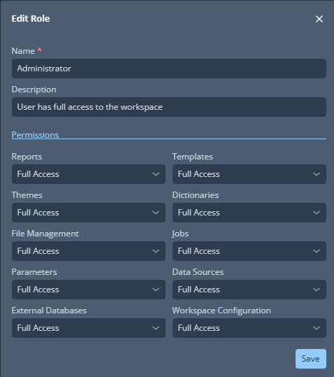
For details on assigning roles to users, see [User Management](users.md).
## Permissions
Each feature category supports a specific set of access levels. The available levels vary by category — not all categories offer the same options.
### Reports
| Access Level | Description |
|---|---|
| *No Access* | The user cannot see reports unless they created them. |
| *Read* | View and export reports, but cannot edit or delete them. |
| *Write* | Edit reports in addition to viewing and exporting. |
| *Full Access* | Full control including the ability to delete reports. |
### Templates
| Access Level | Description |
|---|---|
| *No Access* | No visibility or access to templates. |
| *Read* | View and use templates, but cannot modify or remove them. |
| *Full Access* | Edit and delete templates in addition to viewing and using them. |
### Themes
| Access Level | Description |
|---|---|
| *No Access* | No visibility or access to themes. |
| *Read* | View and use themes, but cannot modify or remove them. |
| *Full Access* | Edit and delete themes in addition to viewing and using them. |
### Dictionaries
| Access Level | Description |
|---|---|
| *No Access* | No visibility or access to dictionaries. |
| *Read* | View and use dictionaries, but cannot modify or remove them. |
| *Full Access* | Edit and delete dictionaries in addition to viewing and using them. |
### File Management
| Access Level | Description |
|---|---|
| *No Access* | No visibility or access to file management. |
| *Read* | View and use managed files, but cannot modify or remove them. |
| *Full Access* | Edit and delete files in addition to viewing and using them. |
### Jobs
Jobs require that the user has at least *Read* access to Reports, Templates, Themes, Dictionaries, File Management, Parameters, and Data Sources — otherwise jobs cannot function correctly.
| Access Level | Description |
|---|---|
| *No Access* | No visibility or access to jobs. |
| *Full Access* | Full control over jobs including creating, editing, and deleting them. |
### Parameters
| Access Level | Description |
|---|---|
| *No Access* | Cannot see or use parameters. |
| *Read* | View and use parameters, but cannot modify or remove them. |
| *Full Access* | Edit and delete parameters in addition to viewing and using them. |
### Data Sources
| Access Level | Description |
|---|---|
| *No Access* | No visibility or access to data sources. |
| *Read* | View and use data sources, but cannot modify or remove them. |
| *Full Access* | Edit and delete data sources in addition to viewing and using them. |
### External Databases
| Access Level | Description |
|---|---|
| *No Access* | No visibility or access to external databases. |
| *Read* | View and use external database connections, but cannot modify or remove them. |
| *Full Access* | Edit and delete external database connections in addition to viewing and using them. |
A user can have *Full Access* to Data Sources while having only *Read* access to the External Databases those data sources connect to. This allows the user to manage data source configurations without being able to alter the underlying database connections.
### Workspace Configuration
| Access Level | Description |
|---|---|
| *No Access* | No visibility or access to workspace configuration settings. |
| *Read* | View workspace configuration, but cannot modify it. |
| *Full Access* | Full control over workspace configuration settings. |
## Best Practices
- **Least privilege** — assign only the minimum access necessary for each user's responsibilities.
- **Review periodically** — ensure roles still align with current duties and organizational policies.
- **Clear naming** — use descriptive role names so their purpose is immediately obvious.
---
# Languages
In CxReports, managing the languages used across your workspace is a straightforward process, accessible through the workspace's configuration settings. The languages you set up are integral to ensuring that reports and dictionaries can accommodate various regional formats and preferences based on the selected language.
## Managing Languages
To fine-tune the language settings in your workspace, follow these steps:
1. Navigate to `Workspace Configuration` > `Languages`.
2. You will be presented with a panel where you can set up and modify the languages that are used throughout the workspace.
Each language you add requires an [IETF language tag](https://en.wikipedia.org/wiki/IETF_language_tag), which is a standardized code used to indicate the conventions for date and number formatting associated with that language. The Code value for the language is critical as it determines how dates and numbers will be displayed in your reports to align with the chosen language's formatting rules.
---
# Databases
In CxReports, the `Databases` page is where you establish a connection between the software and your specific database. This connection is crucial as it allows CxReports to access and extract the data needed for your reports.
As a workspace admin, navigate to the Admin application, then **Connections → Databases**, to manage external database connections.
## Connecting to a Database
To connect CxReports to a database, follow these steps:
1. Open `Databases` page.
2. Click on `Add new external database`.
3. Provide a `Name` to the database.
4. Optionally, provide a short description.
5. Choose available `Database type`.
6. Provide a `Connection string`.
7. Select `Save`.
Once you've completed the above form, the database will become available in the list. You can use `Test connection` button to verify if CxReports can connect to the database.
## Creating Data Sources
After successfully connecting to a database, you can then create a [data sources](../../reports/data-sources.md) in order to extract data from the attached database and present it in reports.
---
# Emails
CxReports offers a versatile feature that allows users to streamline communication by using the built-in email functionality. This feature enables you to not only create and personalize email templates but also schedule them for periodic dispatch. The templates can include reports as attachments, ensuring that recipients receive up-to-date information automatically.
## Email Templates
To utilize the email capabilities of CxReports, you can start by setting up an email template:
### Configuration
When initiating a new email template, the first step is to define its basic attributes:
- **Name (required):** Assign a unique name to your email template for easy identification.
- **Description:** Provide a brief description about the purpose of the template.
- **Active Button (On/Off):** Toggle this to enable or disable the template according to your scheduling needs.
### Data Sources
To enrich your email template with dynamic data:
- **New Data Source:** This allows you to bind a particular data source to your email template. You have the option to either select a pre-existing data source within the application or set up a new one. For more information on managing data sources, visit [Data Sources Page](../../reports/data-sources.md).
- **Email addresses source button (On/Off):** If enabled, this will automatically populate the 'To Field' in the 'Messaging' section with email addresses pulled from the specified data source.
### Message
In this tab, you can craft the content of your email:
- **To Field:** Enter the primary recipients' email addresses, separated by commas if more than one.
- **CC Field:** Add the email addresses of additional recipients who will be visible to all. Separate multiple addresses with commas.
- **BCC Field:** Similar to the 'CC Field,' but recipients are kept confidential. Again, use commas for multiple addresses.
- **Subject (required):** The subject line of your email.
- **Body (required):** Compose the main text of your email here.
### Schedule
Determine when and how often your email should be sent:
- **Start Date:** Choose the date when email dispatch will commence.
- **Start Time:** Specify the time at which the email dispatch should occur.
- **Repeat:** This setting controls the frequency of the emails:
- **Allowed Days Option:** Here you can specify on which days the email should or should not be sent. By default, all days are selected. Deselecting a day will postpone the sending to the next active day.
- **Monthly Day of the Week Option:** Designate a specific weekday for monthly emails.
- **Monthly Start from the End Option:** By checking this box, the system will count backwards from the end of the month to determine the sending date. For instance, if the first Monday is chosen and this option is enabled, the email will be sent on the last Monday of each month.
### Attachments
After selecting reports to attach:
- **Report Dropdown:** Pick one or more reports to include as attachments.
- **Parameter Mapping:** Appears once a report is attached, allowing you to specify [parameter](../../reports/parameters.md) values for each report.
## Managing Email Templates
CxReports provides options to maintain your email templates effectively:
- **Edit Email:** Modify the settings of your email template as needed.
- **Send Email:** Immediately dispatch the email using the current template settings.
- **Delete Email:** Remove the email template from your list of templates.
---
# SMTP settings
CxReports uses SMTP (or Microsoft Graph as an SMTP-equivalent transport) to send report emails — both ad-hoc emails from a report and scheduled deliveries from [Report Generation Jobs](../../reports/jobs/index.md).
There are two ways to configure outbound mail:
- **Per-workspace, via the UI (preferred).** A workspace admin adds one or more SMTP servers in the Admin application under **Connections → SMTP Servers**. Each workspace controls its own credentials, From addresses, and throttling. This is the recommended approach for almost all installations.
- **Globally, via `appsettings.json`.** A single `SmtpServer` block is defined at the application level and shared across every workspace on the instance. Useful when one operations team owns mail delivery for the whole installation, or when you want a default that does not require workspace admins to configure anything.
When both are present, the per-workspace UI configuration takes precedence for that workspace.
## Configuring SMTP via the UI (preferred)
As a workspace admin, navigate to the Admin application, then **Connections → SMTP Servers**, and click **+ Add**. The **Configure SMTP Server** dialog opens.
### Common fields
| Field | Notes |
| --- | --- |
| **Name** | Display name for this SMTP server. Required. Shown when picking a server in email-related settings. |
| **Authentication Type** | `Basic` or `Microsoft Graph`. See the two sections below. Required. |
### Authentication Type: Basic
Classic SMTP username/password authentication. Use this for self-hosted mail servers, Gmail SMTP, and any provider that still supports SMTP AUTH.
| Field | Notes |
| --- | --- |
| **Host** | SMTP server address — e.g. `smtp.office365.com`, `smtp.gmail.com`, `smtp.server.com`. |
| **Port** | Common ports are `25`, `465` (SSL), or `587` (TLS/STARTTLS). |
| **Username** | Usually your email address or account name. |
| **Password** | Account password or, for providers that require it, an app-specific password. |
| **Use SSL** | Enable for secure connections. Recommended whenever the server supports it. |
| **Check Certificate Revocation** | Verifies during the TLS handshake that the server certificate has not been revoked. Enabled by default (recommended). Disable only for internal PKI environments where the certificate chain has no reachable CRL or OCSP endpoint — otherwise sending fails with `unable to get certificate CRL`. |
!!! warning
Microsoft is deprecating Basic Authentication for SMTP. If you are using Microsoft 365 / Exchange Online, switch to **Microsoft Graph** below.
### Authentication Type: Microsoft Graph
Sends mail through the Microsoft Graph API with app-only (OAuth 2.0) authentication. This is Microsoft's recommended approach for Microsoft 365 / Exchange Online.
| Field | Notes |
| --- | --- |
| **OAuth Tenant ID** | Azure AD tenant ID. Find it in **Azure Portal → Azure Active Directory → Overview**. |
| **OAuth Client ID** | Application (client) ID from your Azure AD app registration. |
| **OAuth Client Secret** | Secret value created in your app registration under **Certificates & secrets**. |
**Azure AD setup required**
1. Register an app in Azure AD (**App registrations**).
2. Add the API permission **Mail.Send** (Application type).
3. Grant admin consent for the permission.
4. Create a client secret and copy the value into the **OAuth Client Secret** field.
The **From Address** configured below must be a valid mailbox in your Microsoft 365 tenant — Microsoft Graph rejects sends from addresses that do not exist.
### Throttling
Optional. When enabled, CxReports rate-limits outbound mail so the upstream server is not flooded — important for shared SMTP relays and providers with per-minute send caps.
| Field | Notes |
| --- | --- |
| **Use Throttling** | Toggle to enable throttling. |
| **Emails per Interval** | Maximum number of emails sent during one interval. Default `50`. |
| **Throttle Interval** | Length of one interval — e.g. `1 minute`. |
### From addresses
A list of `Display Name` / `Address` pairs the workspace can send from. Click **+ Add** to add a row, fill in the display name and email address, and save.
When a report or job sends an email, the user picks one of these From addresses. Configuring at least one is required for the SMTP server to be usable.
There is no limit on how many you add, as long as each is a valid address the server is allowed to send from. Defining several — one per brand, department or client — is what lets each [Report Generation Job](../../reports/jobs/index.md#email) choose the address it sends from, and optionally a different Reply-To address, without needing a separate SMTP server for each.
For Microsoft Graph, each address must correspond to a real mailbox in the tenant.
### Test Connection
Click **Test Connection** at the bottom of the dialog to verify the configuration end-to-end. CxReports authenticates against the configured server (or Microsoft Graph) and reports any error inline.
## Configuring SMTP via `appsettings.json`
Define a global `SmtpServer` block in `appsettings.Production.json`. The block applies to every workspace on the instance unless that workspace has its own UI-configured SMTP server, which takes precedence.
```json
{
"SmtpServer": {
"From": "noreply@example.com",
"ReplyTo": "reply@example.com",
"Host": "localhost",
"Port": 1025,
"Username": "",
"Password": "",
"EnableSsl": false,
"CheckCertificateRevocation": true,
"Throttling": {
"MaxEmailsPerInterval": 2,
"ThrottleInterval": 1
}
}
}
```
| Field | Notes |
| --- | --- |
| **From** | Default From address used when sending. |
| **ReplyTo** | Default Reply-To address. |
| **Host** | SMTP server address. |
| **Port** | SMTP port — typically `25`, `465`, or `587`. |
| **Username** / **Password** | Credentials for SMTP AUTH. Leave empty for unauthenticated servers. |
| **EnableSsl** | `true` for SSL/TLS connections. |
| **CheckCertificateRevocation** | Verifies that the server's TLS certificate has not been revoked. Defaults to `true`. Set to `false` only for internal PKI environments without a reachable CRL or OCSP endpoint. Can be set via the `SmtpServer__CheckCertificateRevocation` environment variable in Docker Compose. |
| **Throttling.MaxEmailsPerInterval** | Maximum emails per throttle interval. Omit the whole `Throttling` block to disable throttling. |
| **Throttling.ThrottleInterval** | Throttle interval length, in seconds. |
The global `SmtpServer` configuration only supports Basic SMTP authentication. To use Microsoft Graph, configure SMTP per workspace in the UI.
For the full list of application-level settings, see the [`appsettings.json` reference](../install/appsettings.md#smtpserver).
---
# AI Integrations
AI Integrations connect external AI models to your CxReports workspace. They are used by the [AI Assistant](../../reports/ai-assistant.md) and automatic [dictionary translation](../../reports/dictionaries.md).
As a workspace admin, navigate to the Admin application, then **Connections → AI Integrations**, to manage integrations.
---
## Supported Engines
| Engine | Examples |
| --- | --- |
| **OpenAI** | gpt-5.6-terra, gpt-5.5, gpt-5.4-mini |
| **Anthropic** | claude-opus-5, claude-sonnet-5, claude-haiku-4-5 |
| **Google** | gemini-3.8-flash, gemini-3.5-flash-lite |
| **DeepSeek** | deepseek-flash |
The model name is a free-form string, so any model identifier supported by the selected engine can be used. As new models are released, they can be used immediately by entering the model name.
Gemini models run with a low thinking level, whether they are picked from the list or typed in by hand. Gemini versions before 3 expect a different thinking setting and may reject requests. DeepSeek keeps its own default thinking behaviour. Existing histories without the reasoning DeepSeek requires cannot be continued with DeepSeek; start a new conversation or keep the previous provider.
Gemini requests use Google's own content filtering thresholds, the same as you would get calling the API directly.
---
## Configuration
Each integration requires a **Name**, **Engine**, **Model**, and **API Key**. API keys are stored encrypted and only decrypted at the moment they are needed.
You can create multiple integrations -- for example, a faster model for simple tasks and a more capable model for complex work -- and switch between them per conversation in the [AI Assistant](../../reports/ai-assistant.md).
---
## Notes
- The `AI` permission in [role configuration](roles.md) controls access to AI features.
- Dictionary translation uses the default language first, falling back to the entry key if needed.
---
# Data Export
**Data Export** saves your [workspace](../system/workspaces.md) configuration and content so you can move it to another workspace or CxReports installation. If any files from the workspace filesystem are included, the download is a ZIP; otherwise it is a JSON file.
The page walks you through the elements in steps—**Reports** and, when the Jobs feature is enabled, **Jobs**—so you pick from a shorter list at a time instead of one long tab strip. Everything you select across all steps goes into a single exported file.
## Exportable Elements
The **Reports** step covers:
- [Languages](languages.md)
- [Dictionaries](../../reports/dictionaries.md)
- [Page Types](../../reports/page-types.md)
- [Parameter Groups](../../reports/parameters.md)
- [Global Parameters](../../reports/parameters.md)
- [Global Data Sources](../../reports/data-sources.md)
- [Reusable Parameter Definitions](../../reports/parameters.md)
- [Reusable Data Source Definitions](../../reports/data-sources.md)
- [File Management](../../reports/file-management.md)
- [Report Types](../../reports/report-types.md)
- [Themes](../../reports/themes.md)
- [Templates](../../reports/templates.md)
- [Custom Components](../../reports/custom-components.md)
- [Subreports](../../reports/subreports.md)
- [Reports](../../reports/report-editor.md)
- Default Reports
If the Jobs feature is enabled on this installation, a **Jobs** step also appears, covering:
- Workflow Definitions
You can also export filesystem content from the [File Management](../../reports/file-management.md) page directly.
## Dependencies
The export does not restrict which elements you pick—you can combine them however you like. What must line up is decided when you import; see [Data Import — Handling Dependencies](data-import.md#handling-dependencies).
## Not Included in the Export
!!! note
The following are not part of the export:
- Databases (connection strings)
- Emails (SMTP configuration)
- AI Integrations
- Workspace Users and Roles
- Workflow run history (executions, task runs, events)
The export and import cover only the workspace elements listed under **Exportable Elements** above; any other workspace-level configuration is also excluded.
These must be configured manually in the target workspace.
## Using Data Export
1. Open the **Admin** application and go to `Import / Export → Data Export`.
2. On the **Reports** step, select the elements you want to export and pick the files you want to include from the workspace filesystem.
3. If the Jobs feature is enabled, click `Next` to reach the **Jobs** step and select the workflow definitions you want to export.
4. Use `Previous`/`Next` to move between steps and adjust your selection as needed.
5. On the last step, click `Export Selected` and save the file. The download combines your selections from all steps into one file.
## Bootstrapping a Workspace at Startup
`ImportFilePath` accepts the JSON export file. `FileSystemImportPath` accepts the filesystem content (directory or files). If the export produced a ZIP, extract it first—point `ImportFilePath` at the JSON inside and `FileSystemImportPath` at the filesystem content. See [Workspace Initialization](../install/appsettings.md#workspace-initialization) for details.
## Importing Exported Data
After export, bring the file in through [Data Import](data-import.md).
---
# Data Import
**Data Import** loads a previously exported file—JSON, or ZIP if the workspace filesystem was included—into the current [workspace](../system/workspaces.md). Create that file with [Data Export](data-export.md).
After you upload the file, the page shows one step per group of elements actually present in it (for example, a **Reports** step and/or a **Jobs** step) — you won't see a step for content the file doesn't contain. If the file contains content for a feature that isn't enabled on this installation—for example a **Jobs** section on a host where that feature is off—that content is listed with a notice that it will be skipped.
## Importable Elements
The **Reports** step covers:
- [Languages](languages.md)
- [Dictionaries](../../reports/dictionaries.md)
- [Page Types](../../reports/page-types.md)
- [Parameter Groups](../../reports/parameters.md)
- [Global Parameters](../../reports/parameters.md)
- [Global Data Sources](../../reports/data-sources.md)
- [Reusable Parameter Definitions](../../reports/parameters.md)
- [Reusable Data Source Definitions](../../reports/data-sources.md)
- [File Management](../../reports/file-management.md)
- [Report Types](../../reports/report-types.md)
- [Themes](../../reports/themes.md)
- [Templates](../../reports/templates.md)
- [Custom Components](../../reports/custom-components.md)
- [Subreports](../../reports/subreports.md)
- [Reports](../../reports/report-editor.md)
- Default Reports
If the file contains a **Jobs** step, it covers:
- Workflow Definitions
You can also import filesystem content from the [File Management](../../reports/file-management.md) page directly.
## Handling Dependencies
**Critical external dependencies** (never in the export) must already exist in the target workspace if imported items reference them; otherwise the import fails:
- External Databases
- Google Cloud Service Accounts
- API Connections
They are used by Reusable Parameter Definitions and Reusable Data Source Definitions, and by workflows' data source bindings.
**Missing references:**
- If any element references another element by name (for example a template referencing a theme, a report referencing a template or subreport, a dictionary referencing a language, or a report type referencing page types) and that referenced element is not in the target workspace and is not included in the same import, the import fails.
- A workflow definition's data source bindings follow the same rule: if a binding points at a shared (global) data source by name and that data source is not in the target workspace and not included in the same import, the import fails. Data sources owned by the workflow itself are always included with it, so they never hit this case.
- Missing **file** references (for example an image not present in the export) still allow the import to finish, but paths show up broken.
## Not Included in the Import
!!! note
The following are not part of the import:
- Databases (connection strings)
- Emails (SMTP configuration)
- AI Integrations
- Workspace Users and Roles
- Workflow run history (executions, task runs, events)
The export and import cover only the workspace elements listed under **Importable Elements** above; any other workspace-level configuration is also excluded.
These must be configured manually in the target workspace.
## Using Data Import
1. Open the **Admin** application and go to `Import / Export → Data Import`.
2. Drag and drop the exported file onto the upload area, or click `Browse files from your computer` to choose it.
3. Review the items on each step and select or deselect what you want to import; use `Previous`/`Next` to move between steps.
4. On the last step, click `Upload`.
When an imported element already exists in the target workspace, choose how to resolve the conflict: **Stop** aborts the import, **Keep existing** leaves the current workspace version, and **Replace** overwrites it with the imported version. For workflow definitions, "already exists" is decided by matching name **and** version—two workflows with the same name but a different version both import side by side; replacing a workflow definition also replaces all of its data source bindings.
!!! note
Pay attention to dependencies when importing data. Make sure critical external resources (databases, service accounts, API connections) exist in the target workspace before importing.
## Font Installation
The left sidebar includes a toggle to automatically install all fonts detected in the import archive. This is useful when the archive contains fonts needed for document conversion (such as PPTX).
!!! note
Fonts are installed globally and affect all workspaces. All font installation uses a **keep existing** approach—fonts already present on the system are not replaced.
## Bootstrapping a Workspace at Startup
`ImportFilePath` accepts the JSON export file. `FileSystemImportPath` accepts the filesystem content (directory or files). If the export produced a ZIP, extract it first—point `ImportFilePath` at the JSON inside and `FileSystemImportPath` at the filesystem content. See [Workspace Initialization](../install/appsettings.md#workspace-initialization) for details.
---
# Users
The Users page in CxReports is a crucial feature that allows you to manage the users who can log into the application. This page is exclusively accessible by the root user.
## Adding and Removing Users
Through the Users page, you can add new users or remove existing ones. However, adding a user to this page does not automatically grant them access to a workspace. This is done through the [Workspace Users](../workspace/users.md) page.
To enable a user to use the application, follow these steps:
1. Select `Users` page in the navigation.
2. Click on `Add new user`.
3. Fill out the `New user` form (all fields are required).
4. Select `Save`.
5. The new user will be able to log in with the email and password previously entered in the form from step 3.
To remove a user, select the bin icon next to the edit for a user that you want to prevent from using the application and confirm the choice.
---
# Workspaces in CxReports
Workspaces are a key feature in CxReports. They provide a way to organize your
reports and data in separate, independent areas within the application.
Think of them as individual sandboxes where you can play around with your data
without affecting other workspaces.
## Creating Workspaces
As a root user, you have the ability to create new workspaces. These are
accessible from the Workspaces page within the application. It's important to
note that workspaces are not interconnected. This means that each workspace
operates independently of the others.
To create a workspace, follow these steps:
1. Select `Add new workspace`.
2. Add a `Name` of the workspace.
3. Add a `Description` of the workspace.
4. Add a `Code` of the workspace.
5. Optional: `Init configuration` switch offers user to initialize default [report type](../../reports/report-types.md), [parameter group](../../reports/parameters.md), [language](../workspace/languages.md) and [theme](../../reports/themes.md).
6. Select `Add`.
## Duplicating Workspaces
Root users can duplicate an existing workspace. The duplicate is a fully
independent copy containing:
- All reports, subreports, templates, themes, report types, page types,
languages, parameters, data sources, dictionaries, and custom components.
- Report thumbnails — each report in the duplicate gets its own copy of the
thumbnail image, so the two workspaces never share one.
- Workflow definitions (when workflows are enabled).
- Connections — external databases, data agents, Google Cloud service
accounts, Microsoft cloud accounts, API connections, SMTP servers, and AI
integrations — including their credentials.
- Workspace roles and user memberships, and the public file system.
A few things intentionally start fresh in the duplicate:
- **Report access control** resets to workspace-inherited access, with the
duplicating user granted full access. Reconfigure per-report permissions in
the new workspace as needed.
- Only reports the duplicating user can see are copied.
Duplication is all-or-nothing: if any part fails (for example, a report
references content the duplicating user cannot access), no workspace is
created.
## Managing Workspace Users
After creating a workspace, it won't have any users assigned to it by default.
You, as a root user, need to manually add users to the workspace. This is done
through the [Workspace Users](../workspace/users.md) section of the application.
---
# White Label
CxReports supports white labeling so you can replace the CxReports logo with your own across the Reports app. This is useful when CxReports is embedded in a product you ship to your own customers and you want the experience to carry your brand.
## License requirement
White label is a premium feature. It is only available on instances whose license has the `WhiteLabel` premium feature enabled. If your license does not include it, the **White Label** admin page is hidden and the default CxReports logo is shown everywhere. Contact your account manager if you need this enabled.
## Accessing the settings
White label settings are managed by root users only. When the feature is enabled in the license:
1. Sign in as a root user.
2. Open **System Administration** in the main navigation.
3. Select **White Label**.
## Enabling custom branding
The page exposes two controls:
- **Enable Branding** — a toggle that switches the entire instance between the default CxReports branding and your custom branding. Until this is on, the uploaded logo is not displayed anywhere.
- **Company Logo** — the logo file shown in the application header, the sign-in page, and the report editor.
To turn on white label:
1. Upload a logo (see logo requirements below).
2. Switch **Enable Branding** on.
3. Select **Save**.
The application reloads and the custom logo replaces the CxReports logo. When white label is enabled, a small **Powered by Codaxy** badge appears in the footer of the main layout.
## Logo requirements
The uploaded logo must meet these constraints:
- **File types:** PNG, JPEG, SVG, or WebP.
- **Orientation:** landscape (wider than tall). Portrait images are rejected with a validation error.
- **Display size:** the logo is rendered in a small header bar; aim for an image that reads clearly at roughly 20 pixels in height. SVG is preferred for crisp scaling.
File type and extension are validated both client-side (immediately on upload) and server-side (on save).
## Removing the logo
To revert to the default CxReports logo:
1. Open **System Administration → White Label**.
2. Select **Delete** next to the current logo.
3. Confirm.
4. Select **Save**.
Alternatively, switch **Enable Branding** off — this keeps the uploaded logo on file but shows the default CxReports logo while the toggle is off.
## Scope
White label currently affects:
- The Reports application header logo
- The sign-in page logo
- The report editor's left panel footer badge
- The "Powered by Codaxy" badge in the main layout
It does **not** currently customize application colors, favicon, or custom CSS. Those may be addressed in future releases.
---
# Application settings
CxReports supports a number of settings that can be configured in the `appsettings.json` file. The settings are divided into sections, each of which is described below.
!!! tip "Prefer environment variables?"
Every setting on this page can be supplied as an environment variable instead of a file — join the
section and key with a double underscore, e.g. `ConnectionStrings__Database` or
`SmtpServer__EnableSsl`. Environment variables override the values in `appsettings.json`. See
[Environment variables](environment-variables.md) for the naming rules, arrays, precedence and
Docker Compose / Kubernetes / ECS examples.
## Connection settings **(required)**
- Database: The connection string to the database where the reports are stored.
!!! example
```json
"ConnectionStrings": {
"Database": "Host=localhost;Port=5434;Database=cxreports;Username=cxr;Password=cxr"
}
```
## Encryption **(required)**
- Key: The encryption key used to encrypt sensitive data in the database.
- Vector: The encryption vector used to encrypt sensitive data in the database.
!!! example
```json
"Encryption": {
"Key": "12345678901234567890123456789012",
"Vector": "1234567890123456"
}
```
## LicenseConfiguration
You can set CxReports license key here, without logging into the application. This will also prevent anyone from removing the license key from the application.
!!! example
```json
"LicenseConfiguration": {
"Key": "your-license-key",
"ServerName": "your-license-server-name",
}
```
## AppUrl
Used to specify the root URL of the application. This is needed in the process of automatic report generation.
!!! example
```json
"AppUrl": "https://demo.cx-reports.app",
```
## PathBase
Used the specify the base path of the application. This in required if you are hosting CxReports in a subdirectory of a domain. For example, if you are hosting CxReports in `https://example.com/reports`, you should set the `PathBase` to `/reports`. It can be omitted if the application is hosted in the root of the domain.
!!! example
```json
"PathBase": "/reports",
```
## Password Policy
Settings for the password policy. The password policy is used to enforce password complexity rules.
!!! example
```json
"PasswordPolicy": {
"RequiredLength": 8,
"RequireNonAlphanumeric": false,
"RequireDigit": true,
"RequireUppercase": true,
"RequireLowercase": true
}
```
## RootUser
Initial user that will be created when the application starts. This user will have the root privileges required to create new users and workspaces.
In case you loose access to the app, you can use this setting to create a new user.
!!! example
```json
"RootUser": {
"Email": "admin@example.com",
"Password": "[your-password]",
"DisplayName": "Root User"
//"ApiToken": "[api-token-for-the-root-user]"
}
```
Uncomment and set the `ApiToken` field to allow root access using the API.
!!! note
The password must meet the required complexity rules - a minimum length and a mix of uppercase letters, lowercase letters, numbers, and special characters.
## SmtpServer
Settings for the SMTP server that will be used to send emails. This is needed for sending reports via email.
Throttling settings can be omitted if you don't want to throttle the number of emails sent in a given interval (in seconds)
!!! example
```json
"SmtpServer": {
"From": "noreply@example.com",
"ReplyTo": "reply@example.com",
"Host": "localhost",
"Port": 1025,
"Username": "",
"Password": "",
"EnableSsl": false,
"CheckCertificateRevocation": true,
"Throttling": {
"MaxEmailsPerInterval": 2,
"ThrottleInterval": 1
}
}
```
### CheckCertificateRevocation [1.26.0+](../../changelog/index.md#1260-august-21-2026){ .cx-since title="Available since 1.26.0, see the release notes" }
Controls whether the revocation status of the SMTP server's TLS certificate is verified during the handshake. Defaults to `true` (recommended). Set it to `false` only for internal PKI environments where the certificate chain provides no reachable CRL or OCSP endpoint — otherwise sending fails with `unable to get certificate CRL`. In Docker Compose this can be set with the environment variable `SmtpServer__CheckCertificateRevocation: "false"`.
## Swagger
Settings for the Swagger UI. Swagger is a tool that helps you document and test your API. It is available at `/swagger` endpoint.
!!! example
```json
"Swagger": {
"Enabled": true,
}
```
## Hangfire
Settings to enable the Hangfire dashboard. Hangfire is a tool that helps you manage background jobs. It is available at `/hangfire` endpoint.
!!! example
```json
"Hangfire": {
"Dashboard": {
"Enabled": true
}
}
```
## ReportGenerationWorkerCount [1.24.0+](../../changelog/index.md#1240-june-1-2026){ .cx-since title="Available since 1.24.0, see the release notes" }
Controls the maximum number of concurrent report-generation workers. Increase this to process more reports in parallel on machines with more CPU cores; decrease it to reduce load. If omitted, the default is half of the available CPU cores (minimum 1).
!!! example
```json
"ReportGenerationWorkerCount": 4
```
!!! note "Deprecation"
The legacy key `SmtpServer:DegreeOfParallelism` is deprecated. It is still read for one release if `ReportGenerationWorkerCount` is not set, and the application logs a warning at startup prompting migration. Move the value to the new top-level key.
## Puppeteer
Puppeteer is used for report exports. In case you want to use a custom puppeteer executable, you can specify the path to it here.
!!! example
```json
"Puppeteer": {
"UsePreinstalledChrome": true,
"ChromePath": "/path/to/chrome"
},
```
## Serilog
Settings for the Serilog logger. Serilog is a logging library that is used to log application events.
More information available [here](https://github.com/serilog/serilog-settings-configuration)
## Google Login [1.13.0+](../../changelog/index.md#1130-march-10-2025){ .cx-since title="Available since 1.13.0, see the release notes" }
Settings for the Google login. This is used to enable Google login in the application.
!!! example
```json
"GoogleLogin": {
"Enabled": true,
"SupportedDomains": ["your-domain.com"],
"ClientId": "your-client-id",
"ClientSecret": "your-client-secret"
}
```
## Microsoft Login [1.13.0+](../../changelog/index.md#1130-march-10-2025){ .cx-since title="Available since 1.13.0, see the release notes" }
Settings for the Microsoft login. This is used to enable Microsoft login in the application.
!!! example
```json
"MicrosoftLogin": {
"Enabled": true,
"SupportedDomains": ["your-domain.com"],
"ClientId": "your-client-id",
"ClientSecret": "your-client-secret"
}
```
## Authentication Provider [1.21.5+](../../changelog/index.md#1215-december-24-2025){ .cx-since title="Available since 1.21.5, see the release notes" }
In case of [Okta](sso.md#okta) or [Keycloak](sso.md#keycloak) integration, this property must be set.
!!! Example
```json
"Authentication": {
"Provider": "Oidc"
}
```
## Password login
This settings is used to disable or enable email/password login. By default, email/password login is enabled.
!!! example
```json
"PasswordLogin": {
"Enabled": true
}
```
## HTTPS Redirect
If you are using HTTPS, you can enable this setting to redirect HTTP requests to HTTPS.
This will be automatically detected if you are using Google or Microsoft login.
!!! example
```json
"ForceHttps": true
```
## Cookies [1.23.0+](../../changelog/index.md#1230-april-24-2026){ .cx-since title="Available since 1.23.0, see the release notes" }
Controls when the `Secure` flag is applied to cookies issued by the application. Use `SameAsRequest` to mark cookies as secure only when the originating request is HTTPS, or `Always` to enforce the secure flag on every cookie regardless of the request scheme.
!!! example
```json
"Cookies": {
"SecurePolicy": "SameAsRequest" | "Always"
}
```
## ForwardedHeaders [1.23.0+](../../changelog/index.md#1230-april-24-2026){ .cx-since title="Available since 1.23.0, see the release notes" }
Configures how the application processes `X-Forwarded-*` headers when running behind a reverse proxy or load balancer. Use these settings to declare which upstream networks and proxies are trusted so the original client IP and request scheme are preserved.
- `KnownNetworks`: CIDR ranges of trusted proxy networks.
- `KnownProxies`: IP addresses of individual trusted proxies.
- `ForwardLimit`: Maximum number of forwarded header entries to process.
- `UseForwardedPrefix`: Take the deployment sub-path from the proxy's `X-Forwarded-Prefix` header
instead of configuring [PathBase](#pathbase). Disabled by default.
!!! example
```json
"ForwardedHeaders": {
"KnownNetworks": ["127.0.0.0/8"], // optional
"KnownProxies": ["::1"], // optional
"ForwardLimit": 1, // optional
"UseForwardedPrefix": false // optional
}
```
!!! warning "Only enable `UseForwardedPrefix` if your proxy sets the header"
`X-Forwarded-Prefix` is trusted input: once honored, any client that reaches the application
from a trusted network can change the prefix of every URL the application generates. Enable it
only when a reverse proxy in front of CxReports sets the header itself (and strips any incoming
value), and keep `KnownNetworks` / `KnownProxies` as narrow as your topology allows.
It is ignored when `PathBase` is set, because the two would combine into `header + PathBase`.
Use one or the other.
## Workspace Initialization
The `Init` configuration enables automated workspace setup and data import during application startup, primarily for CI/CD pipelines.
!!! example "Inline Configuration"
```json
"Init": {
"Enabled": true,
"Workspaces": {
"[workspace-code]": {
"Name": "Default Workspace",
"Description": "Default workspace created during initialization",
"Recreate": true,
"FileSystemImportPath": "[./path-to/filesystem.zip]",
"ImportFilePath": "[./path-to/CxReportsExport.json]"
"InstallFonts": true,
}
}
}
```
!!! example "External Configuration"
```json
"Init": {
"Enabled": true,
"WorkspacesFilePath": "[./path-to/workspaces.json]"
}
```
### Configuration Properties
**Root Level:**
- `Enabled`: Activates initialization on startup
- `Workspaces`: Inline workspace definitions (object)
- `WorkspacesFilePath`: Path to external JSON/JSONC workspace configuration
!!!warning "Execution Order & Precedence"
- Both external and inline workspace definitions can be used simultaneously within the same configuration.
- External workspace definitions override inline definitions with matching keys when `Recreate: true`.
**Workspace Object:**
- `Name`: Workspace display name
- `Description`: Optional workspace description
- `Recreate`: Force recreation if a workspace with the same code exists
- `FileSystemImportPath`: Path to filesystem resources
- `ImportFilePath`: Path to workspace data (JSON files generated via the [data export feature](../workspace/data-export.md))
- `InstallFonts`: When set to `true`, automatically installs all fonts found in the imported filesystem that are not already installed
!!!note
The file import supports individual files, directory structures, and compressed archives containing supported file types only. Failed imports stop the initialization and prevent the program from starting.
!!!note
`InstallFonts` installs fonts globally, affecting all workspaces. Fonts already present on the system are not replaced.
### External Configuration File
External workspace files use the same syntax as inline workspace objects, enabling configuration decoupling and environment-specific presets:
!!! example "workspaces.json"
```json
{
"dev": {
"Name": "Development",
"Description": "Default workspace created for the development environment created during initialization",
"Recreate": true,
"FileSystemImportPath": "[./path-to/dev-filesystem.zip]",
"ImportFilePath": "[./path-to/CxReportsExport.json]"
},
"prod": {
"Name": "Production",
"Description": "Default workspace created for the production environment created during initialization",
"Recreate": false,
"FileSystemImportPath": "[./path-to/prod-filesystem.zip]",
"ImportFilePath": "[./path-to/CxReportsExport.json]"
}
}
```
---
# Environment variables
Every setting described in [appsettings.json](appsettings.md) can also be supplied as an environment
variable — you do not have to mount a configuration file at all. This is the usual approach when
running CxReports in Docker Compose, Kubernetes, AWS ECS, or any environment where configuration and
secrets are injected by the platform.
## Naming rule
Take the path of the setting in `appsettings.json` and join the levels with a **double underscore**
(`__`):
| `appsettings.json` | Environment variable |
| --- | --- |
| `"AppUrl": "..."` | `AppUrl` |
| `"ConnectionStrings": { "Database": "..." }` | `ConnectionStrings__Database` |
| `"Encryption": { "Key": "..." }` | `Encryption__Key` |
| `"RootUser": { "Email": "..." }` | `RootUser__Email` |
| `"SmtpServer": { "Throttling": { "ThrottleInterval": 1 } }` | `SmtpServer__Throttling__ThrottleInterval` |
| `"Hangfire": { "Dashboard": { "Enabled": true } }` | `Hangfire__Dashboard__Enabled` |
!!! warning "Always use `__`, never `:`"
The `Section:Key` separator you may see in .NET documentation only works on Windows. On Linux —
which is what the CxReports container runs — shells and container runtimes will not let you set a
variable whose name contains a colon, so **two underscores** is the only form that works
everywhere. A single underscore does *not* work either: `ConnectionStrings_Database` is silently
ignored.
Names are case-insensitive, so `ROOTUSER__EMAIL` and `RootUser__Email` are equivalent. Matching the
casing used in `appsettings.json` keeps things readable.
## Arrays
Array elements are addressed by their index, starting at `0` and contiguous:
```yaml
ForwardedHeaders__KnownNetworks__0: "172.16.0.0/12"
ForwardedHeaders__KnownNetworks__1: "192.168.0.0/16"
ForwardedHeaders__KnownNetworks__2: "10.0.0.0/8"
GoogleLogin__SupportedDomains__0: "your-domain.com"
```
## Keyed sections
Sections keyed by a name — such as the workspaces in [Workspace Initialization](appsettings.md#workspace-initialization) —
use the key as just another path segment:
```yaml
Init__Enabled: "true"
Init__Workspaces__dev__Name: "Development"
Init__Workspaces__dev__Recreate: "true"
Init__Workspaces__dev__ImportFilePath: "/config/CxReportsExport.json"
```
## Values are always strings
Every environment variable is a string; CxReports converts it to the target type it expects. In
Docker Compose, quote the value — an unquoted `true` is read by YAML as a boolean and Compose rejects
it with `contains true, which is an invalid type`:
```yaml
Swagger__Enabled: "true" # correct
ReportGenerationWorkerCount: "4" # correct
ForceHttps: true # Compose error
```
## Precedence
Configuration sources are applied in this order, each one overriding the previous:
1. `appsettings.json` (shipped inside the image)
2. `appsettings.{Environment}.json` — for example `appsettings.Production.json`, the file most
installations mount as a Docker secret. The environment name comes from `ASPNETCORE_ENVIRONMENT`
and defaults to `Production` in the published image.
3. **Environment variables**
4. Command-line arguments
So environment variables win over any `appsettings.*.json` file. You can mount a base configuration
file and override only what differs per environment, or skip the file entirely and configure
everything through variables.
!!! note "Two files are applied after environment variables"
`appsettings.Docker.json`, baked into the image, sets the `Puppeteer` and `Apryse` paths for the
bundled Chromium — those specific keys cannot be overridden with environment variables. The same
applies to the optional `secrets/appsettings.{Environment}.json` file used to inject AWS and
Google Cloud secrets. Every other setting behaves as described above.
## Complete Docker Compose example
The [setup guide](../../getting-started/install.md) mounts an `appsettings.Production.json` file. Here is
the same deployment configured entirely through environment variables:
```yaml
services:
app:
image: codaxy/cx-reports:latest
depends_on:
- db
volumes:
- ./logs:/app/Logs
ports:
- "80:8080"
restart: always
environment:
ConnectionStrings__Database: "Host=db;Database=cxreports;Username=postgres;Password=password"
Encryption__Key: "6F761C152A69C34B655BFF6226116AD4"
Encryption__Vector: "A9B2BC02C2FDDE88"
RootUser__Email: "first.user@cx-reports.com"
RootUser__Password: "password"
RootUser__DisplayName: "First User"
AppUrl: "https://reports.example.com"
SmtpServer__Host: "smtp.example.com"
SmtpServer__Port: "587"
SmtpServer__From: "no-reply@example.com"
SmtpServer__EnableSsl: "true"
db:
image: postgres
volumes:
- postgres_data:/var/lib/postgresql/data
environment:
POSTGRES_DB: cxreports
POSTGRES_USER: postgres
POSTGRES_PASSWORD: password
restart: always
volumes:
postgres_data:
```
Keeping secrets out of `docker-compose.yml` is done with an `env_file`:
```yaml
services:
app:
image: codaxy/cx-reports:latest
env_file:
- ./cx-reports.env
```
```bash title="cx-reports.env"
ConnectionStrings__Database=Host=db;Database=cxreports;Username=postgres;Password=password
Encryption__Key=6F761C152A69C34B655BFF6226116AD4
Encryption__Vector=A9B2BC02C2FDDE88
RootUser__Password=password
```
!!! note
Values in an `env_file` are not quoted and are taken literally to the end of the line, so a
connection string containing `;` needs no escaping.
## Kubernetes example
```yaml
env:
- name: ConnectionStrings__Database
valueFrom:
secretKeyRef:
name: cx-reports
key: database-connection-string
- name: Encryption__Key
valueFrom:
secretKeyRef:
name: cx-reports
key: encryption-key
- name: AppUrl
value: "https://reports.example.com"
```
On AWS ECS the same variables are entered as task definition environment variables — see
[Host on ECS](aws-ecs.md).
## Frequently used variables
| Variable | Purpose |
| --- | --- |
| `ConnectionStrings__Database` | PostgreSQL connection string **(required)** |
| `Encryption__Key`, `Encryption__Vector` | Encryption key and vector **(required)** |
| `RootUser__Email`, `RootUser__Password`, `RootUser__DisplayName` | Initial administrator account |
| `LicenseConfiguration__Key`, `LicenseConfiguration__ServerName` | License key applied at startup |
| `AppUrl` | Public root URL of the application |
| `PathBase` | Base path when hosting under a subdirectory |
| `ForceHttps` | Redirect HTTP requests to HTTPS |
| `Cookies__SecurePolicy` | `SameAsRequest` or `Always` |
| `ForwardedHeaders__KnownNetworks__0` | Trusted proxy network behind a load balancer |
| `SmtpServer__Host`, `SmtpServer__Port`, `SmtpServer__Username`, `SmtpServer__Password`, `SmtpServer__From`, `SmtpServer__EnableSsl` | Outgoing email |
| `ReportGenerationWorkerCount` | Concurrent report-generation workers |
| `Swagger__Enabled` | Expose the Swagger UI at `/swagger` |
| `Hangfire__Dashboard__Enabled` | Expose the Hangfire dashboard at `/hangfire` |
| `GoogleLogin__Enabled`, `GoogleLogin__ClientId`, `GoogleLogin__ClientSecret` | Google sign-in |
| `MicrosoftLogin__Enabled`, `MicrosoftLogin__ClientId`, `MicrosoftLogin__ClientSecret` | Microsoft sign-in |
| `PasswordLogin__Enabled` | Enable or disable email/password login |
| `Authentication__Provider` | Set to `Oidc` for [Okta or Keycloak](sso.md) |
| `ASPNETCORE_ENVIRONMENT` | Which `appsettings.{Environment}.json` is loaded (default `Production`) |
| `ASPNETCORE_HTTP_PORTS` | Port the application listens on inside the container (default `8080`) |
Each of these is documented in full on the [appsettings.json](appsettings.md) page.
## Troubleshooting
A variable that is ignored is almost always one of these:
- A single underscore instead of `__`, or a `:` separator on Linux.
- A misspelled section — the name must match `appsettings.json` exactly (casing aside).
- An array index that does not start at `0`.
- The setting is one of the `Puppeteer` / `Apryse` keys applied after environment variables, as noted
under [Precedence](#precedence).
To confirm what the container actually received, run `docker compose exec app env | sort` and check
that the variable is present and spelled as expected.
---
# Single Sign-On (SSO)
CxReports supports Single Sign-On (SSO) authentication through multiple providers, allowing users to authenticate using their existing organizational credentials.
## Supported SSO Providers
### Google Login [1.13.0+](../../changelog/index.md#1130-march-10-2025){ .cx-since title="Available since 1.13.0, see the release notes" }
Google SSO for Google Workspace integration. Configure in Google Cloud Console under APIs & Services > Credentials.
### Microsoft Login [1.13.0+](../../changelog/index.md#1130-march-10-2025){ .cx-since title="Available since 1.13.0, see the release notes" }
Microsoft SSO for Entra ID (Azure AD) and Microsoft 365 accounts. Configure in Azure Portal under App registrations.
### OpenID Connect [1.21.5+](../../changelog/index.md#1215-december-24-2025){ .cx-since title="Available since 1.21.5, see the release notes" }
OpenID Connect (OIDC) support for SSO authentication with providers such as Keycloak, Okta, and other OIDC-compliant identity providers. Configure using the `OidcConfig` settings in `appsettings.json`.
## Configuration
All SSO providers are configured through the `appsettings.json` file. For detailed configuration options, see [Application Settings](appsettings.md).
The `PasswordLogin` setting can be used to hide the username/password login form when you want users to authenticate exclusively through SSO providers like Microsoft, Google, or OpenID Connect providers.
```json
{
"GoogleLogin": {
"Enabled": true,
"SupportedDomains": ["your-domain.com"],
"ClientId": "your-client-id",
"ClientSecret": "your-client-secret"
},
"MicrosoftLogin": {
"Enabled": true,
"SupportedDomains": ["your-domain.com"],
"ClientId": "your-client-id",
"ClientSecret": "your-client-secret",
"TenantId": "your-tenant-id"
},
"OidcConfig": {
"Authority": "",
"ClientId": "",
"ClientSecret": "",
"Audience": "",
"Issuer": ""
},
"PasswordLogin": {
"Enabled": true
}
}
```
### OpenID Connect Configuration Examples
#### Keycloak
For Keycloak integration, configure the [authentication provider](appsettings.md#authentication-provider-1215) and configure the `OidcConfig` section with your Keycloak realm details:
```json
{
"OidcConfig": {
"Authority": "https:///realms/",
"ClientId": "",
"ClientSecret": "",
"Audience": "",
"Issuer": "https:///realms/"
}
}
```
**Configuration values:**
- `Authority`: Your Keycloak server URL with realm (e.g., `https://keycloak.example.com/realms/myrealm`)
- `ClientId`: The Client ID from your Keycloak client configuration
- `ClientSecret`: The Client Secret from your Keycloak client credentials
- `Issuer`: Typically the same as Authority (your Keycloak realm URL)
- `Audience`: Optional, only required if your Keycloak setup requires audience validation
#### Okta
For Okta integration, configure the [authentication provider](appsettings.md#authentication-provider-1215) and configure the `OidcConfig` section with your Okta organization details:
```json
{
"OidcConfig": {
"Authority": "https://", // e.g. https://trial-1234567.okta.com/
"ClientId": "", // e.g. 0oa123456789012345678901234567890
"ClientSecret": "", // e.g. 01234567890123456789012345678901234567890
"Issuer": "https://" // e.g. https://trial-1234567.okta.com/
}
}
```
**Configuration values:**
- `Authority`: Your Okta organization URL with authorization server (e.g., `https://dev-123456.okta.com/oauth2/default`)
- `ClientId`: The Client ID from your Okta application
- `ClientSecret`: The Client Secret from your Okta application
- `Issuer`: Typically the same as Authority (your Okta authorization server URL)
- `Audience`: Not required for Okta and can be omitted
**Note:** The `Audience` parameter is optional for both Keycloak and Okta. It should only be included if your identity provider configuration specifically requires audience validation.
#### Redirect URIs
When registering the CxReports client with your OIDC provider, configure the following URIs:
| Purpose | URI |
|---------|-----|
| Sign-in callback (`redirect_uri`) | `https://[your-domain]/signin-oidc` |
| Post-logout callback (`post_logout_redirect_uri`) | `https://[your-domain]/signout-oidc` |
!!! warning "Breaking change in 1.24.0"
The post-logout redirect URI was previously misspelled as `/singout-oidc`. Starting with version 1.24.0, the correct path is `/signout-oidc`. The legacy `/singout-oidc` path is still accepted as a fallback so existing deployments continue to work, but you should update your OIDC provider configuration to use `/signout-oidc` at your earliest convenience — the legacy alias may be removed in a future release.
### Google Login Configuration
**Redirect URI:** When registering the app in Google Cloud Console, set the redirect URI to:
```
https://[your-domain]/signin-google
```
**Claims mapping:**
| Claim | Description |
|-------|-------------|
| `name` | User's display name |
| `email` | User's email address |
### Microsoft Login Configuration
The `TenantId` field is optional and used for single-tenant applications. If omitted, the app accepts accounts from any Microsoft tenant (multi-tenant).
**Redirect URI:** When registering the app in Azure Portal, set the redirect URI to:
```
https://[your-domain]/signin-microsoft
```
**Claims mapping:**
| Claim | Description |
|-------|-------------|
| `name` | User's display name |
| `email` | User's email address |
## Setup
- **Google**: Create Google Cloud Project, enable OAuth 2.0, configure credentials, set redirect URI to `https://[your-domain]/signin-google`
- **Microsoft**: Register app in Azure AD, configure permissions, generate client secret, set redirect URI to `https://[your-domain]/signin-microsoft`
- **Keycloak**: Create a client in Keycloak realm, set access type to confidential, configure redirect URIs
- **Okta**: Create an OIDC application in Okta Admin Console, configure redirect URIs, obtain client credentials
## Security
Use HTTPS in production, store secrets securely, implement domain restrictions, and monitor authentication logs.
## User Management
Users are automatically created upon first SSO login. User information is synchronized from the SSO provider while maintaining role and permission management within CxReports.
---
# How to host CxReports on AWS EC2
In this tutorial, we will guide you through all necessary steps in order to host a CxReports on an AWS EC2 instance.
!!! Warning
This tutorial is explicitly made for creating instances for testing purposes and excludes any sort of custom domain setup. Any sort of production environment require abiding to standard security practices.
## Launching an Amazon Linux EC2 instance with User Data
1. Log into the `AWS console`, select the region where you want to spawn the instance and navigate to `EC2` service
2. Select `Launch instance`
3. Enter the name of the instance - for example: `CxReports - Test`
4. Under `Application and OS Images (Amazon Machine Image)` select `Amazon Linux 2023 AMI` - this one is free-tier eligible
5. Under `Instance type` select type of instance that you want to launch - for example `t3.micro`
6. Under `Key pair (login)` select `Proceed without a key pair` if you don't want to use one. Otherwise, you'll have to create a key pair. Refer to this [document](https://docs.aws.amazon.com/AWSEC2/latest/UserGuide/create-key-pairs.html) for instructions on how to do it.
7. In `Network settings` navigate to `Firewall (security groups)` and select `Create security group` and make sure to select:
- `Allow SSH traffic from` and in the drop down `Anywhere`
- `Allow HTTPS traffic from the internet`
- `Allow HTTP traffic from the internet`
8. Navigate to `Advanced details` (skip `Configure storage` section) and scroll all the way to the bottom until you encounter `User data - optional`
9. In the User Data window paste the following block of code:
!!! note "User password requirements"
User password must have a minimum of 8 characters, out of those 8 characters, at least 1 special character, number and letter need to be present.
```
#!/bin/bash
# Install docker and compose
sudo sudo yum update -y
sudo yum install docker -y
sudo curl -sL https://github.com/docker/compose/releases/latest/download/docker-compose-$(uname -s)-$(uname -m) -o /usr/local/bin/docker-compose
sudo chmod +x /usr/local/bin/docker-compose
# Enable and start Docker
sudo systemctl enable docker
sudo systemctl start docker
sudo systemctl enable docker.service
sudo systemctl enable containerd.service
# Create the "cxreports" directory and subdirectories
mkdir -p /home/ec2-user/cxreports/logs
# Create the appsettings.Production.json file with initial content
cat < /home/ec2-user/cxreports/appsettings.Production.json
{
"ConnectionStrings": {
"Database": "Host=db;Database=cxreports;Username=postgres;Password=password"
},
"Encryption": {
"Key": "6F761C152A69C34B655BFF6226116AD4",
"Vector": "A9B2BC02C2FDDE88"
},
"RootUser": {
"Email": "first.user@cx-reports.com",
"Password": "P@ssw0rd",
"DisplayName": "First User"
}
}
EOT
# Generate new encryption key and vector using OpenSSL
ENCRYPTION_OUTPUT=$(openssl enc -aes-128-cbc -k secret -P -md sha1)
NEW_KEY=$(echo "$ENCRYPTION_OUTPUT" | grep 'key=' | cut -d'=' -f2)
NEW_VECTOR=$(echo "$ENCRYPTION_OUTPUT" | grep 'iv ' | cut -d'=' -f2 | tr -d '\r\n' | cut -c1-16)
# Update the appsettings.Production.json file with the new key and vector
sed -i "s/\"Key\": \".*\"/\"Key\": \"$NEW_KEY\"/" /home/ec2-user/cxreports/appsettings.Production.json
sed -i "s/\"Vector\": \".*\"/\"Vector\": \"$NEW_VECTOR\"/" /home/ec2-user/cxreports/appsettings.Production.json
# Create the docker-compose.yml file
cat < /home/ec2-user/cxreports/docker-compose.yml
services:
app:
image: codaxy/cx-reports:latest
depends_on:
- db
volumes:
- ./logs:/app/Logs
ports:
- "80:8080"
restart: always
secrets:
- source: appsett_app
target: /app/appsettings.Production.json
db:
image: postgres
volumes:
- postgres_data:/var/lib/postgresql/data
environment:
POSTGRES_DB: cxreports
POSTGRES_USER: postgres
POSTGRES_PASSWORD: password
restart: always
secrets:
appsett_app:
file: ./appsettings.Production.json
volumes:
postgres_data:
EOT
# Navigate to the "cxreports" directory and start the application
cd /home/ec2-user/cxreports
sudo docker-compose up -d
```
10. Click `Launch instance` on the right side of the screen.
> **Note:** It takes some time for instance to spawn, it should be ready in about 10 minutes, but that depends on the instance itself.
11. Navigate again to `EC2` > `Instances`
12. Select the instance that you spawned in the dashboard and navigate to `Network` tab
13. Under `Networking details` you will have `Public IPv4 Address` and `Public IPv4 DNS`, access them via `HTTP`
14. Enter the login information:
- Email: first.user@cx-reports.com
- Password: P@ssw0rd
> **Note**: If you changed the root user password in User Data, use that one.
15. Select `Enter license key` and add your license
> **Note:** Depending on the tier and quality of instance, actions can be delayed and slow.
---
# How to host CxReports on Amazon ECS
!!! Disclaimer
This hosting guide does not cover the advanced features as load balancers, scaling, custom domains, specific networking setups or production-ready security practices.
If you want such features taken care of and don't have the means to manage it, we recommend choosing one of our cloud packages.
## 1. VPC - Virtual Private Cloud
Create a [VPC](https://docs.aws.amazon.com/vpc/latest/userguide/what-is-amazon-vpc.html) that will be used. For testing purposes, default VPC that is already present can be used.
## 2. Subnet
Create a [subnet](https://docs.aws.amazon.com/vpc/latest/userguide/configure-subnets.html) for the VPC that the app will use. For testing purposes, default VPC that is already present can be used.
## 3. Database
The app needs a database and If you do not have an [RDS instance](https://docs.aws.amazon.com/rds/) that you could use, this is how to fire one up:
- **Engine options:** `PostgreSQL`.
- **Templates:** `Free tier`.
- **Settings:**
- **Credential settings:** Under `Credentials management` select `Auto generate password`.
- **Connectivity:**
- **Virtual private cloud (VPC):** Select the one you chose to use in *step 1.*
- **VPC security group (firewall):** Leave `Choose existing` if you are using the default VPC with the default security groups or adjust if you have created a separate VPC and respective security group.
- Proceed to create the database.
- The end result of completing this section is the ability to add complete value for the connection database string key in the next step:
- **Database Endpoint (Host) Example**: *database-1.cracke26qdd3.eu-central-1.rds.amazonaws.com*
- **Database Name Example**: *cxreportstest*
- **Database Username Example**: *postgres*
- **Database Password Example**: *Check the note below.*
!!! Important
Note down the auto generated password from the banner. Once the database has been created, you will need the host name (endpoint) in order to create the DB connection string. You can get it by navigating to the database and copying it from the `Connectivity & security` tab.
## 4. ECS - Task Definition
Navigate to Task definition within [ECS service](https://docs.aws.amazon.com/ecs/) in order to create a new task definition:
- **Task definition family:** Provide a task definition family name
- **Infrastructure requirements:**
- **Launch type:** `AWS Fargate`.
- **Operating system/Architecture:** `Linux/X86_64`.
- **Task size:** Set the `CPU` to `1 vCPU` and the `Memory` to `3 GB`.
- **Container - 1 section**:
- **Container details:** Specify the `Name` of the container and set the `Image URI` to `codaxy/cx-reports:latest`.
- **Port mapping:** Set `Container port` as `8080`, `Protocol` as `TCP` and `App protocol` as `HTTP`
- **Read only root file system:** Enable the `Read only` option.
- **Environment variables:**
- **Add individually:** Add the following keys and values:
| **Key** | **Value type** | **Value** |
| ----------- | ---------- | ---------------------------------------- |
| ConnectionStrings__Database | Value | `Host=`*your-database-endpoint-from-step-3*`;Database=`*the-name-of-the-database-that-you-defined*;Username=`*postgres*`;`Password=`*master-password-you-got-from-step-3* |
| Encryption__Key | Value | *see the note below* |
| Encryption__Vector | Value | *see the note below* |
| RootUser__Email | Value | *replace-with-your-custom-email-address* |
| RootUser__Password | Value | *replace-with-your-custom-password* |
| RootUser__DisplayName | Value | *replace-with-your-custom-display-name* |
!!! Note
Copy the `highlighted` values as they are in the tutorial. Replace all other values with custom ones. To set up **key** and **vector** visit [encryption section](https://docs.cx-reports.com/getting-started/docker/#encryption).
## 5. ECS - Cluster
Navigate to ECS to create a container cluster, set the following options as described and leave all other default as they are:
- **Cluster configuration:**
- **Cluster name:** Provide a name of the cluster, for example 'CxReports_Test_Cluster'.
- **Infrastructure:**
- Check `AWS Fargate (serverless)` and proceed to create the cluster.
## 6. ECS - Service
Go inside of the new cluster that you created in ***step 5.*** to create a new service:
- **Compute configuration:**
- **Compute options:** Select `Capacity provider strategy`.
- **Capacity provider:** Select `FARGATE` with `Base` being `1` and `Weight` being `1`.
- **Platform version:** Select the `LATEST` option.
- **Deployment configuration**:
- **Aplication type:** Select the `Service` option..
- **Task definition:** Under `Family` section select the task definition that you created in step 4.
- **Service name:** Add a service name.
- **Networking:**
- **VPC:** Select the VPC that you created in ***step 1.*** or the default one that you have.
- **Subnets:** Choose the subnets that you created in ***step 2.*** or select the default ones that you have.
- **Security groups:** Select the default one or create a new one.
> ***Note**: Select a security group that can accept traffic to `port 8080`.*
- **Public IP:** Enable the `Turned on` option.
## 7. Accessing your instance
1. Navigate to the newly created service
2. Select `Task` tab
3. On the task dashboard, select the task that is running
4. Navigate to the `Networking` tab
5. The IP address is located under `Public IP` section
---
# Database Backup
It is crucial to regularly back up your application database to protect your data and ensure you can restore it in case of corruption, server failure, or accidental deletion. This guide explains how to back up the PostgreSQL database used by CxReports when running via Docker Compose.
## What You Are Backing Up
In the default Docker Compose configuration you created under "Docker Compose Configuration", the db service uses a postgres image and has a mounted volume (e.g. postgres_data) for the database files.
However, simply backing up the volume's files is less portable than using a PostgreSQL dump. The recommended approach is to use pg_dump to create a logical backup that can be restored on the same or a different PostgreSQL server.
## Prerequisites
You will need the following information (these are the same values you configured in your docker-compose.yml and appsettings.Production.json):
- **Host**: db (in Docker Compose network)
- **Database name**: as configured (in the example: cxreports)
- **User**: e.g. postgres (or your custom user)
- **Password**: as configured (e.g. password, or your secure value)
- **Container name**: Unless you renamed it, it will be something like yourfolder_db_1 (Docker Compose auto-names) or simply reference it by service db
## Creating a Backup
You can run the backup from your host machine (assuming you have Docker installed) by executing a command that uses pg_dump inside the db container:
```bash
docker-compose exec db pg_dump -U postgres -d cxreports -F c -b -v -f /var/lib/postgresql/data/backup/cxreports_$(date +%Y%m%d_%H%M%S).dump
```
Here's what each option means:
- `docker-compose exec db` → run a command inside the db service container
- `pg_dump` → PostgreSQL command to dump database
- `-U postgres` → user name
- `-d cxreports` → database name
- `-F c` → output format "custom" (makes a .dump file which can be restored with pg_restore)
- `-b` → include large objects (blobs)
- `-v` → verbose
- `-f /var/lib/postgresql/data/backup/...` → path inside container where the backup file will be written
!!! note "Directory Requirements"
You must ensure the directory `/var/lib/postgresql/data/backup/` exists and is writable. You might prefer to map a host directory into the container for backups so you retain them on your host.
The timestamp `$(date +%Y%m%d_%H%M%S)` ensures each backup file is uniquely named.
## Copying Backup Files
Once the backup file exists inside the container, you'll want to copy it to your host machine (or to an off-site location) for safekeeping:
```bash
docker cp yourfolder_db_1:/var/lib/postgresql/data/backup/cxreports_20251029_120000.dump ./backups/
```
Replace `yourfolder_db_1` with the actual container name (you can find it with `docker ps`), and adjust the source path/basename accordingly. Keep a regular schedule and rotate backups (e.g., keep the last 7 daily backups, one per week for the last month, etc.)
## Restoring a Backup
If you need to restore the backup (e.g., on a new container or after you wipe your database), you can follow these steps:
### 1. Stop the Application
Stop the db container (and optionally app container) to ensure no active connections:
```bash
docker-compose down
```
### 2. Remove Old Database (Optional)
Remove the old database volume or start fresh (be aware this deletes existing data!):
```bash
docker volume rm yourfolder_postgres_data
```
Or if you use a host-directory volume, clear it appropriately.
### 3. Copy Backup File
Copy the backup file into the container's file system or mount it where pg_restore can access it.
### 4. Start Database Container
Start the db container again (it will initialize the database empty):
```bash
docker-compose up -d db
```
### 5. Restore the Database
Execute pg_restore to restore the dump into your database:
```bash
docker-compose exec db pg_restore -U postgres -d cxreports -v /var/lib/postgresql/data/backup/cxreports_20251029_120000.dump
```
### 6. Start Application Container
Start the app container as needed:
```bash
docker-compose up -d app
```
## Automating Backups
For better reliability, consider adding a cron job (on the host or a separate backup container) to automate the backup process:
- Run daily at early off-peak hours
- Copy backup to host and optionally to external storage (S3, remote server, tape)
- Rotate and purge old backups (e.g., keep 7 daily, 4 weekly, 12 monthly)
- Monitor backup success/failure and validate restorability at intervals (e.g., quarterly test restore)
If using Docker on a host system, a sample host cron entry might look like:
```bash
0 2 * * * cd /path/to/project && docker-compose exec db pg_dump -U postgres -d cxreports -F c -b -v -f /var/lib/postgresql/data/backup/cxreports_$(date +\%Y\%m\%d_\%H\%M\%S).dump && docker cp yourfolder_db_1:/var/lib/postgresql/data/backup/cxreports_$(date +\%Y\%m\%d_\%H\%M\%S).dump /path/to/backups/
```
## Best Practices
- **Test restores regularly** - Always test restoring a backup periodically to verify your process works and the dump is valid
- **Secure backup files** - They often contain sensitive data, so apply filesystem permissions and consider encrypting backups
- **Off-site storage** - Store backups off-site or in the cloud in case the host machine fails or is destroyed
- **Monitor disk usage** - Monitor disk usage of backup directory and rotation logic to prevent running out of space
!!! warning "Volume Mount Limitations"
While the volume mount (postgres_data) ensures persistence of the database files, this alone does not replace a logical dump: for portability, migration, or protection from volume-level corruption, pg_dump is strongly recommended.
---
# CxReports API
The CxReports API allows developers to integrate CxReports into other applications seamlessly. Typical use cases include previewing reports inside iframes and exporting reports to PDF, Excel, Word, and PowerPoint.
---
## Getting Started
The API is available at `/api/v1/`. To explore it interactively, enable Swagger in your configuration and open it in a browser. A live version is available at the [demo environment](https://demo.cx-reports.com/swagger/index.html), though the installed version of your instance may differ — always prefer the locally-enabled Swagger for your version.
Official API clients for various languages are listed on the [Developer Resources](developer-resources.md) page.
---
## Authentication
All API requests must include a Bearer token in the `Authorization` header:
```
Authorization: Bearer {token}
```
To generate a token, open the User menu in the top-right corner and select **Personal Access Tokens**.
> **Important:** Personal Access Tokens must only be used server-side. Do not expose them in client-side JavaScript or iframes. For browser-based use, see [Iframe Authentication](#iframe-authentication) below.
---
## Workspaces
Most endpoints are scoped to a workspace using the `{workspaceId}` path parameter, which can be either a numeric ID or a workspace code string.
### List workspaces
```
GET /api/v1/workspaces
```
Returns all workspaces the authenticated user has access to.
**Response `200 OK`**
```json
[
{
"id": 0,
"name": "string",
"description": "string",
"code": "string"
}
]
```
---
## Reports
### List reports
```
GET /api/v1/ws/{workspaceId}/reports
```
Returns all reports in the workspace, optionally filtered by report type.
| Parameter | Type | In | Description |
|-----------|------|----|-------------|
| `workspaceId` | string | path | Workspace ID or code |
| `type` | string | query | Filter by report type code |
**Response `200 OK`**
```json
[
{
"id": 0,
"name": "string",
"reportTypeId": 0,
"reportTypeName": "string",
"reportTemplateName": "string",
"themeName": "string",
"isDefault": true
}
]
```
---
### List report pages
```
GET /api/v1/ws/{workspaceId}/reports/{reportIdOrTypeCode}/pages
```
Returns the pages belonging to a report. Useful for targeted exports that exclude specific pages.
| Parameter | Type | In | Description |
|-----------|------|----|-------------|
| `workspaceId` | string | path | Workspace ID or code |
| `reportIdOrTypeCode` | string | path | Report ID or report type code |
**Response `200 OK`**
```json
[
{
"id": 0,
"name": "string",
"type": "page"
}
]
```
---
## Exporting Reports
Reports can be exported synchronously (the response is the file) or asynchronously (the response is a job ID you poll). Use the async export for large reports or when you need to avoid request timeouts.
### Export synchronously (GET)
```
GET /api/v1/ws/{workspaceId}/reports/{reportIdOrTypeCode}/pdf
```
Exports a report and returns the file directly. Pass parameters as query strings.
| Parameter | Type | In | Description |
|-----------|------|----|-------------|
| `workspaceId` | string | path | Workspace ID or code |
| `reportIdOrTypeCode` | string | path | Report ID or report type code |
| `params` | string (JSON) | query | Report parameters object |
| `data` | string (JSON) | query | Inline data to pass to the report |
| `tempDataId` | integer | query | ID of a previously uploaded temporary data object |
| `lang` | string | query | Preferred language for the report |
| `timezone` | string | query | Preferred timezone |
| `format` | string | query | Output format. One of: `pdf`, `docx`, `xlsx`, `pptx`, `html`. Defaults to `pdf` |
| `includeAttachments` | boolean | query | If `true`, wraps the report and its attachments in a ZIP. Defaults to `false` |
| `template` | string | query | Code or ID of the template to use. Defaults to the report's default template |
| `theme` | string | query | Code or ID of the theme to use. Defaults to the report's default theme |
| `accessible` | boolean | query | If `true`, produces an accessible PDF (PDF/UA-1). Defaults to `false` |
**Response `200 OK`** — file stream with `Content-Type` and `Content-Disposition` headers set.
---
### Export synchronously (POST)
```
POST /api/v1/ws/{workspaceId}/reports/{reportIdOrTypeCode}/pdf
```
Same as the GET export above, but accepts parameters as a JSON body. Prefer this over GET when passing large data payloads, and use it whenever you need PDF encryption or permission flags.
| Parameter | Type | In | Description |
|-----------|------|----|-------------|
| `workspaceId` | string | path | Workspace ID or code |
| `reportIdOrTypeCode` | string | path | Report ID or report type code |
**Request body**
```json
{
"params": {},
"data": {},
"lang": "string",
"timezone": "string",
"format": "pdf",
"includeAttachments": false,
"template": "string",
"theme": "string",
"password": "string",
"allowPrinting": true,
"allowCopying": true,
"accessible": false
}
```
**Response `200 OK`** — file stream.
**Response `400 Bad Request`** — protection was requested with a non-PDF `format`.
#### Accessible PDF
Set `accessible` to `true` to receive a PDF/UA-1 document. The export is tagged either way — that
is what makes the text readable in order — but finishing does the rest of what the standard asks
for: running headers and footers become artifacts so a reader does not hear the page number between
every section, figures carry their descriptions, tables carry their header groups, the document gets
an outline from its table of contents, and the conformance identifier is written into the metadata.
```
GET /api/v1/ws/{workspaceId}/reports/{reportIdOrTypeCode}/pdf?accessible=true
```
It is off unless asked for, because finishing rewrites the document: the export takes longer and the
file size changes.
What the finisher cannot do is supply what the report does not say. A chart with no alternative text
is still a chart with no alternative text, and the identifier is only written when the document is
conformant — an accessible export of a report that is not ready comes back as an ordinary PDF rather
than as a false claim.
---
#### PDF encryption and permissions
Set `password` to encrypt the exported PDF with AES-256. Readers must enter that password to
open the document. The `allowPrinting` and `allowCopying` fields set PDF permission flags; both
default to `true`.
```json
{
"format": "pdf",
"password": "invoice-2026",
"allowPrinting": true,
"allowCopying": false
}
```
A password is optional. Denying `allowPrinting` or `allowCopying` without one creates an encrypted
PDF that opens without a prompt and carries the requested permission flags. Those flags are
enforced by the PDF reader and are not access control or DRM.
PDF protection is only available for the `pdf` format, and only on this POST endpoint —
the GET export deliberately does not accept a password, because query strings are recorded in
server logs and browser history.
`includeAttachments` combines with it. The ZIP is built around the already-protected document,
so the PDF inside still needs its password. Attachments in the ZIP are separate, unencrypted
dataset files; do not use PDF protection to secure sensitive attachments.
---
### Start an async export
```
POST /api/v1/ws/{workspaceId}/reports/{reportIdOrTypeCode}/export
```
Queues a report for generation and immediately returns a `temporaryFileId`. Poll the status endpoint until the file is ready, then download it.
| Parameter | Type | In | Description |
|-----------|------|----|-------------|
| `workspaceId` | string | path | Workspace ID or code |
| `reportIdOrTypeCode` | string | path | Report ID or report type code |
**Request body**
```json
{
"params": {},
"data": {},
"lang": "string",
"timezone": "string",
"format": "pdf",
"includeAttachments": false,
"accessible": false,
"excludePages": [0],
"tempDataId": 0,
"template": "string",
"theme": "string"
}
```
**Response `202 Accepted`**
```json
{
"temporaryFileId": 0
}
```
Use the returned `temporaryFileId` with the [async export endpoints](#async-export-status-and-download) below.
---
## Async Export: Status and Download
These endpoints are used after starting an async export (or generating a job review document) to check progress and retrieve the file.
### Check export status
```
GET /api/v1/ws/{workspaceId}/exports/{tempFileId}/status
```
Poll this endpoint periodically until `isReady` is `true`.
| Parameter | Type | In | Description |
|-----------|------|----|-------------|
| `workspaceId` | string | path | Workspace ID or code |
| `tempFileId` | integer | path | Temporary file ID returned from the export request |
**Response `200 OK`**
```json
{
"id": 0,
"status": "InProgress",
"isReady": false,
"errorMessage": null,
"expiryTime": "2026-03-04T13:00:00.000Z",
"name": null,
"contentSize": null,
"contentType": null
}
```
| Field | Description |
|-------|-------------|
| `status` | Current state: `InProgress`, `Completed`, or `Failed` |
| `isReady` | `true` when the file is ready to download |
| `errorMessage` | Populated only when `status` is `Failed` |
| `expiryTime` | When the temporary file will be automatically deleted |
| `name`, `contentSize`, `contentType` | File metadata, populated once `status` is `Completed` |
**Responses:** `404 Not Found` — file has expired, been deleted, or the ID is invalid.
---
### Download exported file
```
GET /api/v1/ws/{workspaceId}/exports/{tempFileId}/content
```
Downloads the generated file. **Only call this after confirming `status` is `Completed` and `isReady` is `true`.**
| Parameter | Type | In | Description |
|-----------|------|----|-------------|
| `workspaceId` | string | path | Workspace ID or code |
| `tempFileId` | integer | path | Temporary file ID |
**Response `200 OK`** — file stream with `Content-Type` (e.g. `application/pdf`, `application/vnd.openxmlformats-officedocument.spreadsheetml.sheet`) and `Content-Disposition` headers set.
**Responses:** `400 Bad Request` — file is not yet ready or content is empty. `404 Not Found` — file not found or expired.
#### Async export flow
```
POST /export → { temporaryFileId }
↓
GET /exports/{id}/status (poll until isReady = true)
↓
GET /exports/{id}/content → file download
```
---
## Temporary Data
Large or sensitive data payloads can be uploaded once and referenced by ID in subsequent report export requests, avoiding repeated transmission.
### Upload temporary data
```
POST /api/v1/ws/{workspaceId}/temporary-data
```
| Parameter | Type | In | Description |
|-----------|------|----|-------------|
| `workspaceId` | string | path | Workspace ID or code |
**Request body**
```json
{
"content": {},
"expiryDate": "2026-03-04T13:00:00.000Z"
}
```
**Response `200 OK`**
```json
{
"tempDataId": 0,
"expiryDate": "2026-03-04T13:00:00.000Z"
}
```
Pass the returned `tempDataId` as a parameter in export requests.
---
## Jobs
Jobs process batches of report entries. A typical job workflow is: start a run → poll status → (optionally) generate a review document → deliver.
### List jobs
```
GET /api/v1/ws/{workspaceId}/jobs
```
**Response `200 OK`**
```json
[
{
"id": 0,
"name": "string",
"description": "string",
"code": "string",
"reviewRequired": true,
"isActive": true,
"lastRunTime": "2026-03-04T13:00:00.000Z"
}
]
```
---
### Start a job run
```
POST /api/v1/ws/{workspaceId}/jobs/{jobIdOrCode}/runs
```
| Parameter | Type | In | Description |
|-----------|------|----|-------------|
| `workspaceId` | string | path | Workspace ID or code |
| `jobIdOrCode` | string | path | Job ID or code |
**Request body**
```json
{
"params": {},
"data": {}
}
```
**Response `200 OK`**
```json
{
"jobRunId": 0
}
```
---
### Get job run status
```
GET /api/v1/ws/{workspaceId}/jobs/{jobIdOrCode}/runs/{jobRunId}/status
```
| Parameter | Type | In | Description |
|-----------|------|----|-------------|
| `workspaceId` | string | path | Workspace ID or code |
| `jobIdOrCode` | string | path | Job ID or code |
| `jobRunId` | integer | path | Job run ID returned when the run was started |
**Response `200 OK`**
```json
{
"finished": false,
"entries": 0,
"status": {
"queued": 0,
"review": 0,
"completed": 0,
"errors": 0
}
}
```
---
### Generate a review document
```
POST /api/v1/ws/{workspaceId}/jobs/{jobIdOrCode}/runs/{jobRunId}/generate-review-document
```
Generates a consolidated document for reviewing the job run's entries. Returns a `temporaryFileId` — use the [async export endpoints](#async-export-status-and-download) to track and download the result.
| Parameter | Type | In | Description |
|-----------|------|----|-------------|
| `workspaceId` | string | path | Workspace ID or code |
| `jobIdOrCode` | string | path | Job ID or code |
| `jobRunId` | integer | path | Job run ID |
**Response `202 Accepted`**
```json
{
"temporaryFileId": 0
}
```
---
### Deliver a job run
```
POST /api/v1/ws/{workspaceId}/jobs/{jobIdOrCode}/runs/{jobRunId}/deliver
```
Delivers all entries for the job run after review and approval. Only applicable when `reviewRequired` is `true` on the job.
| Parameter | Type | In | Description |
|-----------|------|----|-------------|
| `workspaceId` | string | path | Workspace ID or code |
| `jobIdOrCode` | string | path | Job ID or code |
| `jobRunId` | integer | path | Job run ID |
**Responses:** `200 OK` on success. `404 Not Found` if the job run does not exist.
---
## Report Types
### List report types
```
GET /api/v1/ws/{workspaceId}/report-types
```
**Response `200 OK`**
```json
[
{
"id": 0,
"name": "string",
"description": "string",
"code": "string",
"defaultReportId": 0,
"defaultReportName": "string"
}
]
```
---
## Report Templates
### List templates
```
GET /api/v1/ws/{workspaceId}/templates
```
**Response `200 OK`**
```json
[
{
"id": 0,
"name": "string",
"code": "string"
}
]
```
---
## Themes
### List themes
```
GET /api/v1/ws/{workspaceId}/themes
```
**Response `200 OK`**
```json
[
{
"id": 0,
"name": "string",
"code": "string"
}
]
```
---
## Iframe Authentication
Personal Access Tokens must not be used client-side. To authenticate reports embedded in iframes, use a short-lived Nonce token instead.
### How it works
1. **Server-side:** Call `POST /api/v1/nonce-tokens` using your PAT to create a single-use Nonce.
2. **Client-side:** Append the value to your iframe URL as `?nonce={value}`.
3. On the first request, the Nonce is exchanged for a session cookie. All subsequent iframe requests are authenticated via that cookie.
### Create a nonce token
```
POST /api/v1/nonce-tokens
```
No request body or parameters required.
**Response `200 OK`**
```json
{
"nonce": "string"
}
```
See the [Consumer Demo App on GitHub](https://github.com/cx-reports/consumer-demo-app-nextjs) for a complete integration example.
---
## HTTP Status Codes
| Code | Meaning |
|------|---------|
| `200 OK` | Request succeeded |
| `202 Accepted` | Async job accepted and queued |
| `400 Bad Request` | Invalid request, e.g. file not ready for download |
| `401 Unauthorized` | Missing or invalid Bearer token |
| `404 Not Found` | Resource not found, expired, or deleted |
---
# Developer Resources
This page contains information about available resources to help you integrate CxReports into your environment.
## API Clients
To interact with CxReports programmatically, you can use our API clients published across NPM, NuGet, PyPI, Packagist, and Maven Central. These clients allow you to integrate CxReports functionalities into your applications.
!!! code
=== "Node.js"
``` bash
npm install @cx-reports/api-client
```
=== "C#"
``` bash
dotnet add package CxReports.ApiClient
```
=== "Python"
``` bash
pip install cxreports-api-client
```
=== "PHP"
``` bash
composer require cx-reports/api-client
```
=== "Java (Maven)"
``` xml
com.cx-reportsapi-client0.1.0
```
- [@cx-reports/api-client](https://www.npmjs.com/package/@cx-reports/api-client) npm package for TypeScript/JavaScript projects
- [CxReports.ApiClient](https://www.nuget.org/packages/CxReports.ApiClient) NuGet package for .NET projects
- [cxreports-api-client](https://pypi.org/project/cxreports-api-client) PyPi package for Python projects
- [cx-reports/api-client](https://packagist.org/packages/cx-reports/api-client) Packagist package for PHP projects
- [com.cx-reports:api-client](https://central.sonatype.com/artifact/com.cx-reports/api-client) Maven Central package for Java projects
## Swagger / OpenAPI
Every CxReports instance ships with an interactive Swagger UI that documents the full public API. It is the most up-to-date reference for your installed version, and it lets you authorize with a Personal Access Token, inspect request and response schemas, and try calls live against your own data.
- **Swagger UI:** `/swagger/index.html` on your instance. Enable Swagger in your configuration if it is not already on.
- **OpenAPI document:** `/swagger/v1/swagger.json` — import into Postman, Insomnia, or any OpenAPI client generator to scaffold a custom client.
- **Authorize:** click the **Authorize** button in Swagger UI and paste a Personal Access Token (issued from your user avatar → **Personal Access Tokens**). All subsequent "Try it out" calls go out as the authenticated user.
The OpenAPI document is also the source of truth used by the official API clients listed above, so the schemas you see in Swagger match what those clients expect.
## Demo Applications
To help you get started quickly, we provide demo applications that showcase how to integrate and use CxReports in different environments. These demos can serve as a reference or a starting point for your own projects.
- [Next.js Demo Application](https://github.com/cx-reports/consumer-demo-app-nextjs)
## Additional Resources
For more detailed information, code examples, and further documentation, please visit our [GitHub page](https://github.com/cx-reports).
---
# Data Agent
The Data Agent connects your databases with cloud installations of CxReports that are accessible via the Internet. It establishes a websocket connection to CxReports and waits for instructions from the server to execute database queries.
## Installation
You can install the Data Agent using Docker or the Windows Installer.
### Installation via Docker
!!! note "Prepared Configuration Files"
Prepared configuration files [are available on GitHub](https://github.com/cx-reports/configuration-samples/tree/main/cx-reports-data-agent).
To install the application using Docker, follow these steps:
1. Create a `docker-compose.yml` file with the following content:
```yml
services:
app:
image: codaxy/cx-reports-data-agent:latest
restart: always
network_mode: host
secrets:
- source: appsettings_file
target: /app/appsettings.Production.json
volumes:
- ./data:/root/.config/CxReports/DataAgent
secrets:
appsettings_file:
file: ./appsettings.Production.jsonc
```
2. In the same folder, create the `appsettings.Production.jsonc` file with the following content:
```jsonc
{
"Tunnels": [
{
"ServerUrl": "[url-of-the-cx-reports-instance]",
"AllowServerProvidedConnectionStrings": false,
"ConnectionStrings": {
"DB1": "[database-connection-string]"
}
}
]
}
```
3. Fill in the placeholders with actual values.
4. Start the agent using the command:
```bash
docker compose up
```
5. Copy the public server key from the console.
6. Start the application as a daemon using:
```bash
docker compose up -d
```
7. Register the agent in CxReports.
8. Head to the Admin application, then **Connections → Data Agents**.
9. Register the agent using the public key provided.
10. Register new databases using the agent and try them out in your reports.
### Installation on Windows
Follow these steps to install the Data Agent as a Windows Service:
1. Go to [CxReports Data Agent GitHub Repository](https://github.com/cx-reports/data-agent) and download the installer package.
2. Install the application.
3. Open `C:\Program Files\CxReports\DataAgent\appSettings.json` and configure tunnels and allowed connection strings using the instructions in the next section. Note that administrator permissions are required to make changes to this file as it is located inside the Program Files folder.
4. Navigate to `C:\Windows\System32\config\systemprofile\AppData\Roaming\CxReports\DataAgent\logs` and open the log file (agent permissions required here as well).
5. Copy the server public key from the log file.
6. Go to the Admin application, then **Connections → Data Agents**.
7. Register the agent using the public key provided.
8. Register new databases and test them in reports.
## Agent Configuration
The `appSettings.json` file looks like this:
```json
{
"Tunnels": [
{
"ServerUrl": "[url-of-my-cx-reports-instance]",
"AllowServerProvidedConnectionStrings": false,
"ConnectionStrings": {
"DB1": "[connection-string-here]"
}
}
],
...
}
```
In this configuration:
- `ServerUrl` is the URL of your CxReports instance.
- `AllowServerProvidedConnectionStrings` determines if the server can provide connection strings.
- `ConnectionStrings` contains the connection strings for your databases.
Make sure to replace the placeholders with your actual values.
Configuration changes are automatically applied without the need to restart the agent.
By following these instructions, you can successfully install and configure the Data Agent to connect your databases with CxReports.
---
# Google Sheets Data Source Integration Tutorial
In this tutorial, we will go trough all necessary steps to enable Google Sheets to be used as a [data source](../../reports/data-sources.md).
## Setting up a Google Service Account
1. Go to [Google Cloud Console](https://console.cloud.google.com/) and sign in with your Google account. If you do not have a Google Cloud project, create one by clicking on "Select a project" and then "New Project".
2. Click on "APIs & Services" in the sidebar, search for "Google Sheets API" and enable it. Do the same thing for "Google Drive API". Return to the homepage after this step.
3. Under "IAM & Admin" in the sidebar, select "Service Accounts" and click on "+ Create service account" to initiate the service account creation process. Provide the name of the account. You can skip optional sections.
4. Account that you have created will appear in the table on "Service Accounts" dashboard, select the account and navigate to "Keys" tab, select "Add Key" followed by "Create new key" option, the "Key type" should be "JSON". Selecting "Create" will create the key and will prompt you to download the json file. Make sure to download it as you will need this later.
!!! Warning
Navigate to a google sheet that you want to use as a data source for CxReports and share it with the email of the Google Service Account that you have created. Row 1 of the sheet that you want to use should have names of the headers that you want in the Data Table in the CxReports.
## Setting up Google Service Account in CxReports
1. Open the Admin application, select your workspace, and navigate to **Connections → Google Cloud**, then click on "+ Add New Service Account"
2. Fill out the form with necessary information:
- **Name:** Name of the Google Service Account within the CxReports environment
- **Email:** Email of the Google Service Account that you have created in the first step of this tutorial
- **Scopes:** Enable the scopes (both Google Sheets and Google Drive will be enabled/disabled simultaneously)
- **Key (JSON)**: Copy and Paste the contents of the JSON key that you have downloaded during the first step of this tutorial
3. Select "Save"
## Creating Google Sheet Data Source
1. Navigate to the report in which you want to use a Google Sheet as a Data Source
2. In the navigation bar on top, select "Report" tab, navigate to "Data Sources" and select "+ Add new data source"
3. Fill out the form with necessary information:
- **Name**: Name of the data source
- **Type**: Select "Google Sheets"
- **Google Account**: From the dropdown, select the Google Service Account that you have created in CxReports
- **Sheet ID**: Add the ID of the google sheet that you want to use (the location of the Google Sheet ID is highlighted in this example https://docs.google.com/spreadsheets/j/**3p7m1L034M8-GgKQzcOtinkpBreia1gIbBR9nKHTh3vL**/edit?gid=0#gid=0)
- **Range**: Add the sheet range in the format of `sheet_name`!`columns_range` (for example, Sheet1!A:Z)
4. Select "Save"
5. Drag & drop ["Data Table"](../../reports/components/data-table.md) component from the component bar to the report page
6. Select the data source that you have created under "Data source" option in the "Configuration" tab of the component and click "Generate columns"
---
# Release notes
Every release, newest first.
## 1.26
### 1.26.2 (September 16, 2026)
- Added report delivery to a local or mounted volume, so generated PDFs can be written straight to a path on the server or a mounted share
- Added report delivery to S3, or to any S3-compatible store such as MinIO, using an S3 Connection defined in the Admin application
- Added report delivery to an SFTP server, using an SFTP Connection defined in the Admin application, with password or private key authentication
- Added Google Gemini and DeepSeek as AI Assistant providers, alongside OpenAI and Anthropic
- Added Range and Marker Line chart series, so a record can draw a shaded region between two bounds or a reference line across the chart
- Added drag-and-drop reordering to the Lookup parameter options editor, along with a Default column that marks one option as the parameter's default value
- Added a Paste List button to the Lookup parameter options editor, which turns pasted text into options — one value per line, or an id and a text separated by a comma or a semicolon
- Added row reordering to the Key-Value Grid, the Badge element and custom component parameters, which use the same editor
- Improved the data source editors: Name and Type sit on one row, dependencies are placed per data source type, Create new / Use existing moved to the header, and Description replaces Display Name
- Improved Custom Components in the Reports top ribbon, which now show their name and note on hover instead of truncating the title
- Improved the Test Connection action in the Admin application, which now shows a progress indicator and cannot be triggered again while a test is running
- Improved job delivery templates, which now use the same notation as reports and portals — `{$data..field}`, `{$it..field}` for the current row of a repeating data source, and `{$params.}` for job parameters, which templates could not reach before. Existing jobs are converted automatically on upgrade, so nothing needs rewriting
- Fixed API data sources running before the data source they depend on resolved, which produced a failed export or a report with an empty table
- Fixed API data source requests sending hidden static headers and body, and duplicating the Content-Type header, when a request builder is used
- Fixed a data source bound to a reusable definition not being able to declare its dependencies
- Fixed PostgreSQL queries failing when an optional parameter was left empty and the query starts with a null check
- Fixed query parameters used inside CASE expressions missing from the parameter mapping list
- Fixed Delete in the Elements content editor removing the table on the page behind it
- Fixed Ctrl+C and Ctrl+X copying the selected element instead of the text selected on the page
- Fixed Lookup parameters with a default value rendering blank, instead of showing the default option's text
### 1.26.1 (August 26, 2026)
- Replaced the third-party PDF engine with the in-house CxReports.Pdf library, which handles document merging, password protection, copy and print permissions, and PDF form fields
- Added a Preview button to data source editor windows, which runs the current, unsaved definition and shows the result in the Data Explorer
- Added preview, edit and create data source buttons next to the data source field in Data Table editors, so the corresponding windows can be opened directly from the table configuration
- Parameter mapping inputs in data source editors now use expression editors with code completion
- Added a Currency column type to Data Tables, with a default currency format configurable per table
- Added a Unit field for column and bar series on time axes, so size and offset can be entered in time units instead of milliseconds
- Fixed truncated nested report content that couldn't fit on the page, instead of being rendered on the next one
- Fixed JavaScript data source and chart options editors corrupting scripts that define helper functions after the main callback
- Fixed pivot headers over a single metric being centered instead of following the column's alignment
### 1.26.0 (August 21, 2026)
- Split Application into Reports and Admin modules
- Split Jobs into Job Configuration and Job Runs
- Added Undo and Redo operations to the Custom Components editor
- Added Custom Component value rendering to Custom Tables
- Added support for using embedded pages as report thumbnails
- Improved page break logic
- Overhauled the Theme editor
- Improved Custom Table row repetition
- Improved PDF generation performance
- Improved Page duplication logic and property copying
- Fixed scrolling issues in multiselect Lookup parameters with dozens of selected options
- Fixed issues with Reusable Data Source selection in the Job creation interface
- Fixed report thumbnail generation and behavior
- Fixed Set Parameter Window behavior when no parameters are defined
- Fixed QR Code component sizing issues and improved rendering quality
- Fixed error that occurred when configuring a Data Table without a data source
- Fixed nested Subreport behavior on Import and Workspace deletion
- Fixed issue with searching and filtering Custom Components in the Reports' Top Ribbon section
- Fixed issue where import failed on duplicated reports with report-scoped Custom Components
- Fixed `PathBase` handling in the Admin and Jobs apps and in the report preview, where API calls, links and bundled assets escaped the configured subpath
- Fixed the app switcher, the license warning link and the Google/Microsoft sign-in buttons dropping the configured `PathBase`
- Fixed sign-out redirecting outside the configured `PathBase`
- Added optional `ForwardedHeaders:UseForwardedPrefix` to take the deployment subpath from a reverse proxy's `X-Forwarded-Prefix` header instead of configuring `PathBase`
## 1.25
### 1.25.4 (August 3, 2026)
- Fixed Docker Chromium preloading
### 1.25.3 (August 2, 2026)
- Upgraded the internal Chromium version to support the latest ICU locale formatting
### 1.25.2 (July 21, 2026)
- Added support for the `CheckCertificateRevocation` flag in SMTP settings
- Fixed page breaking algorithm
- Fixed issues with exporting `ReusableParameterDefinitions` and `Language` code fields
### 1.25.1 (June 18, 2026)
- Exposed `$report.language`, providing access to the currently selected culture code
- Improved parameter detection in SQL queries
- Prevented crashes caused by invalid culture codes and improved culture selection
- Fixed an issue where AI Skill Definitions and global skills were coupled together
- Fixed lookup parameter API request construction and JSON value/display fields
- Fixed an issue that prevented theme names and code from being updated
### 1.25.0 (June 8, 2026)
- Added a **Convert PDF** tool that converts an uploaded PDF to an editable Microsoft Office format (Word, Excel, or PowerPoint). The tool requires the [Apryse module](../reports/export-formats.md#apryse-module-requirement), which powers the conversion engine
- Added [white label](../administration/system/white-label.md) support as a premium feature, allowing root users on licensed instances to replace the CxReports logo with a custom company logo across the application
- Added support for automatic row numbering in Data Table columns, allowing rows to be numbered sequentially and optionally reset for each group
- Added persistent text styling support for PDF form fields, ensuring configured style settings are preserved in generated documents
- Fixed issue that prevented new components from being dropped at the last position in the Elements tab
## 1.24
### 1.24.0 (June 1, 2026)
- Added top-level `ReportGenerationWorkerCount` setting to configure the number of concurrent report-generation workers
- Deprecated `SmtpServer:DegreeOfParallelism` in favor of `ReportGenerationWorkerCount`; the legacy key is still read with a startup warning and will be removed in a future release
- Deleting a report generation run no longer blocks the request and times out on large runs: the delete now happens in the background in batches, with a live progress toast in the UI
- Fixed an issue where icon and font URLs inside the bundled CSS escaped the configured `PathBase`, causing 404s for FontAwesome and Open Sans assets on instances hosted under a subpath
- Fixed a typo in the OIDC post-logout callback path: the canonical URI is now `/signout-oidc` (previously misspelled as `/singout-oidc`). The old path remains accepted as a fallback for backwards compatibility, but operators should update their OIDC provider's registered `post_logout_redirect_uri` to the corrected value. See [SSO settings](../administration/install/sso.md#redirect-uris) for details.
- Added line smoothing support to the Generic Chart widget, including a configurable smoothing ratio for line series.
- Added a preview section to the Custom Table column builder for easier column configuration and validation before saving changes.
## 1.23
### 1.23.3 (May 22, 2026)
- Added automatic font detection and installation workflows for fonts required for document conversion to other formats (such as PPTX). Fonts can now be installed through Admin Fonts, workspace initialization, file/archive uploads, and data imports
- Added a secondary Y-axis to the Generic Chart component
- Improved the AI integration interface
- Improved SQL and MongoDB AI Assistant behavior
### 1.23.2 (May 18, 2026)
- Workspace file paths now use a `~/files/` prefix resolved at runtime, so reports can be imported/exported across workspaces without broken references. Legacy `/` paths are auto-migrated.
- Removed potentially sensitive parameter queries from Job Report Generation logs
- Fixed an issue where PDF Text Box components were not correctly rendered when used inside repeated structures
- Added `FontsImportPath` to `InitOptions` to configure and preload fonts required for PPTX conversion at application startup
- Resolved license warning issue with Spire.PDF
- Improved Custom Component and Echart behavior with AI Assistants
- Fixed an issue where import would sometimes fail if only the filesystem was uploaded
- Improved Data Source error logging to provide more detailed information
- Fixed bug where parameters of the `Month Range` type in Reusable and Global Parameters did not have their configuration preserved
- Improved search on the File Management page and File Browser
- Adjusted size of the AI Chat to prevent overflow on smaller screens
### 1.23.1 (April 27, 2026)
- Fixed an issue where the application version was incorrectly displaying as development version on the previous release
- Fixed an issue where Monaco autocomplete would get stuck on large data sets, blocking the browser tab
- Fixed a cosmetic issue in table column configuration where one field was too wide
### 1.23.0 (April 24, 2026)
- Added AI assistant support for report creation and editing
- Added API endpoint connection timeout
- Performed key rotation as a precautionary security measure; added migration that clears key storage and logs out all users across all instances after upgrade [CVE-2026-40372](https://msrc.microsoft.com/update-guide/vulnerability/CVE-2026-40372)
- Added template override in API report generation requests
- Added theme override in API report generation requests
- Added page headings and descriptions to main navigation pages
- Improved UI and UX and visual consistency
- Enhanced Key-Value Table to support different value rendering options; updated visibility condition logic for consistency
- Enhanced table footer and caption value input
- Improved PDF text box detection in repeated elements
- Improved API endpoint URL validation
- Improved clipboard permission checks and cut operation
- Custom component names are now displayed in the element tree (edited)
- Added support for Kerberos authentication in Microsoft SQL Server Database connections
## 1.22
### 1.22.3 (April 11, 2026)
- Fixed an issue where some license keys could not be removed after expiration.
### 1.22.2 (March 30, 2026)
- Fixed issue where certain component composition caused UI freeze
### 1.22.1 (March 18, 2026)
- API data sources now support the PUT method and different content types and a request mapper for a wider range of functionalities
- API data sources and JavaScript mappers can be used in Jobs
- Fixed issue with `Edit` window not opening on API data sources
### 1.22.0 (February 25, 2026)
- Introduced Bulk import functionality, allowing you to import multiple workspaces at once
- Flow components can now be named
- Fixed issue with "Pase before" and "Paste after" when in Template Editor
- Repeated values (iterator `$it`) can now be passed to ECharts component
- Fixed issue with Dictionary edit, where default language could not be added or changed.
- Microsoft SSO now works both with Multi-tenant and Single-tenant applications
- Enhanced Workspace selection dropdown in the header: added workspace codes for easier navigation
## 1.21
### 1.21.5 (December 24, 2025)
- Added OpenID Connect support for SSO authentication, compatible with providers such as Keycloak, Okta, and others
### 1.21.4 (December 15, 2025)
- Improved license validation
- Added Microsoft OAuth integration for the SMTP server via Microsoft Graph API
### 1.21.3 (December 8, 2025)
- Fixed issue preventing SMTP settings from being edited
### 1.21.2 (December 4, 2025)
- Added conditional email delivery based on specified criteria
- Check license status before importing workspace during startup to prevent potential issues with unlicensed workspaces
- Fixed bug preventing the editing of data sources
### 1.21.1 (November 27, 2025)
- Added new V1 endpoints:
- Generate Consolidated Job Run Report
- Approve all deliveries from a Job Run
- Added Swagger auth for easer API testing
- Enhanced TreeGrid configurability
- Fixed issue where an icon prevented the Jobs window from opening
- Fixed issue with custom page sizes not exporting correctly
### 1.21.0 (November 17, 2025)
- Jobs can now accept data when triggered via API, allowing for more flexible automation workflows
- Jobs now support downloading consolidated reports for review, making it easier to audit and verify batch processing results
- Added API endpoint to retrieve the list of pages within a report
- Introduced API Connection settings that let you create preset configurations with predefined headers, endpoints, and authentication—making it easier to maintain consistent API data source usage across your entire workspace
- Custom font uploads are now supported when using Apryse, which improves document conversion quality and ensures your reports display with the correct typography
- Added a new option in grids to preserve grouping order and improved search functionality in the grid grouping options selection
- Email deliveries now support configuring recipient type (To, Cc, Bcc) directly from the data source, providing more flexibility in how you route your automated emails
- Fixed issue where malformed lists with multiple indentation levels were generated in the Rich text component
- Fixed issue where fonts occasionally failed to load on the first report during rapid exports
- Fixed MySQL query issue with number conversion from int32 to int64
- Fixed issue where global parameters configured via External Database or Google API were not saved properly—note that this issue did not affect local report parameters
## 1.20
### 1.20.0 (October 16, 2025)
- Added Apryse integration which allows you to export your reports as Word, Excel or PowerPoint documents
- Fixed an issue causing the `Add Data Agent` window to display incorrectly
## 1.19
### 1.19.2 (September 12, 2025)
- Fixed issue with the Introduction Wizard showing up after login
- New and improved `Data Table` editor
### 1.19.1 (September 3, 2025)
- The occasional failure during data import has been resolved
- The issue with workspace duplication has been resolved
### 1.19.0 (August 25, 2025)
- Implemented mobile view-only mode
- Improved document export with async processing and new download center for better management of large document exports
- Added subreport preview capability - first page now visible within parent reports
- You can now set limits on how many connections your app makes to an external database, helping improve stability and performance
## 1.18
### 1.18.3 (August 15, 2025)
- Fixed timeout issues that could occur when generating long reports
- Resolved an issue where passed parameters or data would occasionally fail to apply correctly to the report
### 1.18.2 (August 8, 2025)
- Issue with excluded pages switch in preview window has been resolved
### 1.18.1 (August 6, 2025)
- Fixed issue with hidden pages causing the preview to become stuck in a loading loop
### 1.18.0 (August 6, 2025)
- Added an onboarding wizard going through the main features for new users
- Added help buttons to all component editors that link to relevant documentation
- Improved report rendering performance
- Added whitespace preservation as an option for `Text`, `Heading` and `Paragraph` components
- Added HTML report export functionality
- Resolved an issue with the `Data Table` component where columns specified as `Element` render were not being displayed correctly
## 1.17
### 1.17.1 (July 11, 2025)
- Subreports can now be excluded from the Table of Contents
- Subreports can now be counted and numbered separately from the main report
- Files can now be automatically imported on startup by defining their path in the configuration file
- Automatic file import supports Zip archives, folders, and allowed file types
- Workspace configuration can now be stored in a separate JSON file
- Files and folders can now be deleted directly in the Image file browser
- Fixed an issue where the 'page counting' property wasn't properly initialized from the selected report template when creating new pages
### 1.17.0 (July 1, 2025)
- Fixed an issue with job status tracking and display inconsistencies
- Corrected issue with numbering in the Table of Contents
- Fixed a bug in the theme editor where some pie slices were not shown
- Resolved an issue in the File Manager that allowed items to be moved without checking for naming conflicts
- Report parameters now support complex types through JSON, enabling more flexible configurations
- Added an **"Add to dictionary"** option to the context menu for applicable components (`Text`, `Heading`, `HTML`, `Link`, and `Paragraph`). Textual content can now be added to an active dictionary with a suggested autogenerated key that replaces the original content
- Integrated AI-powered translation to improve the language translation workflow. Dictionary entries can now be automatically translated into all defined languages based on the default language
- Added support for automatic workspace import on startup via a configuration file to streamline CI/CD workflows
- Workspace import configuration now supports specifying a Root user token for automated authentication
- Added import and export functionality for both entire workspaces and individual folders
## 1.16
### 1.16.1 (June 10, 2025)
- Fixed an issue with the timezone parameter in API exports
### 1.16.0 (June 9, 2025)
- With this release, we have improved the table breaking algorithm, which will now break tables more efficiently across pages
- Application will now consume the host's timezone, which will be used for all date and time related operations, if not explicitly set in generation process
- Issue where key value grid's padding was not being applied correctly has been resolved
- Issue with right click in elements editor on custom and data tables has been resolved
- New paste options in right click (context) menu in the report editor were added, with general paste functionality has been revoked
## 1.15
### 1.15.4 (June 2, 2025)
- Fixed issue with Rich Text Editor, where the content was stuck in initial state
- Tabs will now show report, template and theme names in the tab header
### 1.15.3 (May 30, 2025)
- Fixed an issue with login not working properly when the app is served under HTTP protocol
- Table of Contents component now support breaking across pages
### 1.15.2 (May 26, 2025)
- Legend Entry and Link component issues have been resolved
- We improved paths' encoding in image component
- Introduced new Data Explorer window, instead of old See available Data
### 1.15.1 (May 15, 2025)
- You can now validate JavaScript data sources before running a report by pre-running them
- Fixed an issue where JavaScript data sources wouldn't work properly with uncommon code patterns
### 1.15.0 (May 15, 2025)
- Added Job Parameters feature for flexible job scheduling and execution
- Integrated Apache ECharts library with new Chart component for customizable data visualization
- Improved Key/Value grid configuration
- Tweak: custom components are now rendered in preview more in report editor
## 1.14
### 1.14.2 (April 25, 2025)
- Added ability to configure HTTP/HTTPS in system settings
- Fixed an issue where the right-click menu wasn't appearing when clicking on components
### 1.14.1 (April 17, 2025)
- Issue with some table styles not being applied correctly has been resolved
- Improved Personal Access Token management
### 1.14.0 (April 11, 2025)
- Implemented an option to allow custom CORS configuration through system configuration
- Cells of a table now support adding elements to them
- Introduced a new component - Legend Entry - which can be related to a chart
## 1.13
### 1.13.1 (March 28, 2025)
- Rich Text and HTML components can now break within a flow
- Implemented multi column page break
- Introduced Style Editor to component configuration
### 1.13.0 (March 10, 2025)
- Added external Google and Microsoft logins [more](../administration/install/appsettings.md#google-login-1130)
- Added [Table of Figures](../reports/components/table-of-figures.md) component as well as Figure Caption for these purposes
- Table of contents will now properly consume headings from repeated subreport
- Improved Padding and Border sections within component Editor
- Introduced "Paste after this component" option in report editor right-click context menu
## 1.12
### 1.12.3 (February 28, 2025)
- Issue with template size not being saved is now resolved
### 1.12.2 (February 27, 2025)
- Issue with Page break in subreports is now resolved
### 1.12.1 (February 26, 2025)
- IntelliSense was added in the subreports repeat section, and custom components
- Custom components inside a table can now consume `$params` as source of data.
### 1.12.0 (February 21, 2025)
- [BREAKING: Change the way subreports repeat is configured](breaking-changes.md#release-1120-february-21-2025)
- Implemented an option to export data sources into CSV alongside reports
- Introduced PDF Merge tools, users will now be able to merge uploaded PDFs into one or use Google Drive as a source and destination for the merged files. For more information visit this page.
## 1.11
### 1.11.4 (February 12, 2025)
- Permissions refactoring
- Fixed an issue with dynamic naming of reports in jobs
- Fixed an issue with API parameters
### 1.11.3 (February 7, 2025)
- Fixed an issue caused by using right click on a component
### 1.11.2 (February 6, 2025)
- Added option to fully customize paper size
- Resolved issue with font not loading on the first export
- Removed deprecated Export/Import functionalities
- Fixed an issue with updating data sources on active jobs
- Fixed an issue where access control was not duplicated correctly when duplicating a workspace
### 1.11.1 (January 29, 2025)
- Added option to cancel and delete job entries
- Improved job scheduling and exectuion
- Expand and Revert to Natural Size option is now split in multiple options
- Improved compontent category filtering
### 1.11.0 (January 20, 2025)
## 1.10
- Email throttling option has been implemented which will enhance delivery management
- Added support for integration with Oracle databases
- Added option to fine-tune access control for Jobs section
- Series within chart component now support repeat functionality
- MonthRange parameter now supports inclusive date configuration
- Reports now support improved dynamic naming
- Job functionality now supports uploading generated reports to Google Drive
- Improvements in code completion (IntelliSense)
- Fixed an issue with report configuration changes not being saved
- Introduced an option to change report name dynamically
- Zoom setting is now preserved on report user level
### 1.10.5 (December 27, 2024)
- Performance improvements in the report generation process
- Email Data sources now support multiple types
### 1.10.4 (December 19, 2024)
- Introduced intellisense for expressions and text templates
- Resolved an issue with generating table columns which contain null dates
- File management improvements
- Overall cache improvements
### 1.10.3 (December 13, 2024)
- Fixed an issue which prevented Swagger from loading
- Improved custom table styling experience
### 1.10.2 (December 09, 2024)
- Implemented the option to hide/show rows in custom tables when meeting designated condition(s)
### 1.10.1 (December 06, 2024)
- Added a search field to the File Management system for easier navigation
- Improved component configuration for smoother customization
- Now support cell wrappers, enabling dynamic repetition of content
- Made additional improvements to Google Sheets feature
- Reports having related data sources are now deletable
- PostgreSQL data sources which used "ANY" in "WHERE" statements of query will now work properly
### 1.10.0 (November 22, 2024)
- You can now choose to either override or keep existing values during data imports
- Tables can now automatically calculate columns with each new data load
- Improved experience when exploring themes
- Emails are now automatically detected within SQL queries
- Resolved an issue with local Chromium for a more stable experience
- Expanded customization options of Custom Table component
- Improved application logging
## 1.9
### 1.9.3 (November 01, 2024)
- Added option to duplicate columns in Data Table component
- Fixed an issue causing creating Subreports to fail
### 1.9.2 (October 25, 2024)
- Oracle DB connector draft
- Small chart improvements
- UI improvements
### 1.9.1 (October 23, 2024)
- Dictionaries will now properly reload after being activated
- Fixed an issue which caused excluded pages to appear in export
- Cloning a workspace will no longer break data source links
### 1.9.0 (October 14, 2024)
- MongoDB can now be used as a data source
- Improved drag&drop functionality of components within report editor
- File Management improvements
- Re-designed parameters form
## 1.8
### 1.8.4 (October 03, 2024)
- Component categorization improvements
- Custom components Export / Import
- Added support for temporary state for custom components
- Scatter graph configuration improvements
- Added Axis Line color and width configuration
- Added Axis Labels color configuration
- Added more page sizes, like A5, B4, B5, B6
### 1.8.3 (October 01, 2024)
- Remove empty page on every export
### 1.8.2 (September 30, 2024)
- Fixed issue with thumbnail generation
- Fixed grid groupings
- Improved styling for editor section
- Chart improvements
### 1.8.1 (September 20, 2024)
- Hot-fixed issue with data sources having '-' sign in their name
### 1.8.0 (September 20, 2024)
- Charts and tables can now bind to iterators
- Timezone is now taken into consideration when exporting to PDF
- Added support for Croatian and Bosnian language
- Page Master Description is no longer required on data import
- All code editors within the app can be expanded now
- Upgraded PuppeteerSharp to v12
- Upgraded Chromium to 1.2.8
## 1.7
### 1.7.2 (September 04, 2024)
- Fixed issues with Chromium
- Fixed issues with list styling
- Fixed issues causing Jobs to be saved with an error
### 1.7.0 (August 23, 2024)
- Added Link component
- Added Paragraph component
- Added option to sync all values for paddings and borders
- Added Undo/Redo shortcuts in Templates
- Added relative timestamps to report cards
- Added option to style rich text editor
- Added custom styling for custom tables
- Added margin input to chart component
- Added alternate table rows for custom tables
- Optimized conditional styling
- Fixed an issue which caused upload of multiple files to fail
- Fixed an issues which caused dictionary identifier not to be saved
- Fixed an issue which caused Odd/Even row not to work properly
## 1.6
### 1.6.5 (August 19, 2024)
- Fixed the bug where you were unable to pass parameters to the V1 PDF report generation endpoint
- More options in data table configuration (caption and footer colSpan)
### 1.6.4 (August 13, 2024)
- Fixed the bug where you were unable to add new page type
- UI improvements
### 1.6.3 (August 5, 2024)
- Fixed bug where the workspace was deleted if it had active global dictionaries.
### 1.6.2 (August 5, 2024)
- UI improvements and bug fixes
### 1.6.1 (July 31, 2024)
- Under the hood improvements
- Small bug fixes and UI/UX improvements
### 1.6.0 (July 29, 2024)
- [BREAKING: Change the way component repeat alias is configured](breaking-changes.md#release-160-july-29-2024)
- Added support for MySQL databases
- JavaScript data sources now accept an object with properties `$params`, `$data`, `$dict`. This change allows for more flexibility when working with JavaScript data sources.
- Bar codes can now be rotated in 90-degree increments
- Added support for Scalar type in SQL Data sources
- Fixed security vulnerability in the V1 API, which allowed listing all reports without proper authorization
- SQL Data sources now return honest error messages when the query fails
- Added support for ReplyTo email address in the Email component
- Minor UI/UX improvements throughout the browsing pages
## 1.5
### 1.5.3 (July 20, 2024)
- Report page caching issue are now resolved
- Drag and drop improvements
### 1.5.2 (July 15, 2024)
- Updated the application's error handling mechanism to redirect to the 404 page when appropriate
- Major performance improvements
- UI Configurable SMTP settings
- Fixed bug with parameters count not being displayed correctly in the report editor
### 1.5.1 (June 24, 2024)
- Added new barcode formats to the Barcode component
- Free version will now require a free license key as well; the license key can be provisioned via configuration file as well
- Added a preview tab inside of the configuration of charts and tables
### 1.5.0 (June 13, 2024)
- Implemented offline mode functionality
- Nonce tokens will only provide read-only rights to users
- Added a Consumer Demo App which mocks the integration of CxReports with other applications:
- GitHub:
- Consumer Demo App
- Added official API and the API documentation
## 1.4
### 1.4.0 (June 6, 2024)
- Implemented Conditional styling
- Implemented nested repeats within the component
## 1.3
### 1.3.1 (May 30, 2024)
- Fixed a bug where email attachments were being sent without the mime type
### 1.3.0 (May 30, 2024)
- Added CxReports Visual Guide to the documentation
- Added new formatting values
- Implemented Undo/Redo keyboard shortcuts
- Implemented the option to duplicate an element which places it next to the copied element
- Improved relative image paths in Reports
- Fixed a bug that caused report parameters not being saved
- Added the option to generate a PDF preview of the content of the email that will be sent
## 1.2
### 1.2.3 (April 24, 2024)
- Resolved several issues with Rich Text Editor, new line I now properly applied and font resizing is removed
- Languages, dates, number formats and culture can now be assigned on the report level
- Added preview panel to "Colors" tab and added option to style ToC levels in "Text" tab
- Added several QoL improvements to browsing images via "Image" component
- Major improvements to "Table of Content" component:
- Users can now independently stylize the ToC levels
- ToC component now has mock content for better experience while stylizing it
- Added "TOC OPTIONS" tab within the component's configuration with various new options
### 1.2.2 (April 23, 2024)
- Fixed a potential issue related to the initial system user missing on the app startup
### 1.2.1 (April 18, 2024)
- Fixed an issue with Globalization Invariant Culture not working properly when using SQL Data sources and Microsoft SQL Server
### 1.2.0 (April 17, 2024)
- Data Tables now support merge of columns in a single row
- The File Management section now supports uploading font files
- The File Management section now supports the option to copy the file path
- Added custom percentage format "Hide percent sign" (percentnosign)
- Added custom format for padding numbers with leading zeroes (zeropad)
- New option to preview store data was added within Report
- Subreport Pages are now visible in a Report
- Category axis in column and bar charts now supports option to respectfully set width and height of a single category.
- Implemented better error handling for chart axis
- Fixed "Drag & Drop" issue in Elements grid when editing Templates
- Upgraded to the latest version of .NET (8)
- Various formatting improvements
- Expended functionality of list component
- Image loading optimizations
- Report generation optimizations
## 1.1
### 1.1.51 (April 3, 2024)
- Major improvements in report localization and number formatting
- Data Table just got better with new features like row grouping, column styling, and more
- Minor Theme improvements and bug fixes
### 1.1.50 (March 20, 2024)
- Support table grouping header and footer styles in themes
- Other UI improvements and bug fixes
### 1.1.49 (March 15, 2024)
- Fixed the issue with theme names not working properly
- Fixed the issue with an additional page being added when printing subreports
### 1.1.48 (March 13, 2024)
- Prevent background service from crashing the application when the database is not available
- Updated login page
- Allow charts to freely align labels (Category axis)
### 1.1.47 (March 11, 2024)
- Introduced a new Badge component, enhancing visual indicators within our application.
- Introduced an "Open Licenses" window, providing a comprehensive list of all open-source licenses utilized in our software, ensuring transparency and accessibility to license information.
- Resolved an issue with the email data source where the Data Source (DS) type dropdown was not functioning correctly. This fix ensures smoother data source configuration and selection.
### 1.1.46 (March 7, 2024)
- Fixed the bug with sticky component resize and drag handle
### 1.1.45 (March 6, 2024)
- Added support for emails semicolon separator as input for repeating emails
- Improved email add/edit window
- Table Of Content improvements in edit mode
### 1.1.44 (February 28, 2024)
- Removed seeded data on initial setup
- Fix issue with missing navigation to database settings
### 1.1.43 (February 26, 2024)
- Adding and editing templates improvements
- Codemirror replaces with Monaco editor
### 1.1.42 (February 21, 2024)
- Allow placing components in placeholders
- Added Serbian and German translations
---
We understand that breaking changes can be a pain, but we try to keep them to a minimum. Here is a list of breaking changes that we have made in the past.
### Release 1.12.0 (February 21, 2025)
- We've changed how subreport repetition and parameter passing work. Previously, when defining a repeat alias, you could enter any value. Now, it follows the same approach as component repeats. The repeat alias must always start with `$it`, followed by a customizable second part. If left empty, it defaults to `record`. You can then reference `$it.record` when configuring parameters for the subreport. This change does not apply automatically to existing reports, so you'll need to update the repeat alias manually.
## Release: 1.6.0 (July 29, 2024)
- Changed the way component repeat alias is configured. Before, you could configure repeat alias to be any string, without any prefix. In this release, that is adjusted. Now, repeat alias must start with the `$it` prefix. By default it is configured to be `$it.record`, but the second part of the alias can be changed. For example, you can configure it to be `$it.item` or `$it.row`. This will not apply automatically to existing reports, therefore you will need to adjust the repeat alias manually.
---
# Portal Assistant
The Portal Assistant is an interactive chat embedded in the Portal Designer that can inspect the dashboard you're building and create and modify pages, widgets, and data wiring -- all through natural language.
To use the Portal Assistant, your role must have the `AI` permission (see [Roles](../administration/workspace/roles.md)) and at least one [AI Integration](../administration/workspace/ai-integrations.md) must be configured in the workspace. Open it from the **AI Assistant** button in the designer's ribbon.
---
## Conversations
Each conversation is tied to the portal draft you were editing when it was created -- the assistant only ever edits the **draft** version, never a published one. The model dropdown at the top of the chat lets you pick which [AI Integration](../administration/workspace/ai-integrations.md) to use, and each conversation remembers its model choice.
---
## What the Assistant Can Do
Every time you send a message, the assistant automatically receives an overview of the portal you're editing -- its pages and navigation modules, the page you currently have selected, and the data sources wired into it -- so it can respond in context without you having to explain your setup.
The assistant works on three things:
- **Pages** -- list, create, update the properties of (name, route, icon, navigation visibility), and delete pages in the draft portal.
- **Widgets** -- browse the widget catalog, look up a widget's full configuration reference, and add, update, move, or remove widgets anywhere in a page's layout, including inside containers with named regions (tabs, sidebar sections, and similar).
- **Data** -- list and inspect a page's data sources, add a new one (a SQL query against a workspace database, or inline JSON for quick sample data), update or remove one, browse the workspace's external databases, and manage page parameters that data sources and widgets can bind to.
Designs, layouts, themes, and portal-level navigation are not covered by the assistant in this first version -- work on those directly in the designer.
The assistant can also leverage [AI Skills](../reports/ai-skills.md) -- currently **Global** skills (always included) and **External Database** skills (included when a page's data source targets that database) apply to portal conversations; report-scoped skills do not.
---
## Tips
- **Select the right page first.** The assistant sees the currently selected page. Navigate to the page you want to work on before sending your message.
- **Select a widget for targeted changes.** Select a widget in the canvas so the assistant knows which one you mean.
- **Be specific.** Instead of "make the table nicer," try "widen the customer column and sort by total descending."
- **Reference data sources by name.** Widgets bind to page data as `{$data.}` -- tell the assistant the data source name you want a widget wired to, or ask it to list the page's data sources first.
- **One page at a time.** The assistant works best focused on a single page. For multi-page changes, work through them sequentially.
---
# Portals
## A branded place to put your documents and data
Instead of emailing documents around, publish a portal: pages your own users sign into to
browse, filter and download what you generate for them — your logo, your colours, your domain.
[Page and portal state](state.md){ .md-button .md-button--primary }
[Build one with AI](assistant.md){ .md-button }
## What a portal is made of
:material-view-dashboard-outline:{ .cx-tile-icon } **Pages and widgets** Tables, charts, navigation and text, arranged on a canvas the same way you build a report. [Widget reference](widgets/text.md)
:material-database-outline:{ .cx-tile-icon } **Live data** Each page pulls from your data sources and takes parameters, so what a visitor sees is current and filtered to them.
:material-palette-outline:{ .cx-tile-icon } **Your brand** A shared design carries the theme, layout and navigation across every page in the portal.
## How it comes together
1**Design the shell** A design bundles a theme with the page layouts every page sits in — navigation, header, framing.
2**Add pages and wire data** Each page gets a route, its own data sources and parameters, and a tree of widgets on the canvas.
3**Publish** You edit a draft; publishing makes that version the one your users see.
## Read next
- :material-state-machine:{ .lg .middle } __Page and portal state__
---
Where a value lives and how long it lasts — `$params`, `$data`, `$vars`,
`$portal.state` and `$user`, and how widgets pass values to each other.
[:octicons-arrow-right-24: Page and Portal State](state.md)
- :material-robot-outline:{ .lg .middle } __Portal Assistant__
---
An assistant inside the designer that can read the portal you are building and
create pages, widgets and data wiring from a description.
[:octicons-arrow-right-24: Portal Assistant](assistant.md)
- :material-palette-outline:{ .lg .middle } __Branding__
---
Put your own logo, colours and domain across the product, portals included.
[:octicons-arrow-right-24: White Label](../administration/system/white-label.md)
- :material-swap-horizontal:{ .lg .middle } __Move a portal between workspaces__
---
Export a portal from one workspace and import it into another.
[:octicons-arrow-right-24: Data Export](../administration/workspace/data-export.md) ·
[Data Import](../administration/workspace/data-import.md)
!!! info "Before you start"
Portals surface documents produced by [reports](../reports/index.md), so it helps to have
at least one report template working first.
---
# Page and Portal State
A portal page works with a few kinds of state. Knowing which is which tells you where a value lives and how long it lasts.
| Path | What it holds | Lifetime |
|---|---|---|
| `$params` | The page's parameter values — its own and those declared on the layouts it uses | Own parameters: while you are on the page. Layout parameters: for the whole visit |
| `$data` | Results of the page's data sources — its own and the layouts' | Own sources: reloaded every time you open the page. Layout sources: loaded once, reused across pages |
| `$vars` | Anything you put there — a row a table selected, a value one widget wants another widget to see | While you are on the page |
| `$portal.state` | Anything you put there, when it must survive moving to another page | For the whole visit, across every page |
| `$user` | The person signed in and viewing the portal — read-only | For the whole visit |
Reloading the browser starts a fresh visit: `$vars` and `$portal.state` are empty again and every parameter returns to its default. That is expected.
## Connecting two widgets on a page — `$vars`
`$vars` is the simplest way to make one widget react to another. One widget writes a value, the others read it. There is nothing to declare: write to any name you like.
A table publishes the row you click by pointing its selection at a `$vars` path:
```
$vars.selectedRow
```
Any other widget on the page then reads it, in text:
```
Selected customer: {$vars.selectedRow.name}
```
…or in a **Visible Expression**, to show a details panel only once something is picked:
```
{$vars.selectedRow} != null
```
…or as a parameter mapping for a data source, so the details load for whatever is selected.
Anything works the same way: bind an input to `$vars.searchTerm` and filter a list on it, write `$vars.activeTab` from a button and switch panels on it.
`$vars` belongs to the page you are on. Open another page and it starts empty again — that is what makes it safe to use for scratch values. When a value must survive moving to another page, use `$portal.state` instead.
## The person viewing the portal — `$user`
`$user` is the signed-in user. It is always there and you never declare it, on every page and every layout:
| Path | What it holds |
|---|---|
| `{$user.displayName}` | The name to greet them by |
| `{$user.email}` | Their email address |
| `{$user.firstName}`, `{$user.lastName}` | The two halves of the name |
| `{$user.id}` | Their numeric user id |
| `{$user.language}` | Their language code, e.g. `en` |
| `{$user.workspaceId}`, `{$user.workspaceName}` | The workspace the portal belongs to |
Use it in text:
```
Welcome back, {$user.displayName}
```
…in a **Visible Expression**, to show a panel to one person only:
```
{$user.email} == 'ana@acme.com'
```
…or as a parameter mapping, so a data source loads the signed-in person's own rows:
```
{$user.email}
```
`$user` is **read-only**. Binding an input to `$user.email` does nothing — the value comes from who is signed in, and a write to it is ignored.
!!! warning "`$user` is not a security boundary"
Expressions are evaluated in the browser, so a parameter derived from `$user` is sent from the browser like any other. Somebody determined can change it before it reaches the server. Use `$user` to show the right thing to the right person and to save them picking their own name from a filter — never as the only thing standing between a user and data they should not see. Where the data itself must be restricted, restrict it in the query, the database, or the API behind the data source.
## Shared layout parameters
A parameter declared on a **layout** is shared by every page that uses that layout. Pick a year in a filter on the layout, move to another page, and the same year is selected. A page can declare its own parameter with the same name; on that page the page's value wins, and the layout's value is untouched for the other pages.
## Layout data sources are loaded once
A data source declared on a layout — for example the current user — is fetched when it is first needed and then reused on every page that shares the layout. It is fetched again only when something it depends on changes (a parameter it uses, or another data source it reads).
## Values that outlive the page — `$portal.state`
`$portal.state` works exactly like `$vars` — bind to any path under it, no declaration needed — but its values are kept for the whole visit and are visible on every page. Use it for a region picked on one page and used on the next, and `$vars` for everything that only concerns the page you are on.
`$portal.scopes` is where the runtime keeps the values behind `$params`, `$data` and `$vars`. You can read it (the **Data Explorer** shows it), but writes to it are ignored — change a parameter through `$params` instead.
## Inspecting state
In the page editor, **Data Explorer** shows `$params`, `$data`, `$vars`, `$user` and `$portal` as the current page sees them, including which layout each shared value comes from.
---
# Accordion
> A vertical stack of collapsible sections — FAQs, grouped settings, progressive disclosure.
**Layout widgets** · widget type `accordion` · binds through [text templates](../../reports/text-templates.md) in item labels
**Related:** [Tabs](tabs.md) · [Section](section.md) · [Container](container.md)
## Options
| Option | Values | Default | Description |
|---|---|---|---|
| *Items* | A list of sections | Three sections | Each item has an id and a label, and can be disabled |
| *Default selected item(s)* | Item ids | None | Which sections start expanded |
| *Selection* | Single · Multiple, with a [state](../state.md) path | Single | Whether one or several sections can be open at once, and where the open set is stored |
| *Icon* | An icon key | Theme default | The expand and collapse indicator in each header |
| *Trigger Style* / *Content Style* / *Item Style* / *List Style* | CSS | Empty | Styling per part |
| *Box Style* | Sizing and spacing | — | The box around the accordion |
## Notes
- Every item has two slots — the clickable header and the panel — and both take any widgets
- Bind *Selection* to a [state](../state.md) path when another widget needs to know which section is open
- For switching between panels side by side rather than stacking them, use [Tabs](tabs.md)
---
# Alert
> An inline callout for a status message, a warning or contextual help.
**Display widgets** · widget type `alert` · binds through [text templates](../../reports/text-templates.md)
**Related:** [Badge](badge.md) · [Text](text.md)
## Options
| Option | Values | Default | Description |
|---|---|---|---|
| *Title* | Any text or template | `Title` | The alert heading |
| *Description* | Any text or template | `Alert description` | Secondary text under the title |
| *Icon* | An icon key | Info circle | Shown at the start of the alert |
| *Show close button* | On · Off | On | Whether the visitor can dismiss the alert |
| *Alert Style* | Theme variants | Default | Picks the alert's look from the theme |
| *Container Style* / *Dismiss Button Style* | CSS | Empty | Styling for the inner content area and the close button |
| *Box Style* | Sizing and spacing | — | The box around the alert |
## Notes
- Title and content are slots, so either can hold other widgets rather than plain text
- For a short status marker inline with other content, use [Badge](badge.md)
---
# Badge
> A small inline pill for a status, a count or a short label.
**Display widgets** · widget type `badge` · binds through [text templates](../../reports/text-templates.md)
**Related:** [Alert](alert.md) · [Text](text.md) · [Progress Bar](progress-bar.md)
## Examples
**A status taken from the current record**
```cxtemplate
{$record.status}
```
## Options
| Option | Values | Default | Description |
|---|---|---|---|
| *Text* | Any text or template | `Badge` | The pill label |
| *Icon* | An icon key | None | Shown before the label |
| *Badge Style* | Theme variants — e.g. positive, warning, danger | Default | Picks the pill's colour from the theme |
| *Key Value* | Field mapping | None | Maps a data value to the variant, so the colour follows the record |
| *Selection* | Selection settings | Off | Lets the badge take part in a page's selection |
| *Box Style* | Sizing and spacing | — | The box around the pill |
## Notes
- A badge is for a short status next to other content. For a full-width message, use [Alert](alert.md)
- The badge also has a content slot, so extra markup can sit beside the label
---
# Breadcrumb
> A "you are here" trail, built from an ordered list of segments.
**Navigation widgets** · widget type `breadcrumb` · binds through [text templates](../../reports/text-templates.md) in segment labels
**Related:** [Nav Link](nav-link.md) · [Nav List](nav-list.md)
## Options
| Option | Values | Default | Description |
|---|---|---|---|
| *Segments* | An ordered list | — | Each segment has a label, an optional URL and an optional icon |
| *Separator* | Any text or symbol | `/` | Drawn between segments |
| *Segment Style* / *Current Segment Style* / *Separator Style* | CSS | Empty | Styling per part |
| *Color* | Palette or custom | From theme | Text colour of the trail |
| *Box Style* | Sizing and spacing | — | The box around the trail |
## Notes
- The last segment is always plain text, never a link, even if you give it a URL — it is the page you are on, and it is marked as such for screen readers
- The separator is decorative: it is skipped by screen readers and cannot be focused
- For a single link use [Nav Link](nav-link.md); for a generated menu, [Nav List](nav-list.md)
---
# Button
> A clickable button that runs one of the built-in actions.
**Display widgets** · widget type `button` · binds through [text templates](../../reports/text-templates.md) in the action's parameters
**Related:** [Nav Link](nav-link.md) · [Parameter](parameter.md) · [Alert](alert.md)
## Options
| Option | Values | Default | Description |
|---|---|---|---|
| *Text* | Any text or template | `Button` | The button label |
| *Icon* | An icon key | None | Shown before the label |
| *Click action* | See below | None | What happens when the button is pressed |
| *Button Style* | Theme variants | Default | Picks the button's look from the theme |
| *Box Style* | Sizing and spacing | — | The box around the button |
## Click actions
| Action | What it does |
|---|---|
| *None* | Nothing — a button with no behaviour yet |
| *Open window* | Opens one of the portal's windows over the current page, optionally passing parameter values |
| *Navigate to page* | Switches to another page in the portal by its route |
| *Close window* | Closes the window the button sits in. Only meaningful on window content |
| *Show toast* | Shows a themed notification with a title, a description and a timeout |
## Notes
- Window parameters are expressions evaluated when the button is clicked, so `{$data.selectedCustomerId}` or, inside a table row, `{$record.id}` passes the current value
- A window receives a snapshot: later changes on the page behind it do not reach the open window, and its own data sources run again each time it opens
- Windows stack — opening one from inside another leaves the first underneath, and each closes on its own
- Buttons do not open windows on the designer canvas; test the flow in the portal preview
---
# Container
> A box that holds other widgets and arranges them in a row or a column.
**Layout widgets** · widget type `div` · no data binding
**Related:** [Section](section.md) · [Grid Layout](grid-layout.md) · [Sidebar Layout](sidebar-layout.md)
## Options
All of a container's behaviour comes from its box.
| Option | Values | Default | Description |
|---|---|---|---|
| *Display* | Flex · Inline flex · Block · Inline · Inline block · None | Flex | How the box itself lays out |
| *Flex Direction* | Row · Column (and their reverses) | Column | Which way children stack. Shown when *Display* is a flex value |
| *Flex Wrap* | No wrap · Wrap | No wrap | Whether children wrap onto another line |
| *Justify Content* | Start · Center · End · Space between · Space around | Start | Alignment along the direction children run |
| *Align Items* | Start · Center · End · Stretch | Stretch | Alignment across that direction |
| *Column Gap* / *Row Gap* | Any CSS unit | None | Space between children |
| *Width* / *Height* | Any CSS unit | Width 100% | Explicit sizing |
## Notes
- A new container stacks its children vertically. Set *Flex Direction* to row for side-by-side layout
- For a card with a header and an optional footer, use [Section](section.md); for fixed rows and columns, [Grid Layout](grid-layout.md)
---
# Content Placeholder
> Marks the spot in a layout that a page fills in.
**Layout widgets** · widget type `content-placeholder` · no data binding
**Related:** [Sidebar Layout](sidebar-layout.md) · [Container](container.md)
## Options
| Option | Values | Default | Description |
|---|---|---|---|
| *Name* | A name | Empty | Identifies the placeholder, so the matching content is inserted here |
| *Box Style* | Sizing and spacing | — | The box around the inserted content |
## Notes
- Placeholders belong in layouts rather than pages: the layout supplies the shell, and each page's own content lands in the placeholder
- An unfilled placeholder shows a *click to fill* button in the designer
---
# Custom Table
> A hand-built table — you author the rows, cells, spans and content yourself.
**Table widgets** · widget type `custom-table` · binds through [text templates](../../reports/text-templates.md) and an optional repeat source
**Related:** [Data Table](data-table.md) · [Data List](data-list.md)
## Options
The table is a tree of header, data, footer and caption rows. Each cell carries its own content and styling.
| Option | Values | Default | Description |
|---|---|---|---|
| *Content Type* | Text · HTML | Text | How the cell's content is rendered |
| *Text* / *HTML* | Any text or template | Empty | The cell content |
| *Level* | Header · Data · Footer · Caption | Data | Which part of the table the row belongs to |
| *Cols Span* / *Rows Span* | Numbers | 1 | Cell merging |
| *Visible Expression* | An expression | Empty | Hides the row or cell when it resolves false |
| *Font Family* / *Font Size* / *Font Weight* | Typography | From theme | Per-cell text styling |
| *Text Color* / *Background* / *Border* / *Padding* | CSS | From theme | Per-cell appearance |
| *Text Transform* | None · Uppercase · Lowercase · Capitalize | From theme | Per-cell casing |
| *Box Style* | Sizing and spacing | — | The box around the table |
## Notes
- Rows and cells can repeat over a data source, so a hand-built structure can still be data-driven
- Reach for this only when [Data Table](data-table.md) cannot express the layout — everything here is manual, including the headers
---
# Data List
> A list of records rendered as cards or rows rather than columns.
**Display widgets** · widget type `data-list` · binds through a data source, `$record` in templates
**Related:** [Data Table](data-table.md) · [Custom Table](custom-table.md) · [Section](section.md)
## Options
| Option | Values | Default | Description |
|---|---|---|---|
| *Data options* | Data source · Key value | Data source | Whether records come from data or from a list you author |
| *Data source* | An expression, e.g. `{$data.customers}` | — | The records to render |
| *Items* | A list of entries | — | Used in *Key value* mode; each entry has an id and a label |
| *Item type* | Text · Expression · HTML · Element | Text | How each record is rendered. *Element* uses a widget template you build once and repeat per record |
| *Text template* / *Expression* / *HTML template* | Template | — | The item content, for the matching *Item type* |
| *Group by field* | A record field | None | Groups items under headings |
| *Empty text* | Any text | `No items to display` | Shown when the source returns nothing |
| *Selection* | Single · Multiple, with a [state](../state.md) path | Off | Publishes the clicked record |
| *Transformation* | Steps | None | Filter, sort and shape the rows before rendering |
| *List Style* / *Item Style* / *Cursor Style* | CSS | Empty | Styling per part |
| *Box Style* | Sizing and spacing | — | The box around the list |
## Notes
- `$record` is the current item in every template and expression
- *Element* item type is the one to reach for when each row is a small card of several widgets
---
# Data Table
> Rows of data in typed columns, with sorting, aggregates and optional paging.
**Table widgets** · widget type `data-table` · binds through a data source, `$record` in cell expressions
**Related:** [Custom Table](custom-table.md) · [Data List](data-list.md) · [Pagination](pagination.md)
## Examples
```cxtemplate
// Pointing the table at its records
{$data.orders}
// A computed cell, where $record is the current row
{$record.amount} + {$record.vat}
```
## Options
| Option | Values | Default | Description |
|---|---|---|---|
| *Data source* | An expression, e.g. `{$data.orders}` | — | The records to display. Without it the widget shows a placeholder |
| *Transformation* | Steps | None | Select, compute, filter, sort and group applied to the rows before they reach the table |
| *Empty text* | Any text | `No data to show` | Shown when the source returns nothing |
| *Column Settings* | Per-column settings | — | See below |
| *Default sort field* / *Default sort direction* | A field · Ascending · Descending | None | How the table is sorted on first render |
| *Selection* | Single · Multiple, with a [state](../state.md) path | Off | Publishes the clicked row so other widgets can react |
| *Pagination* | On · Off, with page parameters | Off | Pairs with the [Pagination](pagination.md) widget |
| *Border* / *Plain header* / *Resizable* / *Fixed* | On · Off | Varies | Table chrome and column behaviour |
| *Scrollable* | On · Off | Off | Scrolls inside the widget's own box instead of growing the page |
| *Box Style* | Sizing and spacing | — | The box around the table |
## Column settings
| Option | Values | Description |
|---|---|---|
| *Field* | A record field | What the column shows, and the default header text |
| *Content type* | Text · Text template · Value expression · HTML template · Elements · Renderer function | How the cell content is produced. *Elements* renders portal widgets inside the cell, once per row |
| *Format type* | Number · Percent · Date · Currency · Custom | Formatting applied to the value |
| *Custom format* | A format string | Used when *Format type* is *Custom* — see [text formats](../../reports/text-formats.md) |
| *Sortable* | On · Off | Whether the header sorts the rows |
| *Width* / *Col span* / *Row span* | Numbers | Column sizing and cell spanning |
| *Aggregate* | Sum · Count · Average, with a field, value or alias | Feeds a footer or caption row |
| *Select header* | On · Off | Puts the selection control in the header |
## Notes
- `$record` is the current row inside any cell expression or template
- *Transformation* changes the rows for this table only; the data source itself is untouched
- Turn on *Buffered* in the advanced options for very large sets — rows are then rendered as they scroll into view
- For merged cells, mixed HTML or a hand-built structure, use [Custom Table](custom-table.md)
---
# Generic Chart
> A Cartesian chart — bars, lines, columns, scatter and more, one data source per series.
**Chart widgets** · widget type `generic-chart` · binds through a data source per series
**Related:** [Pie Chart](pie-chart.md) · [Data Table](data-table.md) · [Progress Bar](progress-bar.md)
## Options
| Option | Values | Default | Description |
|---|---|---|---|
| *Series* | A list of series | Empty | Each series has its own type, data source and field mapping |
| *Chart Type* | Bar · Line · Column · Scatter · Range · Marker line · Range marker · Swimlane | — | What the series draws |
| *Data Source* | An expression, e.g. `{$data.sales}` | — | The records for that series |
| *X Field* / *Y Field* | Record fields | — | What is plotted. Range and marker types add `X0`/`X1`/`Y0`/`Y1` fields for their bounds |
| *Name* / *Legend Entry* | Text | — | How the series is labelled in the legend |
| *Stacked* / *Stack Name* | On · Off, plus a group name | Off | Stacks series that share a stack name |
| *Axes* | Per-axis settings | — | Min, max, tick and label spacing, orientation, secondary X and Y axes |
| *Color Map* | A named map, or automatic | Automatic | How series colours are chosen; *distant colours* spreads them further apart |
| *Legend* | Placement, alignment, visibility | Shown | The legend block |
| *Tooltip* | Text or element, with a template | Enabled | What is shown on hover |
| *Visible Expression* | An expression | Empty | Hides a series when it resolves false |
| *Box Style* | Sizing and spacing | — | The box around the chart |
## Notes
- Each series carries its own data source, so a chart can combine records from more than one query
- Set the same *Stack Name* on several series to stack them; leave it empty to draw them side by side
- For part-of-whole breakdowns, use [Pie Chart](pie-chart.md)
---
# Grid Layout
> A fixed grid of cells — a row of KPIs, a 2×2 board of charts. Every cell is its own drop zone.
**Layout widgets** · widget type `grid-layout` · no data binding
**Related:** [Container](container.md) · [Sidebar Layout](sidebar-layout.md) · [Section](section.md)
## Options
| Option | Values | Default | Description |
|---|---|---|---|
| *Columns* | 1 or more | 3 | Number of columns. Changing it re-derives the cells |
| *Rows* | 1 or more | 2 | Number of rows. Changing it re-derives the cells |
| *Cell Spans* | Col span · Row span, per cell | 1 × 1 | Lets a cell cover several columns or rows |
| *Column gap* / *Row gap* | Any CSS unit | None | Space between cells |
| *Column template* / *Row template* | CSS grid template | Empty | Advanced override of the computed track sizes |
| *Margin* / *Padding* | Any CSS unit | None | Space around and inside the grid |
| *Box Style* | Sizing and spacing | — | The box around the grid |
## Notes
- Set a cell's *Col span* or *Row span* to build irregular layouts without leaving the grid
- A template takes precedence over *Columns* and *Rows*, so use it only when you need track sizes the counts cannot express
- For free-form stacking rather than a matrix, use [Container](container.md)
---
# Heading
> A semantic heading, `
` to `
`, for page and section titles.
**Display widgets** · widget type `heading` · binds through [text templates](../../reports/text-templates.md)
**Related:** [Text](text.md) · [Section](section.md)
## Options
| Option | Values | Default | Description |
|---|---|---|---|
| *Text* | Any text or template | `Heading` | The heading text |
| *Level* | 1 – 6 | 2 | Which heading element is rendered |
| *Box Style* | Sizing and spacing | — | The box around the heading |
## Notes
- *Level* is what screen readers and the browser's outline use, so pick it for structure and adjust size through the theme rather than the other way round
- For body or inline text, use [Text](text.md)
---
# Icon
> A standalone icon from the enabled icon libraries.
**Image widgets** · widget type `icon` · no data binding
**Related:** [Image](image.md) · [Badge](badge.md)
## Options
| Option | Values | Default | Description |
|---|---|---|---|
| *Icon* | An icon key, e.g. `lucide:star` | None | Which icon to render |
| *Icon Style* | Colour, size, rotation, flip, stroke width, opacity | From theme | Per-icon presentation overrides |
| *Box Style* | Sizing and spacing | — | The box around the icon |
## Notes
- This is a bare icon with no surrounding chrome. For an icon with a label, use [Badge](badge.md) or [Button](button.md), both of which take an icon of their own
---
# Image
> An image from a URL — a logo, an illustration, or a picture field from your data.
**Image widgets** · widget type `image` · binds through [text templates](../../reports/text-templates.md) in *Source* and *Alternate text*
**Related:** [Icon](icon.md) · [Text](text.md)
## Examples
**A picture per record**
```cxtemplate
{$record.avatarUrl}
```
## Options
| Option | Values | Default | Description |
|---|---|---|---|
| *Source* | URL or template | Empty | The image address. Empty shows a placeholder in the designer |
| *Alternate text* | Any text or template | Empty | Description for screen readers |
| *Image fit* | Fill · Cover · Contain · Scale down | Not set | How the image scales inside its box |
| *Width* / *Height* | Any CSS unit | 100% | Explicit size |
| *Loading* | Eager · Lazy | Eager | Whether the browser defers loading until the image is near the viewport |
| *Image Style* | CSS | — | Styling applied to the image element |
| *Box Style* | Sizing and spacing | Height 100px | The box around the image |
## Notes
- Set *Loading* to lazy for images far down a long page
- *Alternate text* is templated too, so a per-record image can carry a per-record description
---
# Nav Link
> One link — to a portal page, an external address or an anchor.
**Navigation widgets** · widget type `nav-link` · binds through [text templates](../../reports/text-templates.md) in the URL
**Related:** [Nav List](nav-list.md) · [Breadcrumb](breadcrumb.md) · [Button](button.md)
## Examples
**A route built from a page parameter**
```cxtemplate
/reports/{$params.reportId}/overview
```
## Options
| Option | Values | Default | Description |
|---|---|---|---|
| *Target* | A route, URL, anchor or template | Empty | Where the link goes — `/sales`, `https://…`, or `#section` |
| *Label override* | Any text | Page name | By default a link to a portal route shows that page's name |
| *Link Style* | Link · Button · Tab | Link | How the link is rendered |
| *Icon* | An icon key | None | Shown before the label |
| *Open in* | Same tab · New tab · Parent · Top | Same tab | The link's target attribute |
| *Match* | Equal · Prefix · Subroute · Ignore query | Ignore query | How the current URL is compared to decide whether this link is active |
| *Box Style* | Sizing and spacing | — | The box around the link |
## Notes
- Pointing at a portal route resolves the page's name automatically, so the label stays correct when the page is renamed
- *Match* controls the active state: use *Prefix* or *Subroute* when a section of the portal should stay highlighted on its child pages
---
# Nav List
> A generated menu of the portal's pages.
**Navigation widgets** · widget type `nav-list` · no data binding
**Related:** [Nav Link](nav-link.md) · [Sidebar Layout](sidebar-layout.md) · [Breadcrumb](breadcrumb.md)
## Options
| Option | Values | Default | Description |
|---|---|---|---|
| *Orientation* | Vertical · Horizontal | Vertical | Which way the list runs |
| *Group by module* | On · Off | Off | Groups entries under their navigation module headings |
| *Match* | Equal · Prefix · Subroute · Ignore query | Ignore query | How the current URL is compared to decide which entry is active |
| *List Style* / *Group Style* | CSS | Empty | Styling for the list and the group headings |
| *Box Style* | Sizing and spacing | — | The box around the list |
## Notes
- The list is built from the portal's pages that have a route, so adding a page adds an entry without touching this widget
- Put one in the sidebar slot of a [Sidebar Layout](sidebar-layout.md) for a standard portal shell
- For a single hand-picked link, use [Nav Link](nav-link.md)
---
# Pagination
> Page buttons for a [Data Table](data-table.md), with an optional page-size selector.
**Table widgets** · widget type `pagination` · reads and writes page parameters
**Related:** [Data Table](data-table.md)
## Options
| Option | Values | Default | Description |
|---|---|---|---|
| *Page param* | A parameter or [state](../state.md) path | — | Holds the current page number |
| *Page size param* | A parameter or state path | — | Holds the current page size |
| *Page count param* | A parameter or state path | — | Holds the total number of pages |
| *Default page size* | A number | 10 | The page size on first render |
| *Allow selection* | On · Off | On | Whether the page-size dropdown is shown — 10, 20, 25, 50, 100 |
| *Length* | A number | 5 | How many page buttons are drawn |
| *Position* | Left · Center · Right | Right | Alignment of the control |
| *Item Style* | CSS | Empty | Styling for the page buttons |
| *Box Style* | Sizing and spacing | — | The box around the control |
## Notes
- The pager holds no data of its own. It drives the same parameters the table reads, so both widgets must point at the same three paths
- Leaving any of the three parameters empty shows a placeholder instead of the control
---
# Parameter
> An input control, or a read-only display, bound to one of the page's parameters.
**Display widgets** · widget type `parameter` · reads and writes `$params`
**Related:** [Button](button.md) · [Data Table](data-table.md) · [Nav Link](nav-link.md)
## Options
| Option | Values | Default | Description |
|---|---|---|---|
| *Parameter* | A page parameter | — | Which parameter this widget is bound to. The parameter itself is added to the page first |
| *Mode* | Input · Display | Input | An editable control, or a read-only value |
| *Label* / *Description* / *Placeholder* | Any text | Parameter name | What is shown around the control |
| *Display Format* | A [format](../../reports/text-formats.md) string | By type | Used in *Display* mode for numbers, dates and month ranges |
| *Render as* | Dropdown · Tabs | Dropdown | How a lookup parameter is presented |
| *Tabs Orientation* | Horizontal · Vertical | Horizontal | For lookup parameters rendered as tabs |
| *Switch/Checkbox style* | Switch · Checkbox | Switch | The control used for a switch parameter |
| *Text* | Any text | Empty | Trailing text beside a switch |
| *Rows* / *Resizable* | Number · On · Off | — | For multi-line text parameters |
| *Disabled Expression* | An expression | Empty | Disables the control when it resolves true |
| *Variant* and the per-part styles | Theme and CSS | From theme | Styling for the field, label, description, tabs, tags and validation message |
| *Box Style* | Sizing and spacing | — | The box around the control |
## Notes
- The control shown follows the parameter's type — a date picker, a lookup, a switch, a text field — so change the parameter's type rather than looking for a control setting here
- The value lands in `$params.`, which any other widget on the page can read. See [Page and Portal State](../state.md)
- Required parameters show the marker and validation message automatically in *Input* mode
---
# Pie Chart
> A pie or donut chart for part-of-whole breakdowns.
**Chart widgets** · widget type `pie-chart` · binds through a data source, or an inline key–value list
**Related:** [Generic Chart](generic-chart.md) · [Data Table](data-table.md)
## Options
| Option | Values | Default | Description |
|---|---|---|---|
| *Data Options* | Keys-Values · Data source | Keys-Values | Inline slices you type, or records from a data source |
| *Source* | An expression, e.g. `{$data.salesByRegion}` | — | The records, in *Data source* mode |
| *Name Field* / *Value Field* | Record fields | `key` / `value` | Which fields become the slice label and size |
| *Value Template* | A template | Empty | On-slice labels. Setting it draws lead lines and labels |
| *Pie Size* / *Start Angle* | Degrees | 360 / 0 | The arc the chart occupies and where it begins |
| *Inner Radius* / *Outer Radius* | Lengths | — | Inner radius above zero gives a donut |
| *Slice Offset* / *Gap* / *Border Radius* | Numbers | 0 | Slice separation and corner rounding |
| *Chart Offset* / *Lead Length* / *Max Label Width* | Lengths | — | Positioning of the pie and its labels |
| *Color Map* | A named map, or automatic | `pie` | How slice colours are chosen |
| *Legend* | Placement, values, toggling | Shown | The legend block |
| *Tooltip* | Text or element, with a template | Enabled | What is shown on hover |
| *Selection* | A [state](../state.md) path | Off | Publishes the clicked slice |
| *Box Style* | Sizing and spacing | — | The box around the chart |
## Notes
- *Transformation* steps run before the data is sliced, so top-N and grouping happen here rather than in the data source
- For trends and comparisons over an axis, use [Generic Chart](generic-chart.md)
---
# Progress Bar
> One numeric value drawn as horizontal progress between a minimum and a maximum.
**Display widgets** · widget type `progress-bar` · binds through [text templates](../../reports/text-templates.md)
**Related:** [Badge](badge.md) · [Generic Chart](generic-chart.md)
## Examples
**Value and bounds taken from the current record**
```cxtemplate
Value: {$record.used}
Maximum: {$record.capacity}
```
## Options
| Option | Values | Default | Description |
|---|---|---|---|
| *Value* | A template resolving to a number | — | What the bar shows. Required |
| *Minimum* / *Maximum* | Numbers or templates | 0 / 100 | The range the value sits in |
| *Text* | A template | Empty | An annotation drawn over the track |
| *Ranges* | Thresholds with a label and colour | None | Recolours the bar past each threshold |
| *Progress Bar Style* | Theme variants | Default | Picks the look from the theme |
| *Box Style* | Sizing and spacing | — | The box around the bar |
## Notes
- Every threshold has a *from* value: the bar takes that range's colour once the value reaches it
- The value template must resolve to a finite number — a missing or non-numeric value leaves the bar empty
---
# Section
> A card with a title, a body and an optional footer.
**Layout widgets** · widget type `section` · binds through [text templates](../../reports/text-templates.md) in the title
**Related:** [Container](container.md) · [Accordion](accordion.md) · [Tabs](tabs.md)
## Options
| Option | Values | Default | Description |
|---|---|---|---|
| *Title* | Any text or template | `Section Title` | The section heading |
| *Show header* | On · Off | On | Whether the header row exists at all |
| *Show footer* | On · Off | Off | Whether the footer row exists at all |
| *Section Style* | Theme variants | Card | Picks the look from the theme; *card* gives the bordered card |
| *Selection* | See below | Off | Lets the whole section act as a selectable item |
| *Header* / *Body* / *Footer* style | CSS | Empty | Styling per slot |
| *Box Style* | Sizing and spacing | — | The box around the section |
## Selection
A section can behave like a selectable panel — useful for a row of cards where one is chosen.
| Option | Values | Default | Description |
|---|---|---|---|
| *Enabled* | On · Off | Off | Turns the section into a selection reader and writer |
| *Mode* | Single · Multiple | Single | Whether several sections sharing a path can be selected together |
| *Path* | A [state](../state.md) path | — | Where the selection is stored, e.g. `$vars.chosenPlan` |
| *Value* | Literal or expression | — | This section's own key. A literal like `category-a`, or an expression such as `{$record.categoryId}` |
In single mode, several sections sharing one path behave like radio buttons — clicking one deselects the others, and ctrl-clicking the selected one clears it. In multiple mode the path holds an array, a plain click replaces the selection, and ctrl-click adds or removes this section.
## Notes
- Header, body and footer are slots — each takes any widgets you drop into it
- The title feeds the widget's label in the page tree, so a templated title still reads sensibly while designing
---
# Separator
> A horizontal or vertical rule between sections of a page.
**Layout widgets** · widget type `separator` · no data binding
**Related:** [Spacer](spacer.md) · [Section](section.md)
## Options
| Option | Values | Default | Description |
|---|---|---|---|
| *Orientation* | Horizontal · Vertical | Horizontal | Which way the rule runs |
| *Line thickness* | Any CSS length | From theme | Height when horizontal, width when vertical |
| *Line color* | Palette or custom | From theme | The colour of the rule |
| *Margin* / *Padding* | Any CSS unit | None | Space around the rule |
| *Box Style* | Sizing and spacing | Min height 10px | The box the rule sits in |
## Notes
- A vertical separator needs a container with a height — put it inside a row-direction [Container](container.md), not directly on the page
- For blank space with no visible line, use [Spacer](spacer.md)
---
# Sidebar Layout
> A page shell: an optional header above a sidebar and a content area.
**Layout widgets** · widget type `sidebar-layout` · no data binding
**Related:** [Grid Layout](grid-layout.md) · [Container](container.md) · [Nav List](nav-list.md)
## Options
| Option | Values | Default | Description |
|---|---|---|---|
| *Sidebar on* | Left · Right | Left | Which side the sidebar column sits on |
| *Sidebar width* | Any CSS width, e.g. `240px`, `20%` | Theme default | Width of the sidebar column |
| *Show header* | On · Off | On | Whether the full-width header row is present |
| *Show sidebar* | On · Off | On | Whether the sidebar column is present |
| *Background* / *Margin* / *Padding* | CSS | — | The shell's own surface and spacing |
| *Sections Style* / *Container Style* | CSS | Empty | Styling for the slots and the outer container |
| *Box Style* | Sizing and spacing | — | The box around the layout |
## Notes
- Header, sidebar and content are slots — a [Nav List](nav-list.md) in the sidebar is the usual portal shell
- This is a page-level layout. For an even matrix of cells, use [Grid Layout](grid-layout.md)
---
# Spacer
> Blank space in a layout. It renders nothing visible — it only takes up room.
**Layout widgets** · widget type `spacer` · no data binding
**Related:** [Separator](separator.md) · [Container](container.md)
## Options
| Option | Values | Default | Description |
|---|---|---|---|
| *Box Style* | Sizing and spacing | Height 20px | The space itself — this is the whole widget |
| *Background* | Palette or custom | None | Fills the reserved space with a colour |
| *Border* | CSS border | None | Draws a border around the reserved space |
## Notes
- Give it a *Background* temporarily while designing to see how much room it takes, then clear it
- For a visible dividing line, use [Separator](separator.md)
---
# Tabs
> A tabbed container. Each tab is its own drop zone, and only the active one is shown.
**Layout widgets** · widget type `tabs` · binds through a data source, or [text templates](../../reports/text-templates.md) in labels
**Related:** [Accordion](accordion.md) · [Section](section.md) · [Nav List](nav-list.md)
## Options
| Option | Values | Default | Description |
|---|---|---|---|
| *Data options* | Key value · Data source | Key value | Whether you author the tab list by hand or generate it from data |
| *Items* | A list of tabs | Three tabs | Used in *Key value* mode — each tab has an id and a label |
| *Data Source* | An expression, e.g. `{$data.categories}` | — | Used in *Data source* mode — the records that become tabs |
| *Tab label* | Text · Expression · HTML · Element | Text | How each tab's label is produced |
| *Text template* / *Expression* / *HTML template* | Template | — | The label itself, for the matching *Tab label* mode |
| *Default tab* | A tab id | First tab | Which tab is active on first render |
| *Selection* | A [state](../state.md) path | — | Where the active tab's key is stored, in *Data source* mode |
| *Scrollable* | On · Off | Off | Whether the tab strip scrolls when it overflows |
| *Bar Style* / *Item Style* / *Content Style* | CSS | Empty | Styling per part |
| *Box Style* | Sizing and spacing | — | The box around the widget |
## Notes
- Tabs generated from a data source show only the bar: since the set of tabs is dynamic, there are no fixed panels to fill. Wire the selection to a state path and let other widgets react to it
- In *Key value* mode each tab is a drop zone, so panels can hold any widgets
---
# Text
> A single run of text on a page — fixed, or filled in from the page's data.
**Display widgets** · widget type `text` · binds through [text templates](../../reports/text-templates.md)
**Related:** [Heading](heading.md) · [Badge](badge.md) · [Alert](alert.md)
## Examples
```cxtemplate
// A value from the page's data
Welcome back, {$data.customer.name}
// A page parameter
Statements for {$params.year}
// A value another widget published
Selected: {$vars.selectedRow.name}
```
See [Page and Portal State](../state.md) for which keyword to use where.
## Options
| Option | Values | Default | Description |
|---|---|---|---|
| *Text* | Any text or template | `Text` | The content to display |
| *Text Align* | Left · Center · Right | From theme | Horizontal alignment |
| *Text Style* | Bold · Italic · Underline | Off | Inline emphasis toggles |
| *Inherit styles* | On · Off | Off | When on, the text ignores the text theme and takes its styling from the container instead — a section header or footer, for example |
| *Box Style* | Sizing and spacing | — | The box around the text |
## Notes
- Templates are evaluated live: when the underlying value changes, the text updates without a page reload
- Turn on *Inherit styles* for text that sits inside another widget's slot and should match it
- For a heading that carries document structure, use [Heading](heading.md) instead
---